Your Guide to Home Color Schemes for Coastal Interiors
Hey friends! If there’s one thing I’ve learned from my design journey, it’s that home color schemes are a huge deal — and a huge hurdle for most of you — when it comes to decorating.
The Challenge of Choosing the Right Home Color Schemes
It’s the most common question I get—how do I choose the right colors? Picking out paint shades, furniture tones, or even just the right accent pieces can feel overwhelming. Trust me, I get it!
Colors can set the entire mood of a space, but they can also be tricky to get just right. You want your home to feel cohesive and beautiful, but blending new colors with your existing décor can feel like a daunting task.
That’s why I’m so passionate about helping you navigate the world of color with confidence. I absolutely love working with color—it’s my happy place!

Mastering Home Color Schemes: An Introduction to 4-Color Palettes
Choosing the right colors for your home can be overwhelming—whether it’s deciding on paint shades, furniture tones, or the perfect accent pieces.
This post is here to simplify that process by introducing you to the concept of 4-color palettes, specifically curated with a coastal flair in mind. The idea is to give you a structured, yet creative, approach to selecting colors that will make your space feel cohesive and truly reflective of your personal style.
Think of it as your foundation—a way to ease into the world of color with confidence.
Before you dive into specific palette strategies, you might find this helpful: How to Pick a Paint Color When You Love Too Many — it gives a practical way to choose the one paint hue that will anchor your whole color scheme.
Then…
If you’re feeling unsure about your color choices, you might also find my post on How to Find Your Color Palette particularly helpful.

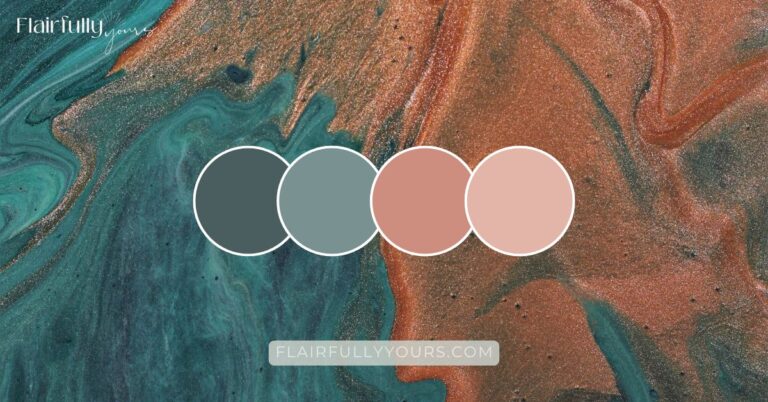
Dig deeper into this coastal blue, soft orange and sandy neutral palette. I share paint shade recommendations, fabrics pairings and styling ideas!
Why 4 colors?
By working with four colors, you gain flexibility in your design choices. It’s like giving yourself a creative playground where you can mix and match based on how bold or subtle you want each color to be.
Basically, it makes things easier in terms of finding pieces (furniture, rugs, accents, etc.) to fill your space.

Whether you’re updating your walls, furniture, or just adding a few new accents, these palettes allow you to play with proportions.
For example, maybe you love a pop of teal but only want a hint of it, or perhaps you want to make it the star of the show. With four colors, you have the freedom to adjust and find the balance that feels just right for your home.
A quick tip:
When you’re working with a four-color palette, think of one or two colors as your foundation. These will dominate the space. The remaining colors are your accents – those little bursts of personality that bring your room to life.
Once you’ve chosen your core colors, the fun part begins—bringing them to life in your decor. Whether it’s a statement chair, a few throw pillows, or a piece of artwork you love, these accents are where your personality really gets to shine. Not sure where or how to start?👉 This blog post is full of simple ways to use accent decor for pops of color that feel natural and pulled together.
For more inspiration on using color to create the perfect space, you might also enjoy reading 5 Steps to a Coastal Breakfast Nook Makeover.
Explore Color Palettes That Elevate Your Home’s Style
Choosing the right home color scheme is more than just picking what’s pretty—it’s about creating a vibe that reflects you and feels cohesive. While it might feel daunting, using a structured approach like the 4-color palette makes the process far easier.

Ready to dive into your color journey?
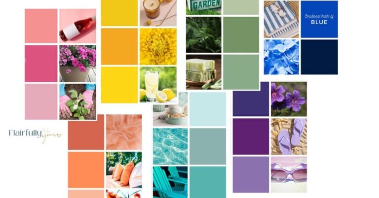
Below, you’ll find a gallery of carefully curated 4-color palettes, each designed to inspire and simplify your choices.
Scroll through these palettes for fresh, stylish combinations that will elevate your space!


Making the Most of Your Color Journey
As you scroll through the 4-color palette graphics I’ve included, let them spark some inspiration for your home. These palettes are designed to help you visualize how colors can work together to create a cohesive, stylish space.
When you find one that catches your eye, think about the tips I’ve shared below to guide your journey. It’s all about tuning into your natural preferences, spotting standout colors, and considering how they might fit with your existing decor.
1. Spot the Standouts
Pay close attention to the colors that immediately draw your eye. Which ones do you find yourself naturally gravitating toward? These are likely the hues that resonate most with your personal style and the vibe you want to create in your home.
For instance, if you’re drawn to watery blues, check out how I used coastal blues to transform a small bath into a serene retreat in this Small Bath DIY makeover.

2. Notice the No-Gos
Equally important, take note of the colors you’re not so fond of. This can help you avoid incorporating shades that might throw off the harmony of your space. Sometimes knowing what you don’t like is just as valuable as knowing what you do like.
3. Pay Attention to Intriguing Hues
As you scroll through, are there any colors that surprise you? Maybe a shade you’ve never considered before catches your eye. These intriguing hues might be the perfect unexpected pop of color to elevate your decor.
Love this idea? Keep it handy.
Even if you’re not ready to go big with a color like this, bring it in with a few small doses in accent pieces like throw pillows, a vase, hand towels, as part of your centerpiece, or as the key color in a photo or print you hang on the wall. Then, if you’re really digging the result, start adding the color in bigger ways.
Need a few unexpected hues to try? Sea Glass Green and Aquaverde SW 9051 are two of my favorite coastal shades that feel fresh, soft, and a little bit surprising—in the best way.
Found a hue that’s calling your name? This article on choosing the best paint color can help you test it in your space before committing. It’s full of practical steps and color palette examples that work with coastal color schemes.
Neutral tones and soft blues are a hallmark of coastal design, but furniture can also play a big role in bringing these colors to life. A woven bench in a natural or whitewashed finish ties in beautifully with your palette while adding texture and function. Get tips on picking the perfect woven bench for your coastal entryway here.
4. Look for Patterns
Do you see a pattern in the colors you’re drawn to? For example, do you consistently love soft, muted tones or are you drawn to bold, vibrant hues?
Identifying these patterns can help solidify your color palette preferences.
You may think that green is a hard no, but it turns out that you are actually drawn to muted earthy tones of green like sage and mossy green… even though deep hunter green remains a firm ‘no’!
If sage sounds like your vibe, explore my Sage Color Palette post for more inspiration.
5. Imagine the Possibilities of the Home Colors Schemes You’re Drawn to
Picture how specific home color schemes would work in your own space. How would they complement your existing decor?
Which colors would work best for walls, and which for accent pieces? Let your imagination guide you—and then give it structure.
If you’re unsure how to actually use your colors without going overboard, I follow a super simple rule: One Bold, Two Calm. It’s my go-to for styling spaces that feel pulled together and calm—not cluttered.
6. Avoid Décor Flops
One of the biggest reasons for a décor “flop” is not considering the existing finishes in your space.
For example, if your home has dominant oak woodwork, introducing a vivid tone like a bright aqua or a raspberry red might feel stark and out of place.
However, this doesn’t mean you need to abandon your love for aqua or red.
Instead, select warmer tones within the respective color family that blend seamlessly with your existing finishes.


Take Your Time, Play with Color, and Make it Yours!
Remember, choosing the perfect color scheme isn’t a race! Enjoy the process!
Experiment with different shades, test them out, and most importantly, have fun with it!
Already have your color scheme figured out? Amazing!
Now it’s time to bring those hues into your space.👉 Here’s my guide to adding pops of color with accent decor in a way that feels pulled together and intentional.
Stick around, because in the next posts, I’ll guide you through more room-specific inspiration, giving you actionable tips to make your home look its absolute best—one color at a time.
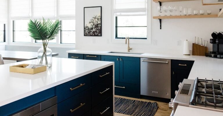
Room-by-Room Coastal Interior Inspiration: Kitchen Edition
After exploring how a 4-color palette can simplify your color choices, let’s dive into applying these palettes, starting with the kitchen! This space is all about striking the perfect balance between style and functionality, while keeping those coastal vibes alive.
Ready to get started with your kitchen? Head over to my post on 5 Color Combos for Your Coastal Kitchen Decor for inspiration to help you bring those breezy, coastal vibes into the heart of your home.


Want the outside of your home to feel as coastal as the inside? Check out my Beach House Exterior Color Palettes for 8 designer combos that always look good.
Up Next: Warm Tones vs. Cool Tones
Now that you’ve mastered the basics of creating a 4-color coastal palette, it’s time to refine your style even further! Are you drawn to the cozy, inviting vibe of warm tones, or do you prefer the crisp, refreshing feel of cool hues?
In my next post, I’ll walk you through the key differences between warm and cool tones, how they impact the mood of a space, and how to decide which one suits your home best. Plus, I’ll share practical tips for blending the two for a balanced and harmonious look.
👉 Discover Warm Tones vs. Cool Tones and get inspired to make confident color choices that bring your vision to life!
Let’s take the guesswork out of decorating—one thoughtful step at a time.
Also, check out these posts for more color inspiration:
- Beach House Exterior Colors: 8 Coastal Palettes That Just Work
- Best Paint Color? Don’t Even Grab a Swatch Until You Do This
- How to Find Your Color Palette
- Sage Color Palette
- Neutrals Color Scheme Ideas to Refresh Your Decor
- Coastal Blues Inspire this Small Bath DIY Makeover
- Lake House Color Palette: Coastal Blue, Soft Orange, Sandy Neutral
- Avoid Overdoing Coastal Decorating with This One Simple Rule