If exterior colors make you want to run for the dunes, I get it. It’s confusing, it’s expensive, and it feels very… permanent.
So let’s skip the overwhelm. These 8 beach house exterior palettes are curated to be no-fail, no-stress, and totally coastal — so you can pick your favorite and actually feel good about it.
Each palette includes:
Exterior (Siding) Color — the main body of the home
Trim Color — windows, fascia, eaves, garage surrounds
Accent Color — your personality pop: front door, shutters, furniture, planters
Look for the “This palette is for you…” line to find your match fast.
Let’s jump in.
Here’s how beach house exterior colors come to life…
Want even more help choosing colors? Grab my Top Coastal Paint Colors guide. It’s a quick, printable cheat sheet of my most-used Sherwin Williams picks for both interiors and exteriors.
8 Coastal Exterior Palettes for Instant Beach-House Curb Appeal
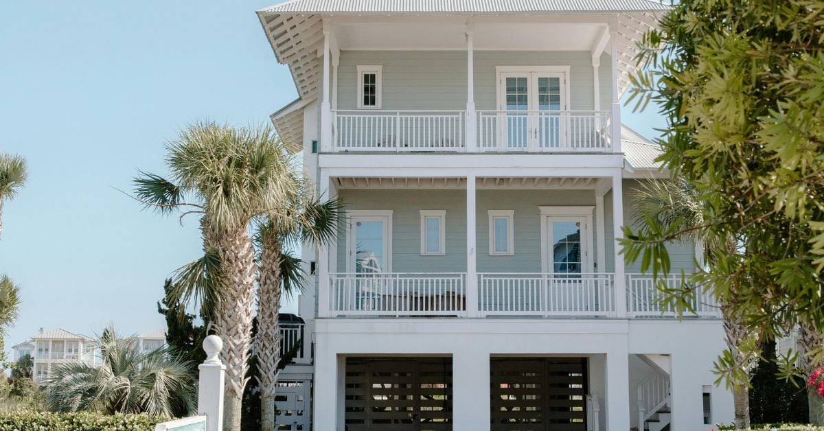
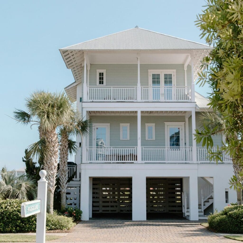
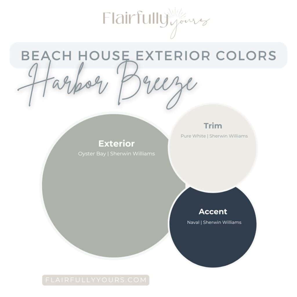
1. Harbor Breeze
For when you want your home to feel like an exhale the moment you pull into the driveway.
See how soft green siding + crisp white trim instantly gives that breezy, coastal-calm look.
Vibe: calm, breezy, quietly coastal
Exterior: Sherwin Williams Oyster Bay Trim: Sherwin Williams Pure White Accent: Sherwin Williams Naval
Oyster Bay gives your home that relaxed sea-glass whisper. Pure White adds clean structure without going stark, and Naval gives a classic deep-nautical moment—especially on a front door.
Why it works: it balances airy softness with timeless contrast. Use the accent on: front door, shutters, porch chairs, mailbox post.
This palette is for you if…
You love subtle coastal greens.
You want a calm, easy, relaxed exterior.
You like contrast but not drama.
You want a home that feels coastal without going “themed.”
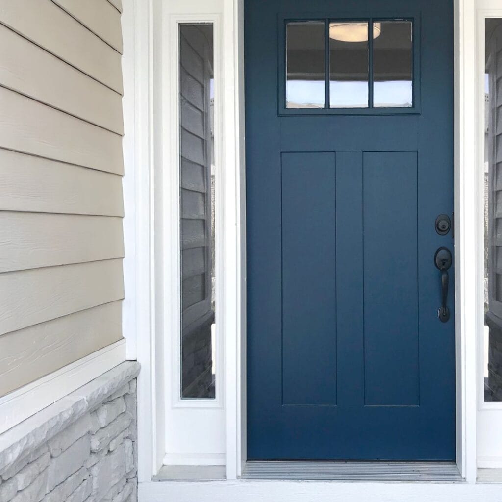
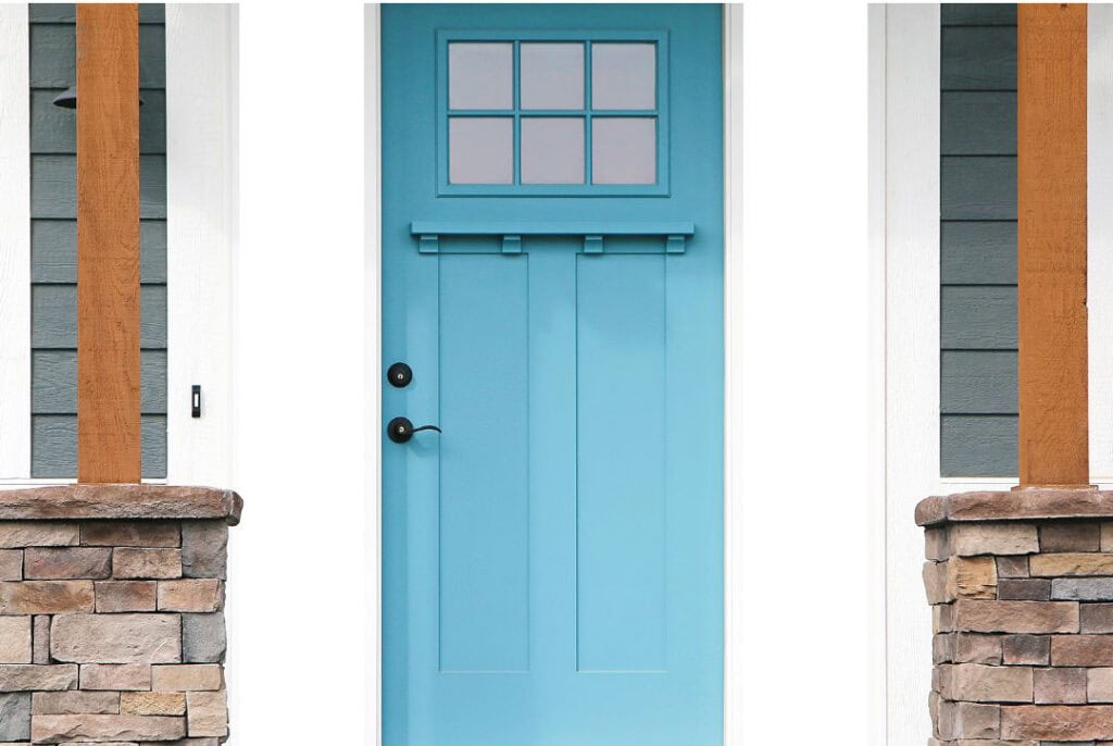
A bold coastal accent door is one of the easiest ways to boost curb appeal fast.
2. Breezy Beach Morning
Soft, airy, and easy — like the coastal version of fresh sheets on your bed.
Light, airy, and perfectly beachy — this palette keeps your exterior feeling fresh from sunrise to sunset.
Vibe: airy, fresh, relaxed
Exterior: Sherwin Williams Sea Salt Trim: Sherwin Williams Alabaster Accent: Sherwin Williams Underseas
Sea Salt outside becomes a whisper of blue-green. Alabaster keeps things soft and welcoming. Underseas brings the deep-sea moment that makes the whole palette come alive.
Why it works: it layers coastal tones for an effortlessly serene exterior. Use the accent on: shutters, porch swings, window boxes.
This palette is for you if…
You want soft coastal color that doesn’t overwhelm.
You like warm trim over crisp white.
You’re after a breezy, spa-like feel.
You want an exterior that feels friendly and calm.
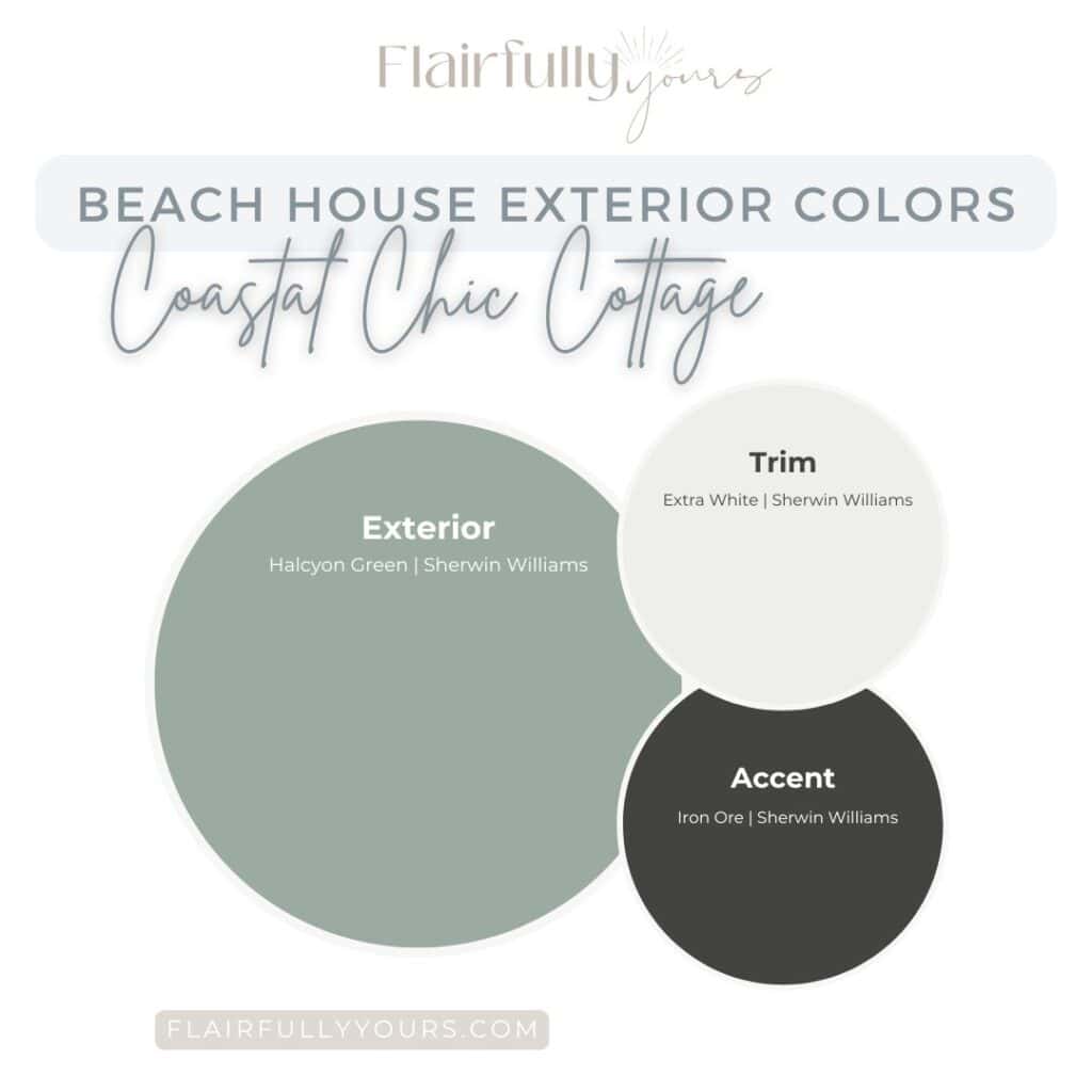
3. Coastal Chic Cottage
Charming meets polished: a little cottage, a little modern, and totally coastal.
A coastal classic with just a hint of drama — clean, crisp, and cottage-perfect.
Vibe: charming meets polished
Exterior: Sherwin Williams Halcyon Green Trim: Sherwin Williams Extra White Accent: Sherwin Williams Iron Ore
Halcyon Green feels elevated without being serious. Extra White modernizes it instantly. Iron Ore brings the bold coastal edge to make your curb appeal pop.
Why it works: it mixes cottage charm with crisp, modern edges. Use the accent on: front doors, shutters, porch railings.
This palette is for you if…
You love coastal greens but want something richer.
You want a cottage vibe with a modern twist.
You prefer clean, high-contrast trim.
You want a color that stands strong in bright light.
4. Harbor Mist
Calm, serene, and quietly beautiful — the “soft glow” version of exterior color.
Soft, misty, and calming — the coastal neutrals that always feel effortless.
Vibe: soft, serene, foggy-morning coastal
Exterior: Sherwin Williams Serenely Trim: Sherwin Williams Pearly White Accent: Sherwin Williams Homburg Gray
Serenely gives you that pale, misty blue glow. Pearly White warms it just enough. Homburg Gray brings the mood in the best coastal way. (Curious why it’s one of my go-to colors? → see why I love Homburg Gray)
Why it works: it’s peaceful, polished, and incredibly easy to live with. Use the accent on: doors, Adirondack chairs, shutters.
This palette is for you if…
You want a soft coastal blue without brightness.
Your home has a lot of shade.
You love subtle contrast.
You’re after a quiet, calming exterior.
Love this idea? Keep it handy.
Email this to yourself so it’s ready when you are!
If you like these combinations, you’ll love my Top Coastal Paint Colors guide. Grab it here.
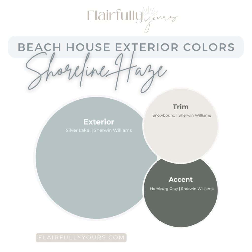
5. Shoreline Haze
Cool, crisp, and modern with just enough coastal moodiness to feel elevated.
Snow at the beach? Just in the paint name! The look is clean, cool, and totally coastal.
Vibe: cool, modern, coastal sophistication
Exterior: Sherwin Williams Silver Lake Trim: Sherwin Williams Snowbound Accent: Sherwin Williams Homburg Gray
Silver Lake is that silvery, misty blue-gray that reads coastal without going pastel. Snowbound lifts and brightens. Homburg Gray brings the attitude — in the best coastal way possible.
Why it works: it feels modern, calm, and effortlessly refined. Use the accent on: front doors, shutters, metal porch furniture.
This palette is for you if…
You love blue-grays with a modern feel.
You prefer cool tones.
Your home has clean lines.
You want a coastal look that isn’t “cute cottage.”
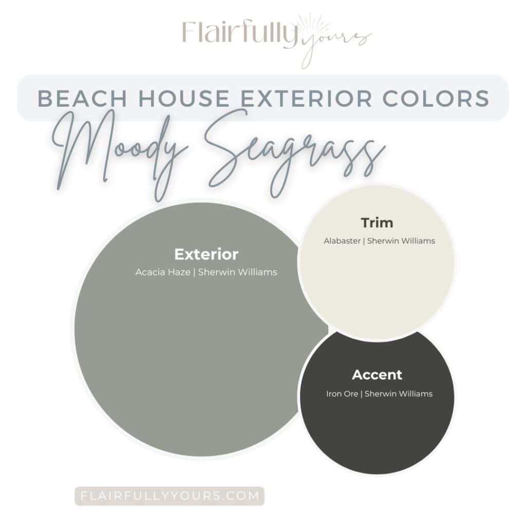
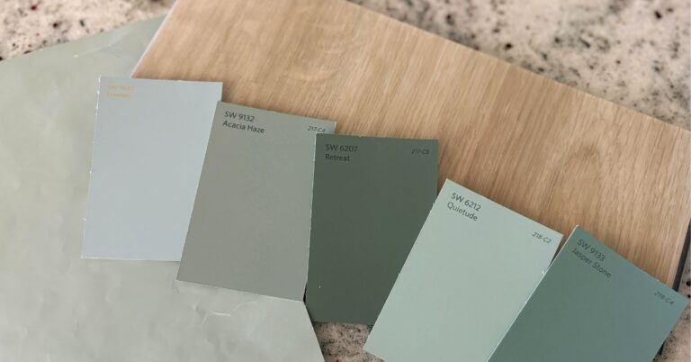
6. Moody Seagrass
Earthy, elegant, and designed to look expensive in every kind of light.
A grounded, coastal vibe — organic, effortless, and quietly bold.
Vibe: earthy, grounded, upscale coastal
Exterior: Sherwin Williams Acacia Haze Trim: Sherwin Williams Alabaster Accent: Sherwin Williams Iron Ore
Acacia Haze brings depth and sophistication. Alabaster softens it so it never feels too cool. Iron Ore adds the dramatic finish.
Why it works: sunlight makes this palette look expensive. Use the accent on: shutters, beams, porch railings, lighting.
This palette is for you if…
You want a coastal look without going pastel or beachy.
You have warm stone or natural elements.
You gravitate toward moody greens.
You want a coastal home that feels truly elevated.
Coastal doesn’t have to be blue — soft greens bring a grounded, serene vibe to your exterior.
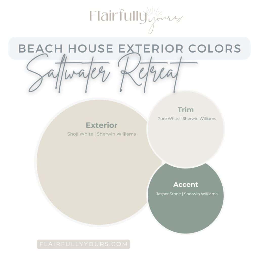
7. Saltwater Retreat
Warm, welcoming, sun-washed coastal charm without trying too hard.
Warm, airy neutrals for the beach lover who wants calm over coastal clichés.
Vibe: warm, breezy, cottage-coastal
Exterior: Sherwin Williams Shoji White Trim: Sherwin Williams Pure White Accent: Sherwin Williams Jasper Stone
Shoji White is sun-washed and cozy. Pure White brightens the trim with that clean, coastal crispness. Jasper Stone gives that soft sea-glass green that feels both coastal and classic.
Why it works: warm + cool balance gives this palette its signature charm. Use the accent on: door, shutters, porch chairs, window boxes.
This palette is for you if…
You love a warm white exterior.
You prefer softer, muted accent colors.
You lean cottage-coastal.
You want a friendly, inviting look.
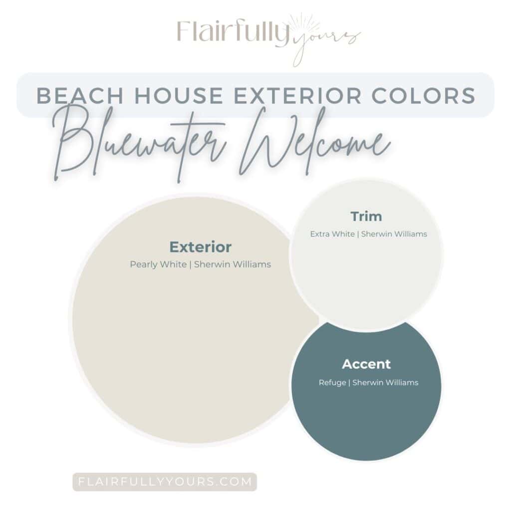
8. Bluewater Welcome
Clean, classic coastal vibes — with a front-door pop that says “come on in.”
The soft-blue pop that makes your whole beach house say… welcome home.
Vibe: crisp, clean, classic coastal
Exterior: Sherwin Williams Pearly White Trim: Sherwin Williams Extra White Accent: Sherwin Williams Refuge
Pearly White feels soft, not stark. Extra White sharpens every detail. Then comes Refuge, the blue-green moment that makes your exterior go from “pretty” to “oh wow.”
Why it works: high contrast + coastal color = guaranteed gorgeous. Use the accent on: front door (YES!), shutters, porch bench.
This palette is for you if…
You love the fresh “white coastal home” look.
You want clean, modern trim.
You love a bold coastal blue door.
You want a look that feels timeless.
A fun coastal accent door keeps your exterior fresh without committing to a full bold color.
How to Choose Your Beach House Exterior Color Palette
Look at your fixed elements: roof, brick, stone, concrete, landscaping.
Test BIG samples in daylight (morning + afternoon)
Let your style lead the palette: cottage, modern, classic, serene, moody…
Pick the vibe first then the color: soft + serene, modern + crisp, moody + coastal.
Choose trim with intentional contrast: too close = flat, too stark = harsh.
Lighter exteriors hide salt, sand, and sun fade better (your future self will thank you.)
Keep siding soft and use deeper colors on doors, shutters, porch accents, and decor for personality.
Remember: your accent color sets the personality.
A great example of how soft siding + crisp white trim = instant coastal curb appeal.
Still deciding on the perfect palette? MyTop Coastal Paint Colors guide can help. It includes my most-loved Sherwin Williams shades for walls, cabinets, trim + accents — all in one quick-start guide. Download it here.
Your Beach House Exterior Is About to Look Stunning
Choosing beach house exterior colors doesn’t need to be overwhelming. With these eight curated palettes, you’ve got everything you need to pick a coastal exterior that feels like you.
And if you’re stuck between two? Just ask! I love talking paint colors.
Want help with interior colors too? My Color Solutions page is where you’ll find room-by-room guides, undertone tips, and my go-to Sherwin Williams formulas for getting color right the first time.
You know that moment when you look at your shelf decor and think, “Why doesn’t this look as good as it should?” Nothing is technically wrong. The pieces are fine….
If choosing paint colors feels harder than it should, take a breath. You’re not behind. You’re not bad at this. And you’re definitely not alone. Most people don’t struggle with…
Hey, friends! If there’s one thing I hear a lot, it’s the confusion over warm tones vs. cool tones. You may have always thought you were a “warm tones” person,…
Because setting the table shouldn’t feel like another chore. Most of us love the idea of coastal table decor that looks effortlessly stylish. But let’s be real—between work, sports practices,…
Hey friends! If there’s one thing I’ve learned from my design journey, it’s that home color schemes are a huge deal — and a huge hurdle for most of you…
If Your Paint Looks ‘Off,’ It’s Not Your Eyes Paint color looks different in your home than it did at the store? Or your best friend’s house? Heck, even from…