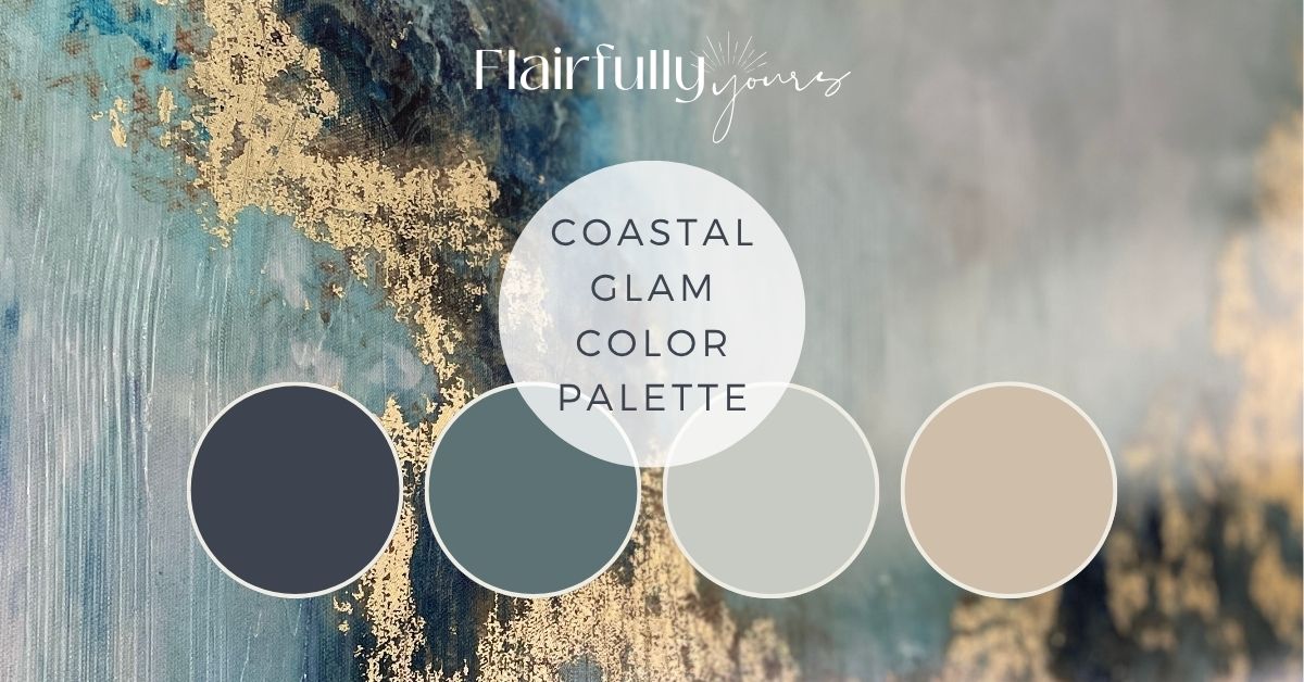
Coastal Glam Color Palette: Moody Blues, Misty Grays & Sandy Neutrals
Love coastal colors but crave something a little more refined? That’s where coastal glam comes in — a soft mix of moody blues, misty grays, and sandy neutrals with just enough shimmer and polish to feel elevated, never overdone.
It’s that perfect mix of calm + confident — where brushed gold meets driftwood tones, and the overall vibe feels intentional and timeless.
In this post, I’ll walk you through the Sherwin-Williams color matches that bring this palette to life, how to use them room-by-room, and a few easy styling tips to pull it all together (even if your finishes don’t “match” perfectly.)

Why This Palette Works
This palette balances cool and warm undertones, which is why it feels so livable.
- Moody blues add rich, grounded depth.
- Soft gray-greens bring that misty, coastal calm.
- Warm sandy neutrals keep it cozy and balanced.
Together, they create that signature coastal glam look — calm, collected, and quietly sophisticated.

The Coastal Glam Color Palette

- SW 2739 Charcoal Blue – Deep, moody navy-gray that grounds the palette. Stunning on cabinetry, accent walls, or consoles.
- SW 6222 Riverway – A smoky teal that feels like a softer, more muted Silken Peacock. Adds color without overpowering.
- SW 7057 Silver Strand – A misty, sea-glass gray with subtle blue-green undertones. Ideal for main walls — flexible and serene.
- SW 9110 Malabar – A soft, sandy greige that warms up the palette. Great for adjacent rooms or larger wall areas.
Together, these tones create a foundation that’s calm but confident — the perfect blend of coastal ease and subtle glam.
Intrigued with Silver Strand? Don’t miss SW Silver Strand: The Chameleon Paint Color for Coastal Homes.
It’s one of those colors that changes with the light — and once you see why, you’ll want it on your walls.
💡 Tip: Always test your swatches side-by-side. Colors shift depending on lighting and the tones next to them.
How It Might Look in a Real Space
Picture this: Silver Strand walls set a calm, airy backdrop — soft and misty with that hint of blue-green that feels like a coastal morning.
You bring in moody blue accents with a painted Slate Tile console table or sideboard, a few deep-toned throw pillows, and maybe a textured blanket draped nearby.
Then layer in warm sandy neutrals through a jute rug, linen curtains, or a natural wood frame. A few gold touches — a lamp base, picture frame, or mirror edge — pull everything together with that subtle glam shimmer.

Now, flip the script.
Start with a darker base, like Slate Tile walls or cabinetry, and soften it with Silver Strand in nearby spaces — maybe the adjoining hallway or built-ins.
Add lighter accents through warm linen upholstery, woven lighting, and sandy-toned textiles. The result feels a little moodier and cozier, but still every bit as coastal glam.

Where This Palette Works Best
Bathroom or Powder Room
Use Silver Strand on the walls for a spa-like glow and Charcoal Blue or Riverway on the vanity. Add brushed gold or champagne hardware — it instantly makes even a small space feel high-end.
Bedroom
Paint walls in Malabar and add Riverway in small accents (pillows, art, or a dresser). Layer soft textures like linen bedding and a woven rug. A touch of gold in lamps or frames ties it all together.
Entryway or Dining Area
These spaces love a little drama. Try Charcoal Blue on a console or lower half of the wall with Silver Strand above. Woven lighting and brass or rattan décor keep it relaxed but polished.

Styling Tips for a Modern Coastal Glam Look
1. Sprinkle the Glam
A single metallic accent can feel random, but repeating it in small touches makes it cohesive. Think lamp bases, mirror frames, drawer pulls — all in the same metal family (or complementary tones).
Try a gold lamp on the console, a pearly vase near the window, maybe a metallic tray on the coffee table. The glow should move with you as the light shifts through the room.
💡 If you’re not sure how much is “too much,” check out How to Avoid Overdoing It: The ‘One Bold, Two Calm’ Rule for Coastal Decorating.
2. Mix in Textures to Calm the Shine
If something glimmers, give it a natural partner. Think a glossy vase on a woven tray, a shimmery pillow beside a soft neutral woven throw.
Try rattan next to brass, linen beside glass, or a seagrass rug under a polished table. Texture is what gives coastal glam its heartbeat.
🌿 See more examples in 7 Natural Textures That Bring Coastal Style to Life.
3. Add a Hint of Mood
Coastal glam loves contrast. So go for a little drama — not a lot. Try shades like Charcoal Blue, Riverway or Homburg Gray on a console table, vanity, built-ins, or accent wall.
Then balance it with a lighter toned walls like Silver Strand or Malabar walls. The contrast adds dimension without overwhelming your space.
🎨 See how I use Sherwin Wiliams Homburg Gray here.
4. Let Your Lighting Do the Work
Light changes everything — truly.
Love this idea? Keep it handy.
In bright, natural light, Riverway reads bluer while Charcoal Blue looks crisp and cool. As the sun sets, both colors shift richer and moodier — in the best way.
The secret to that soft, magazine-level glow? Use warm bulbs (around 2700K) and layer your lighting. Lamps and sconces add depth and ambiance that overhead lighting just can’t match.
Coastal glam lighting is all about the glow — warm bulbs, gold lamp bases, and even soft candlelight bring out the shimmer in this palette beautifully, especially around the holidays when your home feels extra cozy.
✨ For lighting ideas that pair perfectly with this palette, read Best Coastal Lighting Fixtures: Capiz, Woven, and Glass Ideas for Every Room.
5. Layer the Finishes
Coastal glam isn’t about matching — it’s about blending. Mix matte and gloss, rough and smooth, woven and sleek. Try a matte vase beside a glossy frame, a textured throw draped over a smooth sofa arm — that’s how your space starts to feel layered and lived-in, not “done.”
💡 For more on coordinating finishes before you commit, see Build + Reno Interior Finish Kit: Choosing Coastal Decor for Home.
6. Make One Easy Upgrade
Small tweaks go far. Swap dated nickel hardware for brushed gold, trade a boring builder-grade light fixture for something woven or pearly, or paint a single piece of furniture in your moody accent color. One small change can reset the entire tone of your space.
10 Simple Ways to Refresh Your Home Decor with a Hint of Coastal gives you a few ideas to get started

When Finishes Don’t “Match”
I used to be nervous about mixing metals — my kitchen had brushed nickel hardware, the doorknobs and hinges throughout my house had oil-rubbed bronze, and I reallllly wanted to add gold accents to my entryway. But I worried they’d clash.
Spoiler: they didn’t.
Repeating that same gold tone in a few other places — the lamp base, a picture frame, a small bowl — made it feel intentional.
I now have different finishes in many of my rooms – several of which mix and match finishes within the space!
Once I stopped trying to match every metal and started layering what I actually loved, everything felt more connected. Here’s a peek at how I pull off mixed metals the coastal glam way:

Optional Supporting Accents
These colors coordinate beautifully with the palette and come straight from my Top Coastal Paint Colors Guide — so you can expand the look into other rooms while keeping that easy flow:
- SW 7008 Alabaster – Warm white that flatters Silver Strand and Malabar; perfect for trim and ceilings.
- SW 9109 Natural Linen – A lighter neutral if you want a soft transition between rooms.
- SW 7621 Silvermist – A lighter, mistier cousin to Riverway. Use for adjoining spaces where you want a hint of teal.
- SW 7624 Slate Tile – A deeper, grounding blue-gray that ties beautifully with Charcoal Blue on cabinetry or built-ins.

Common Coastal Glam Mistakes (and Easy Fixes)
Letting the glam take over.
A little shimmer goes a long way — and yes, a glittery accent can look amazing when it’s balanced.
Fix it: Repeat a few metallic or sparkly touches (like a vase, mirror, or candleholder) and mix them with matte, woven, or natural textures so it feels intentional, not overdone.
Going all cool tones.
Too much blue or gray can make a room feel flat or chilly.
Fix it: Add warmth with Malabar, Natural Linen, or wood accents. Even a woven tray, jute rug, or rattan pendant can instantly cozy things up.
Forgetting texture.
Coastal glam thrives on layers and contrast.
Fix it: Mix glossy and matte, soft and structured — think linen curtains, a seagrass rug, and a metallic lamp base. Texture is what keeps the look elevated but livable.
Ignoring lighting.
Even the prettiest palette can fall flat under harsh light.
Fix it: Swap daylight bulbs for soft white (around 2700K) to bring warmth and glow. It flatters both your colors and your metallic finishes.
Playing it too safe.
A calm palette is beautiful — but too much “safe” can read boring.
Fix it: Add contrast with Charcoal Blue or Riverway on a vanity, accent wall, or console. A single bold hit adds polish and depth without overpowering your space.
Love These Shades? Take the Next Step
If these tones caught your eye, you’ll love my Top Coastal Paint Colors Guide — full of my favorite combos and pairing tips.
But if you want to skip the guesswork and make your design effortless, the Coastal Color Kit is your solution. It includes Coastal Glam PLUS five other expertly curated palettes, with paint shades, decor pairings, and styling tips, hardware + finish suggestions and what NOT to pair. Everything you need to create a cohesive, stunning coastal vibe.

Final Takeaway on the Coastal Glam Color Palette
Coastal glam isn’t about being fancy — it’s about feeling confident in your choices.
It’s that subtle shimmer, those soft moody tones, and the layered textures that make your home feel finished.
And yes, it’s holiday magic ready — twinkle lights, greenery, and gold details glow even more beautifully against these colors.
So grab a few samples, play with light, and don’t be afraid to mix a little glam into your coastal calm.


Lovely article. I do wish that paint companies would place the “Light Reflective Value” on the paint chip. This is so important to know, and would help customers to get a outcome they desire, instead of thinking your paint didn’t turn out like they wanted.
I couldn’t agree more! LRV is one of those details that doesn’t get enough attention. A helpful rule of thumb: if your room doesn’t get much natural light, be cautious with colors that have a lower LRV—they’ll usually read darker than you expect. On the flip side, in bright, sun-filled rooms, higher LRV colors can sometimes feel lighter than expected. That’s why it’s always a good idea to test large samples in your own space and leave them up for a few days. Check them in the morning, afternoon, evening, and with both natural and artificial light—you’ll be amazed at how much the same color can change throughout the day! 😊