5 Steps to a Coastal Breakfast Nook Makeover
Welcome to the heart of our home, where a touch of coastal charm meets a burst of DIY magic! In this blog post, join me on the journey of a coastal breakfast nook makeover. Discover how five key elements underwent a refreshing update to transform a breakfast nook dining space from its dated demeanor to a vibrant coastal haven.
For more coastal inspiration, check out my small bathroom makeover that beautifully blends coastal blues and glam elements.

Key Elements Used for a Coastal Breakfast Nook Makeover:
- Sherwin Williams Silver Strand Paint
- Dining table refinish
- New rope mesh beachy dining chairs
- Reupholstered bench seat cushions
- The pièce de résistance – a stunning seaglass artwork that steals the show.
1. Fresh Paint: Brighten with Sherwin Williams Silver Strand Paint
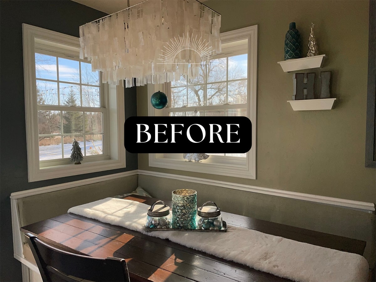
Up until this point, the “neutral” color that served as my base wall color throughout much of my main floor was Sherwin Williams Herbal Wash, a soft sage green. Which, I whole heartedly loved throughout the entire 13-ish years I’ve had it (so much so, that I repainted the same color after a major kitchen remodel several years ago.)
Discover more about why sage could be the perfect hue for your home, where to use it, and how to incorporate it seamlessly in my Flairful Hues: Sage Color Palette Guide post.
But it was time for a change. A change that would deliver a fresh inviting aura that hinted at the gentle breeze of the ocean.
Choosing paint colors is one of the things I love best about projects. I know, I know, not everyone shares that opinion. If you’ve ever picked the wrong color or decided, “nope, don’t like it” AFTER painting an entire room, I sympathize. The amount of thought I put into picking a paint color rivals that of choosing a name for my children!

To make the shift to fresher and brighter, I wanted the bright of white but softer, with a tinge of sea glass. The tricky part was finding a shade that didn’t scream blue. The method that works best is to sample paint colors on a wall in the actual space. Its not unusual to find a patchwork of sample sheets taped all over a wall during my decision making process.
Looking for more color inspiration and tips on finding your perfect palette? Check out my post on Flairful Hues: How to Find Your Color Palette.
And for tips on creating the perfect coastal color palette for your home, check out my guide on choosing the right home color schemes for coastal interiors.
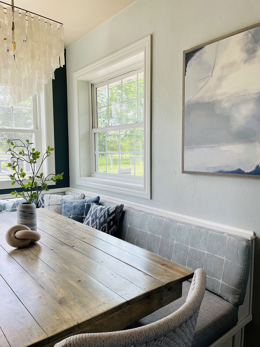
The winning shade, Sherwin Williams Silver Strand, has a green-gray tint that feels lighter than air. Cool cyan undertones give it a misty quality that pick up just the right glimmer of blue from all my natural light.
While I typically have a finished product vision in my head, finding just the right shade to deliver on that image is not always easy. The two most important considerations when deciding on just the right hue include: 1) lighting and 2) the surrounding furnishings.
Lighting
The amount and type of lighting in your space is instrumental in helping you narrow down your color options. Does the space receive natural light? Lamp light? Recessed light? LED light? The lighting will drastically alter the look of a shade of paint more than anything else. Always, always, always sample your paint color in the actual space before committing to it.
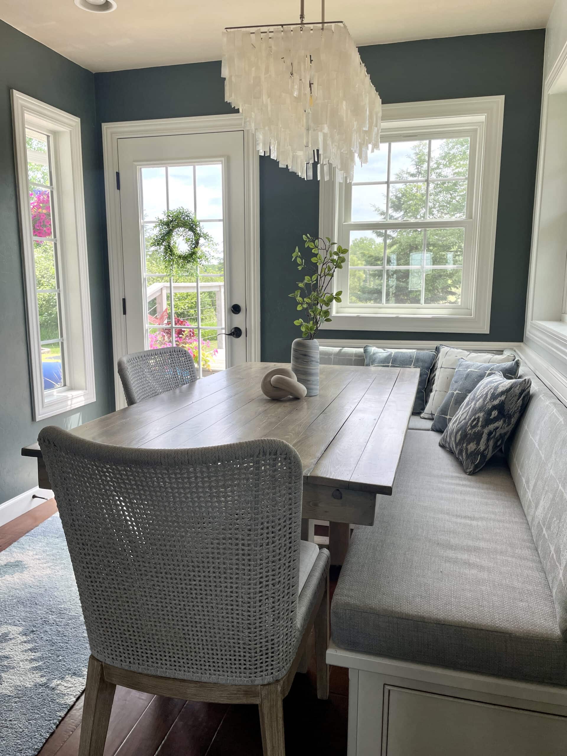
The banquette area of our kitchen is surrounded on multiple sides by windows and a glass paneled door leading to a patio, so the amount of natural light in that space is plentiful from sunup to sundown. Because of this vast amount of light, I decided to keep one of the walls that was previously painted a darker shade as an accent wall to stay exactly as it. The color of this wall is Sherwin Williams Homburg Gray, which is quite possibly my very favorite shade. Ever.

Homburg Gray is a neutral color that can appear as a charcoal gray in many cases. However, because of the lighting and surrounding blues and aquas I tend to accent my spaces with, the Homburg Gray transforms into the most glorious muted teal-gray color.
Key Takeaway: always, always get samples to view in your space before buying. (The 8×8 peel and stick paint swatch samples are great for this!) Make sure to look at the samples at different times of day to see how they look in both day and night.
Surroundings
The second, yet equally pivotal aspect to consider when selecting paint colors is the impact of surrounding furnishings, particularly woodwork.
Woodwork, in my view, emerges as the most influential (and potentially limiting) factor in the paint selection process. Wood finishes possess distinct tones, and the goal is to complement rather than clash with these tones.
For instance, if your woodwork features warm, honey tones, opting for a paint palette with complementary warm undertones ensures a seamless integration.
White Trim Woodwork
When we built our house back in 2008, on a very tight budget, my number one non-negotiable was white trim. When it came down to choosing finishes, features, room sizes, etc that worked with our budget, white trim was the one thing I stood firm with. And I thank myself for that every single day. Because now – many years later and my style more clearly defined as modern coastal – the white woodwork seamlessly aligns.
When dealing with white finishes, the sky’s the limit in which shade of paint works. Because there’s not necessarily a warm or cool tone to coordinate with, I find it much easier to select paint colors for spaces featuring white woodwork. On the other hand, if you are dealing with oak woodwork, for example, you will have a warm, sometimes yellow-ish tone that you need to coordinate with. In which case, a warm sage green color like Sherwin Williams Herbal Wash is a much better choice than a cooler minty tone like Sherwin Williams Tame Teal.
Dark Wood Flooring
In contrast to the white trim in my home, our flooring is a deep, almost mahogany wood color, which (luckily for me) does not lean strongly towards a warm nor a cool undertone. The combination of contrasting white finishes and dark floors really creates a canvas to make paint colors pop.
Key Takeaway: Just because you are drawn to a particular shade or have a color that you love, that does not necessarily mean it will blend harmoniously into your space. Pay attention to the surrounding tones and colors to ensure that your chosen shade complements rather than clashes. Take into account the existing elements in your space, such as furniture, flooring, and decor, and consider how the natural light interacts with the color throughout the day. It’s not just about choosing a color you love; it’s about finding the one that creates a cohesive and visually pleasing atmosphere in your home. Hold paint samples up to these surrounding elements and make sure you find a shade with similar undertones.
Creating a coastal breakfast nook is all about incorporating unique, meaningful elements that evoke a sense of the sea. If you’re looking for more inspiration, check out how I used water skis in my Lake Life Décor project for a fun, nautical touch that can be adapted to any room!
2. Dining Table Refinishing: Dark to Beachy Transformation for a Coastal Breakfast Nook
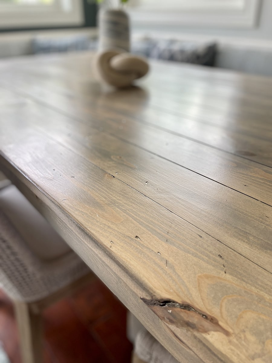
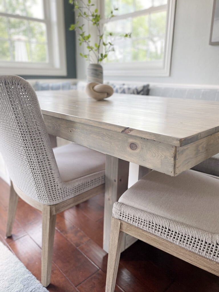
Alas, this is where the changes begin to evolve. My existing custom wood dining table was deep dark wood, initially made to match the flooring. With the new coastal vision I was working towards, I knew the table needed a facelift.
After struggling to find a style and tone that matched my vision, the idea of refinishing the existing wood dining table came to mind.
Not sure if your furniture will actually work in the space? This trick with painter’s tape is a game-changer for layout clarity—especially in tighter spots like breakfast nooks.

My husband – well acclimated to my “projects” – was willing to give it a whirl. After all, what did we have to lose? We planned to replace the table anyway.

If you have ever refinished wood, you know how tough it can be to achieve the desired wood tone. It heavily depends on the type of wood and the tone of the stain.
Picture bleached driftwood. That was the desired end result in this project. After removing the legs, sanding the heck out of the table and ‘sampling’ a few different stains, he had it. But… not the legs.
The legs were a different wood, and thus, the stain soaked in differently, making it nearly impossible to match them to the rest of the table. So new legs it was! And in the end, he nailed the final piece – a gorgeous lighter, bleached, beachy tone.

Love this idea? Keep it handy.
Key takeaway: before staining a piece of furniture, find a scrap of the same type of wood and sample stain colors on that before trying it on your actual project.
3. Airy Vibes: Incorporating Rope Mesh Beachy Dining Chairs
Since this is a banquette area, two sides of the table consist of built-in bench seating with upholstered cushions (more on those to come.) That leaves the other two sides needing dining chairs. The existing chairs were dark wood, specifically matched to our wood floor.
The ultimate goal of this whole space renovation was to make the entire dining space feel more spacious. So like the table, the intent was to lighten up the feel of the chairs by shifting to a lighter finish. The thought of refinishing the chairs crossed my mind, but we opted against that because, quite honestly, I was ready to move away from the classic mission style and move towards a more coastal style dining chair.

To achieve the airy feel I was hoping for, wicker or rattan was the intended direction. But I kept coming back to the rope chairs I was seeing. Between the woven finish and the light color, they absolutely give off the perfect airy aesthetic to blend into the intended coastal breakfast nook vision.
I encountered two significant challenges in my quest for chairs (without breaking the bank!) First, due to space limitations, an armless design was a necessity. Second, the width of the chairs had to be restricted to 24″___” to ensure a proper fit between the table legs.
The Essentials for Living style I choose looks fantastic and I receive so many compliments on them. The one thing that would make them even better – removable seat cushions. Let’s be honest, I was pretty concerned about the light, nearly white seat fabric (which is NOT removable) but the fabric has actually proved to be quite stain resistant, aided in part by their indoor/outdoor attributes.
Key takeaway: don’t pull the trigger too fast when selecting functional pieces; take your time and really thing through how it will be used, who it will be used by, whether it truly works in the space, and what features are non-negotiable to you.
Be sure to MEASURE! Take into consideration the space each furniture piece will occupy and how much clearance space is required surrounding the piece. A dining chair, for example, needs to be the correct height to slide under your table (check seat height and arm height,) and the correct width to fit the table (check leg width and seat width.) Pay attention to how far away from the table your chair will stick out – does this still allow adequate walking space?
Bonus Tip: If your stools or chairs are looking a little worn—or just don’t match your coastal aesthetic—but replacing them isn’t in the budget, don’t worry! A quick DIY update can give them a fresh, stylish look in no time. Check out this simple counter stool makeover for an easy way to refresh your seating without spending a fortune.
4. Fabric Selection: Reupholstering Cushions and Pillows for Coastal Breakfast Nook Bench Seating
Reupholstering is definitely one of the most under-utilized decorating tools. Fabrics make the magic happen. They are instrumental in pulling a look together, creating dimension and adding extra flair to your space. I am lucky to have a local boutique, Kreative Knotts, that specializes in handmade and reclaimed décor. They are my go-to for all reupholstery projects.
Narrowing down fabric selection choices is no easy feat, as there are SO many fabulous options. Oodles and oodles of samples from Charlotte Fabrics were the key to my success.


If you can believe it, the cushions on my banquette were the sole driver in this whole project. They plain and simple needed replacing.
The dining space is surrounded by windows, so the vinyl fabric that covered the seat cushions – while chosen for its wipe-ability (this is where my boys sat to eat, need I say more?!) – did not hold up to the UV exposure. The vinyl surface became significantly cracked and peeled.
So this time around, a heavy duty polyester fabric with fade resistant UV protection in a textured gray was the way to go. Gray because that anchored the whole seating area with surrounding spaces, such as the gray living room furniture nearby and the nickel hardware finished throughout the kitchen.

The benches also included back cushions, which needed transitioning from the previous sage green fabric to something with a little more character to capture that coastal breakfast nook vibe. The muted aqua and white pattern for the bench back cushions was just the thing to pull in my love for aqua and tie together the blue and aqua touches throughout my kitchen and living room.

As mentioned, fabric choices are vast. If you have trouble narrowing them down, allow throw pillows to become your savior. Throw pillows are one of the best, easiest ways to pull in additional colors, patterns and textures. They are THE solution when you want to pull colors together, or add in a favorite shade or pattern.
This is exactly what I did to pull in more of that adjacent accent wall color I told you I loved so much, Homburg Gray (Sherwin Williams). I tend to gravitate towards geometric patterns, so opted to mix and match two patterns, repeating one in reverse colors.


Do my boys toss the pillows aside all the time? Yes they do.
Are the delightful colors and patterns of the pillows worth it? 110%!
Key takeaway: consider reupholstery to freshen up existing furniture, cushions and pillows. Get samples and review the specs of each fabric for durability, material content, and cleanability.
Be sure to check out my post on Kitchen Countertop Decor Ideas for tips on selecting kitchen counter decor that complements your newly upholstered pieces and color schemes!

5. Finishing Touch: Adding Coastal Charm with Seaglass Artwork
Use artwork to take your finished space from done to WOW!
This stunning piece from Joyfully Said couldn’t capture my initial intended vision better if I had created it myself! The colors of this piece so perfectly match my wall colors and upholstery colors that people surely assume I matched the paint colors TO the artwork.

If you look at the photos of the finished space, you likely would assume the wall art to have been my inspirational piece. And it certainly, without a doubt would have been… if I had seen it before finishing the space.
In this case, I hit the jackpot of luck and this piece magically happened to fit seamlessly in the space after it had already been completed. Pure luck. It delivered just the right amount of “beachy” for the coastal breakfast nook I wanted, without going over the top.

That being said, I most certainly do not suggest this method of “hoping for the best!” In fact, this whole project rolled out contrary to my suggested Space Makeover Steps for Success:
- Select an inspirational piece that you want the entire project to build around
- Make your choices for paint, details and accessories based on that inspiration piece.
Key takeaway: paint can be matched to ANYTHING. Always choose your inspiration pieces, furniture, and large ticket items first.
As we wrap up this DIY adventure, the breakfast nook dining space has undergone a coastal revival, bringing fresh energy and a touch of the beachy charm into our daily lives.
Each element, from the soothing Silver Strand paint to the divine Sea Glass artwork, plays a unique role in creating a coastal breakfast nook that reflects our love for summer days at the lake. I hope this journey inspires your own DIY endeavors and adds a sprinkle of coastal flair to your home!
Continue Your Coastal Kitchen Transformation
Want to make everyday meals feel a little more special—without the extra effort? Don’t miss this must-read guide with the easiest coastal table decor tricks, from effortless color pairings to simple swaps that create a stylish, stress-free setup!
Looking to tie your whole kitchen together? Start with Kitchen Countertop Decor Ideas: Simple Styling Tips for fresh, easy ways to style your counters so they blend seamlessly with your new coastal space.
Next, check out 5 Color Combos for Your Coastal Kitchen Decor to find the perfect color palette that brings your coastal kitchen vision to life!