Why Your Sea Salt Room Still Doesn’t Feel Coastal
You picked Sea Salt.
You painted the walls.
You even added a few coastal touches.
And yet… something’s off.
You’re not failing at decorating. You just need a plan that actually works for your space.
The truth?
The paint color alone won’t make a room feel coastal.
What Most People Get Wrong With Sea Salt
Sea Salt is soft, airy, and versatile. But it’s surprisingly easy to pair it with the wrong finishes and decor.
A few common culprits:
- Orange-toned wood that fights the softness
- Stark black accents everywhere
- Bright primary blues that feel too bold
- Icy gray decor that makes the room feel cold
If you’ve tried any of these, it’s not you.
It’s the setup.
Coastal Reality Check
If your walls are Sea Salt but your furniture, finishes, and decor are telling a completely different story, the room will always feel a little disconnected.
That’s why paint color alone rarely creates the look you’re after.
What Actually Works With Sea Salt
Here’s how to make Sea Salt shine without second-guessing every decision.
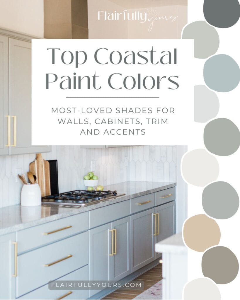
(note all shades mentioned are Sherwin Williams)
Paint + Trim
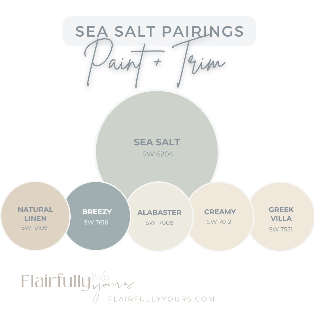
Walls
- Sea Salt SW 6204
- Natural Linen SW 9109
- Breezy SW 7616 (for a slightly airier, coastal blue look)
Trim & Doors
- Alabaster SW 7008
- Warm whites such as Creamy SW 7012 or Greek Villa SW 7551
Cabinetry & Built-Ins
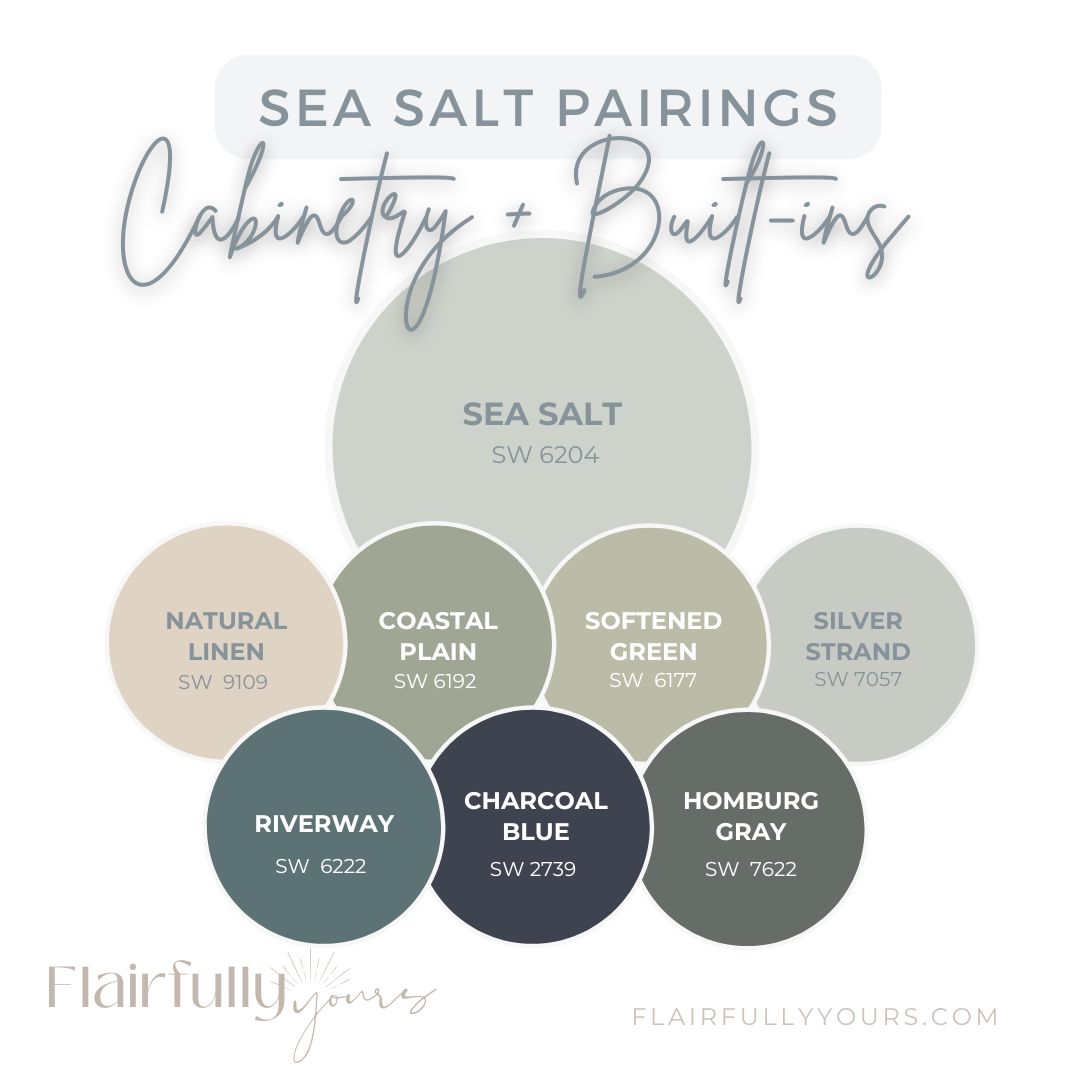
- Sea Salt SW 6204
- Natural Linen SW 9109
For a soft, tonal look that still feels connected to Sea Salt, consider:
- Coastal Plain SW 6192
- Softened Green SW 6177
- Silver Strand SW 7057
For a deeper, moodier coastal moment on a vanity, island, or built-in, try:
- Riverway SW 6222
- Charcoal Blue SW 2739
- Homburg Gray SW 7622
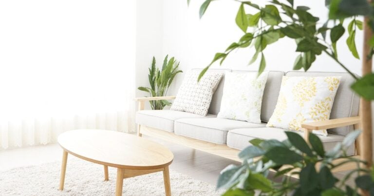
Furniture & Accents
- Soft blues
- Muted greens
- Washed or bleached wood tones
- Rattan
- Seagrass
- Linen throws and pillows
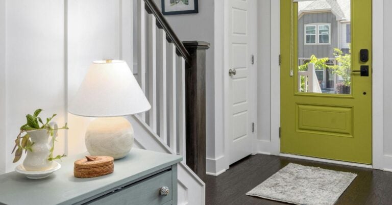
Hardware & Finishes
- Brushed brass
- Soft gold
- Brushed nickel
- Matte black in very small doses
Accent Colors
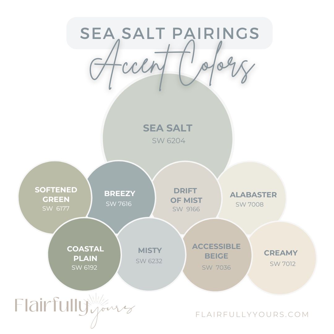
Muted Sage Green
- Softened Green SW 6177
- Coastal Plain SW 6192
Dusty Blue
- Breezy SW 7616
- Misty SW 6232
Soft Greige
Love this idea? Keep it handy.
- Drift of Mist SW 9166
- Accessible Beige SW 7036
Warm White
- Alabaster SW 7008
- Creamy SW 7012
Coastal Tip: Less contrast = more calm.
When everything feels a little softer, the room feels more relaxed.
Notice a Pattern?
Nothing is screaming for attention.
That’s exactly why it works.
The most inviting coastal spaces aren’t built around dramatic color contrasts.
They’re built around layers of colors, textures, and finishes that quietly support each other.
The Secret Most Pinterest Rooms Have in Common
The rooms you’re saving aren’t successful because of one paint color.
They’re successful because every element is supporting the same overall palette.
The walls. The furniture. The textiles. The finishes. The decor.
Everything is working together.
That’s the difference between a room that feels randomly decorated and one that feels effortlessly coastal.
Try This in Your Own Room
Before you buy a single new thing, take a quick look around your space.
Ask yourself:
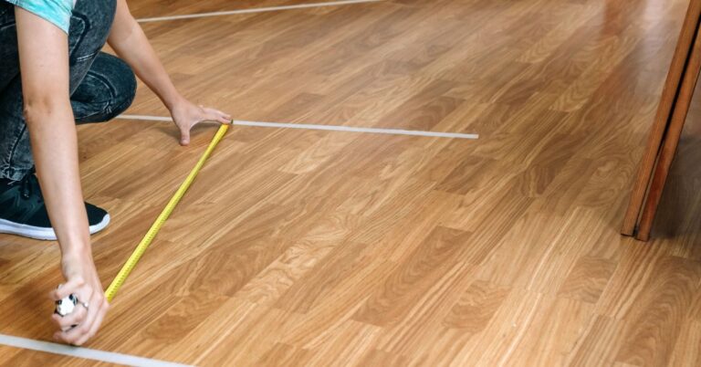
- Do my wood tones feel light and relaxed or dark and heavy?
- Am I using soft, muted accents or bright, high-contrast colors?
- Do my metals support the calm vibe I’m trying to create?
- Have I layered in natural textures like rattan, seagrass, linen, or cotton?
- Does everything feel like it belongs in the same palette?
You may discover that your Sea Salt walls aren’t the problem at all.
The Missing Piece: Decorating by Palette, Not Paint
Sea Salt is just the starting point.
Your room’s real charm comes from the full palette: furniture, finishes, metals, textiles, and decor.
This is where YOU become the hero of your own decorating story.
Once you stop focusing on a single paint color and start looking at the entire palette, decorating becomes so much easier….
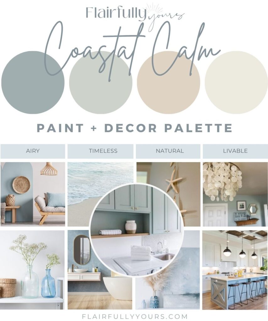
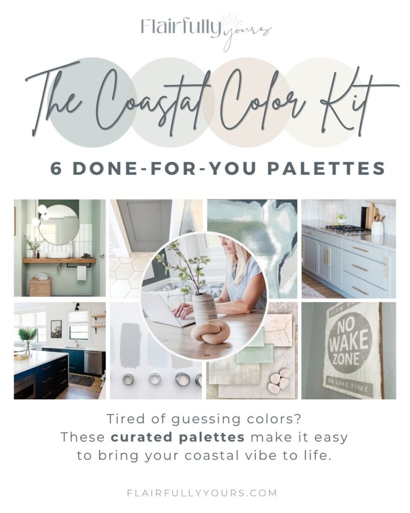
The Coastal Color Kit takes the guesswork out of decorating by showing you exactly what works together.
Inside you’ll find:
- 6 done-for-you coastal paint + decor palettes
- Sherwin-Williams paint color recommendations
- Coordinating accent colors
- Wood tone + flooring suggestions
- Hardware + finish recommendations
- Decor ideas that support each palette
- Guidance on what to avoid!
Instead of wondering:
- Does this wood tone work?
- Is this the right blue?
- Should I use brass or black hardware?
You’ll have a complete roadmap for creating a home that feels calm, coastal, and pulled together.
Not Quite Ready for the Coastal Color Kit?
Grab my free Top Coastal Colors Guide and discover the shades I recommend most often for creating a calm, coastal home.
And if you’re wondering how to make all those colors work together beautifully, you’ll also love my article on How to Decorate Using Tonal Layering. It’s a simple coastal decorating trick that can make your home feel more pulled together without buying all new furniture.
Because creating a coastal home isn’t about finding the perfect paint color.
It’s about knowing what to pair with it.