
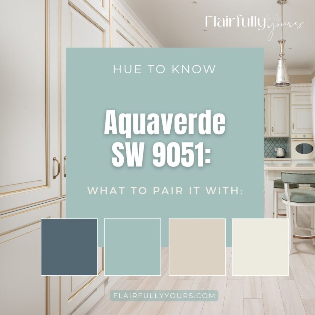
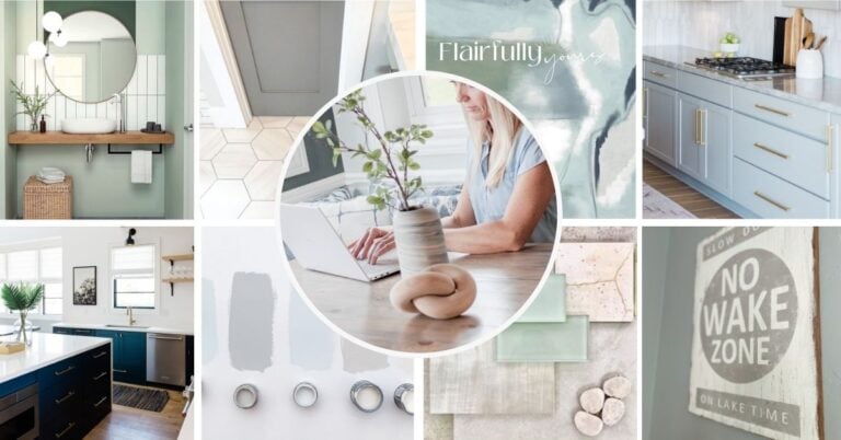
Aquaverde SW 9051: Where to Use It and What to Pair It With
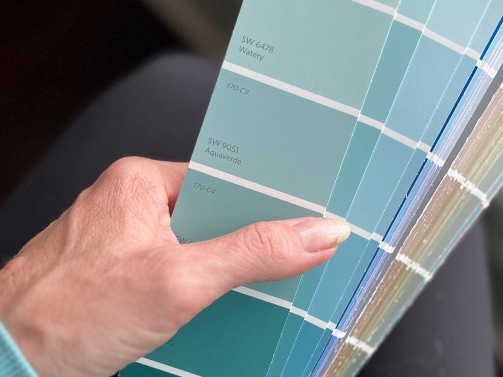
Thinking About Aquaverde?
Aquaverde (SW 9051) is the coastal green that brings just the right energy—vibrant, punchy, and unexpectedly easy to love. Used well, it feels fresh, stylish, and completely pulled together.
Whether you’re updating a front door, styling a bookcase, or just itching to try something new, this guide is packed with smart, real-life ideas for making it work.
💡 This post is for you if:
- You love coastal style but want something with more punch
- You’re craving color—but in small, doable doses
- You want a pulled-together home that feels breezy, not beach-themed
- You’ve stared at swatches too long and just want someone to tell you what works
If that’s you? Let’s dive in. Below you’ll find my favorite ways to use Aquaverde—plus what to pair it with and how to keep the whole look effortlessly coastal.
Not sure if Aquaverde is the right paint color—or how to even decide? This guide breaks down exactly how to choose a color that actually works in your space (aka no second-guessing later). It’s the must-read before you paint anything.
Where to Use Aquaverde
You don’t need to commit to a full wall or whole room to make Aquaverde work. In fact, this bold green shines because of how you use it.
Here are some favorite spots to try it:
1. Painted chair or stool legs
A fun way to freshen up a thrifted chair or wood stool. It pairs beautifully with a bleached wood seat or a linen cushion.
2. Front door refresh
A statement-maker! Aquaverde adds a vibrant, coastal welcome—especially paired with soft white trim, natural planters, and a jute doormat.
3. Bar cart or console table base
Aquaverde gives small furniture just the right pop—especially when styled with glassware, greenery, or a soft neutral runner.
4. Back of open shelving or inside a bookcase
The perfect way to add a splash of color behind your decor. Try it behind books, a stack of sea glass bowls, or white ceramic vases.
5. Bathroom vanity or cabinet drawers
In a small space, this color can be the star—especially when paired with white walls, warm metals, or sandy-toned tile.
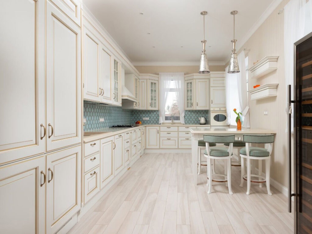
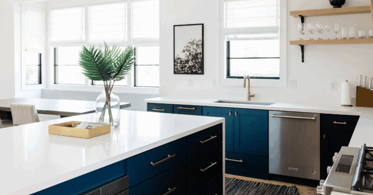
6. Kitchen island base
If your cabinets are neutral, Aquaverde on the island adds personality without making the room feel busy.
7. Accent cabinet or nightstand
A quick weekend project with major payoff. Add some brushed gold hardware and you’ve got a one-of-a-kind piece.
8. Matting for framed art or photos
Try painting the mat of a bleached wood or white frame—it looks stunning with black and white photos or vintage beach prints.
9. Painted tray, mirror frame, or plant stand
Even the smallest surface can carry this bold shade well. Try it on a tray styled with coral and a candle, or a plant stand near a sunny window.
10. Framed color swatch (yes, really!)
Paint a small board or tile and frame it. It’s a fun, no-pressure way to test the vibe—and it might just become your new favorite wall accent.
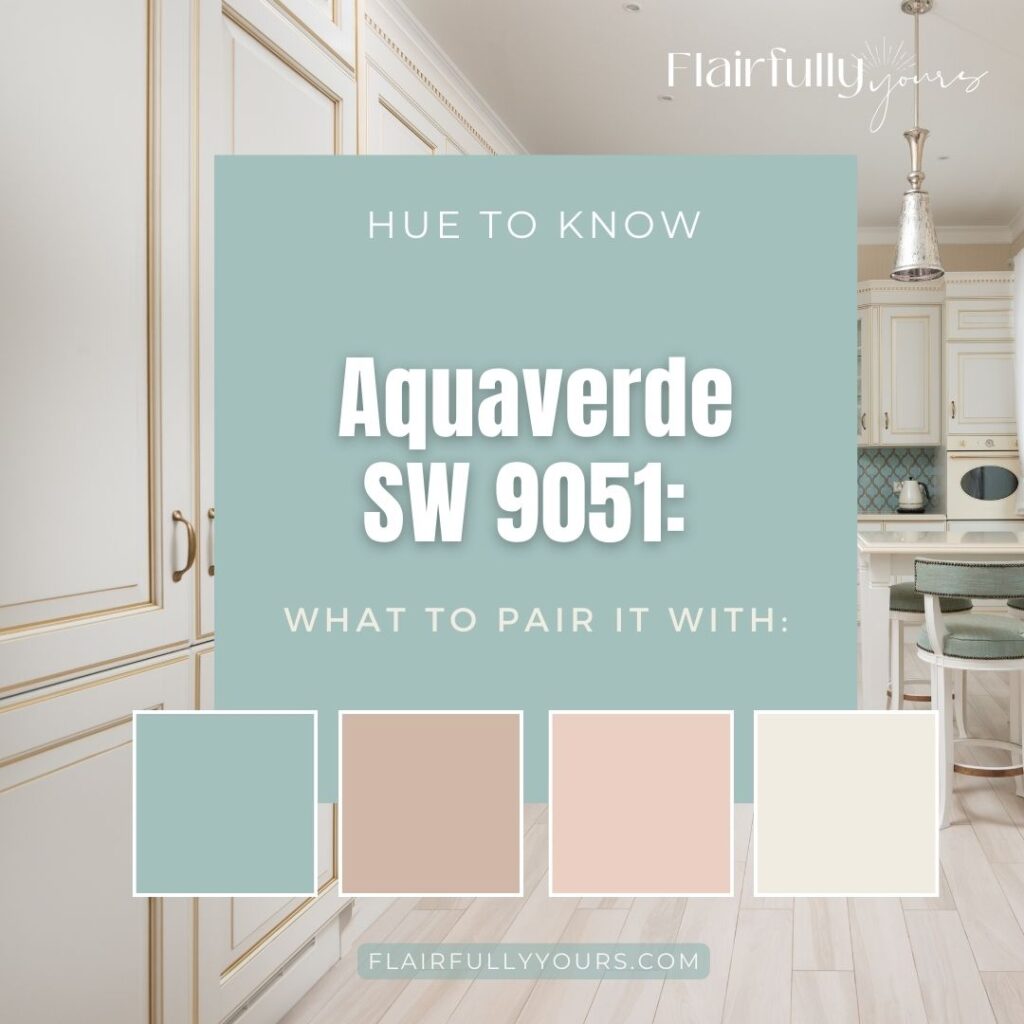
What to Pair Aquaverde With
Aquaverde looks its best when paired with light, calming tones and grounded textures. Try it with:
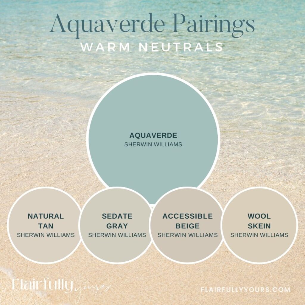
Warm Neutrals
Use these on walls, rugs, or larger surfaces to create that calm base Aquaverde needs to pop.
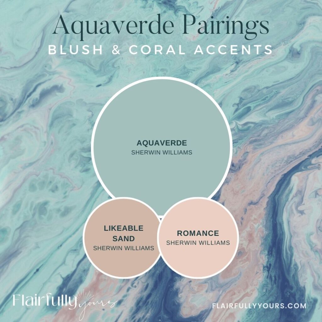
Blush or Coral Accents
Use these in textiles, pottery, or small accent decor—especially pretty in bedrooms or bathrooms with brushed gold finishes.
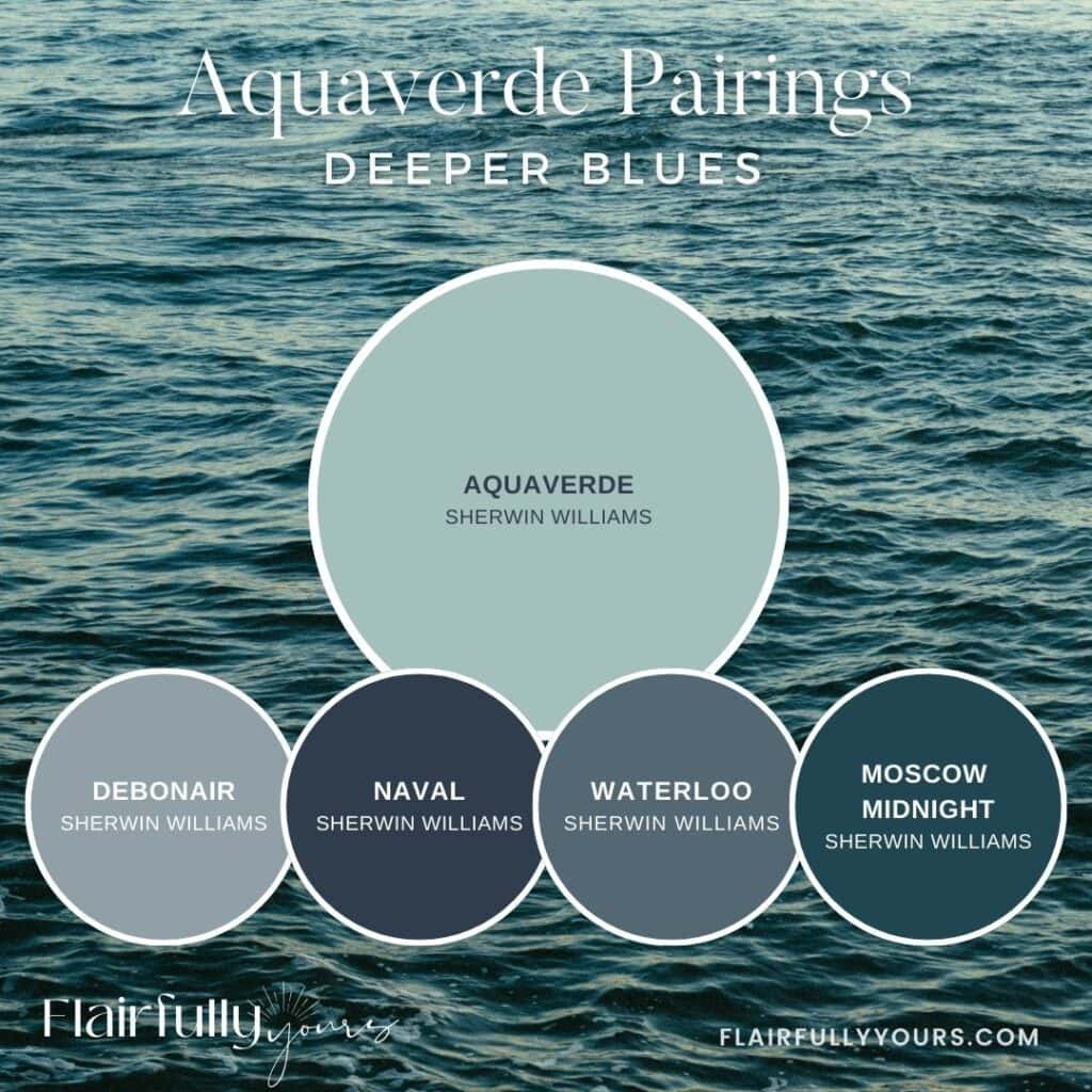
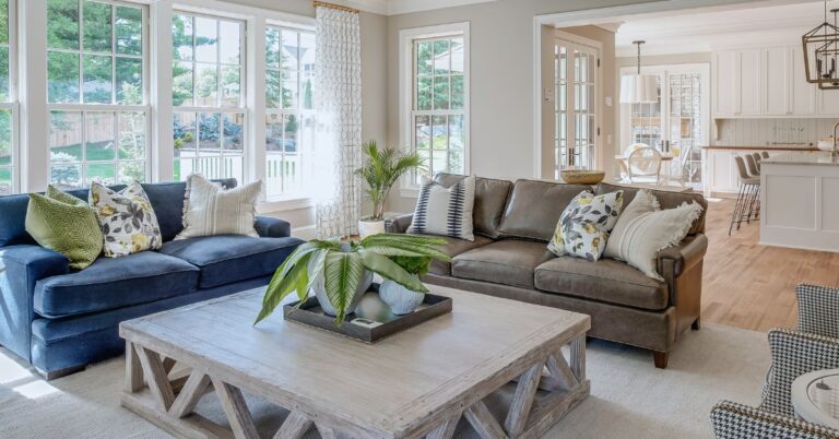
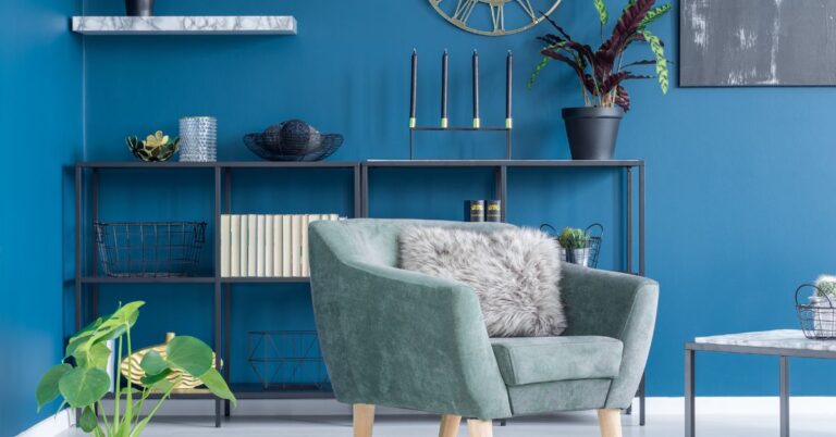
Deeper Blues:
Perfect for pairing through upholstery, throw pillows, or painted furniture pieces when Aquaverde is used in smaller doses.
Finish the look with materials like rattan, white oak, brushed brass, or matte black for that clean-but-cozy coastal balance.
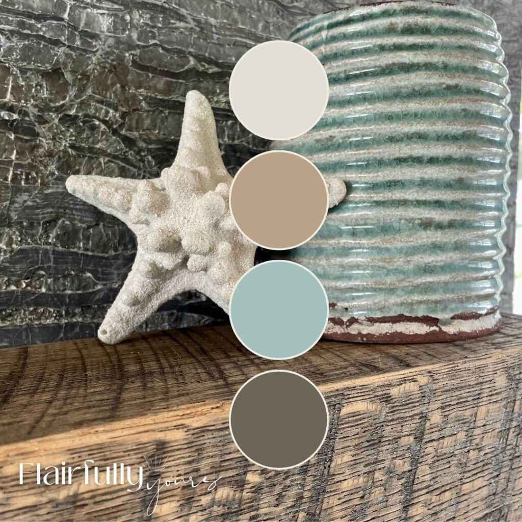
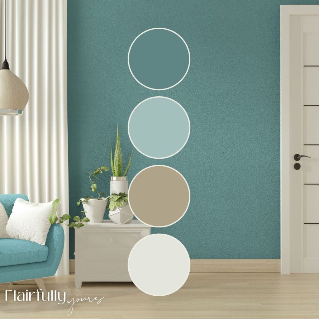
Aquaverde in Action: Real Palette Ideas to Try
Need some color combo inspo? These palettes show Aquaverde playing nice with warm neutrals, playful blushes, and deeper coastal blues. Use them to plan your paint pairings, furniture accents, or even textile choices!
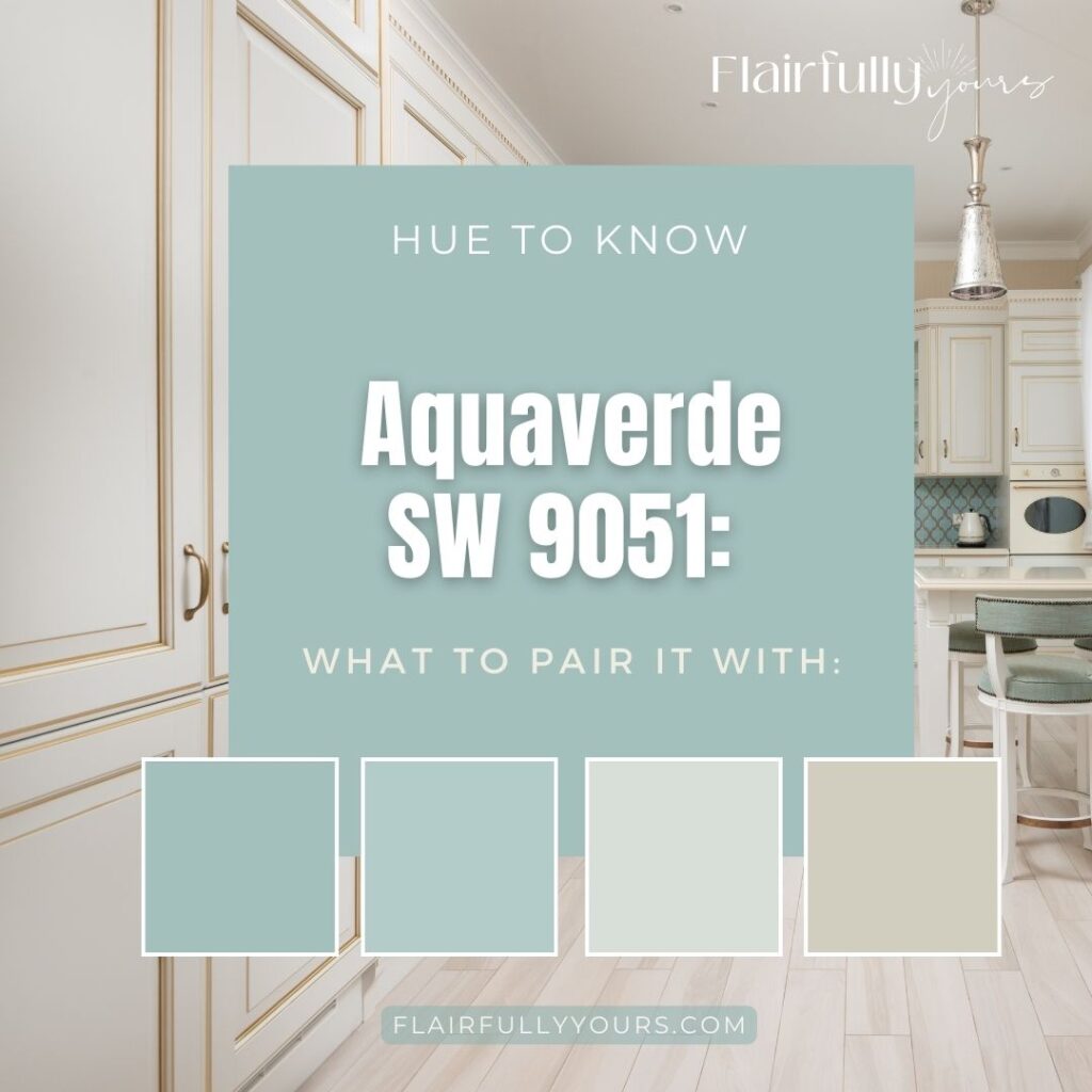
Three fresh ways to pair Aquaverde: go soft and sandy, flirty with blush, or bold with deeper blues. Whether you’re planning paint or playing with pillows, these combos make it easy to style around this not-too-bold, coastal green.
What About Whites? Here’s How to Choose the Right One
When you’re working with a bold color like Aquaverde, the white you pair it with makes a big difference. Here are three go-to whites that work beautifully—whether you’re painting trim, ceilings, or surrounding walls:
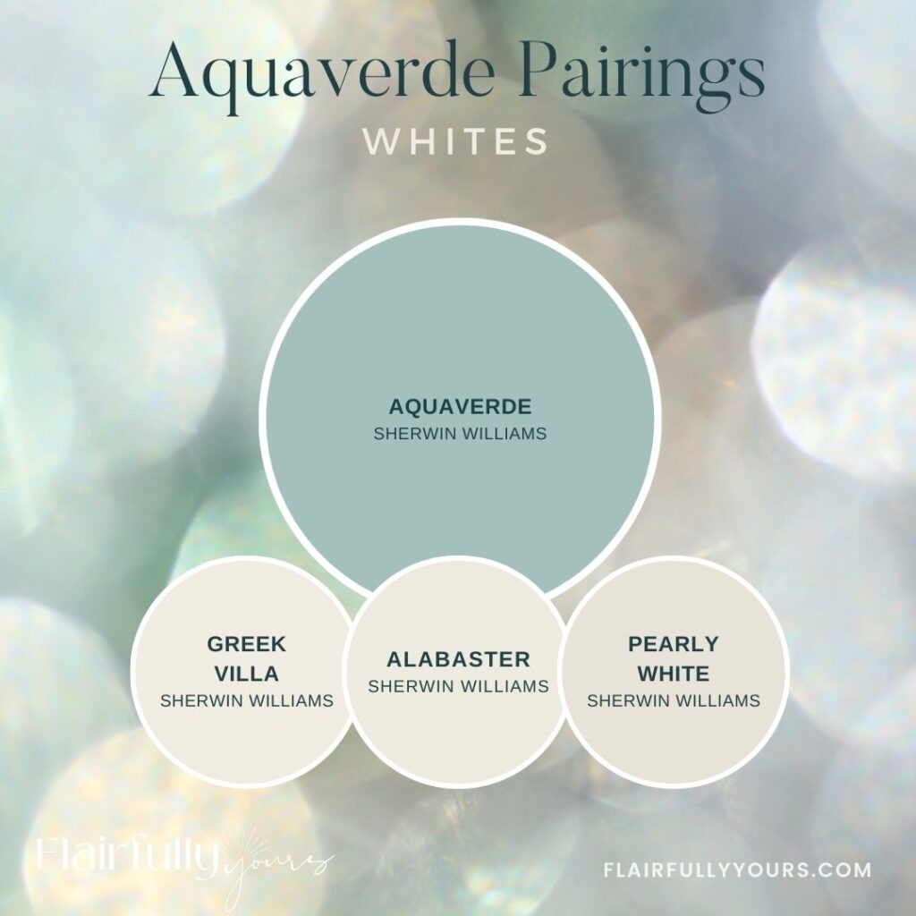
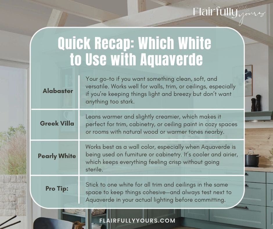
✨ Greek Villa (SW 7551) – creamy & soft
Best for: Perfect for trim, cabinets, or walls if you want a warmer, cozy contrast. Greek Villa pairs beautifully with Aquaverde’s cooler tone and brings a sunwashed, lived-in look to the space.
- A soft, creamy white with subtle warmth
- Gorgeous with Aquaverde if you want a cozy, sunwashed feel
- Great for cabinets, trim, and ceilings when your wall color is cooler
- Also works well as a main wall color if Aquaverde is just an accent
✨ Alabaster (SW 7008) – versatile & balanced
Best for: A tried-and-true favorite. Alabaster works for walls, trim, and ceilings and keeps everything feeling light and calm without looking stark. It gives Aquaverde a crisp edge, but still feels soft.
- A balanced white—not too stark, not too creamy
- Works beautifully as ceiling paint, trim, or entire wall color
- If you want something clean but not cold, Alabaster is a great backdrop
- Helps Aquaverde look crisp and defined without feeling high-contrast
✨ Pearly White (SW 7009) – clean & airy
Best for: If you’re using Aquaverde on cabinets, furniture, or accent pieces, Pearly White makes a gorgeous wall color. It’s cooler than the others, so it keeps the palette feeling fresh and beachy.
- Softer and cooler than Greek Villa or Alabaster
- Works well as a main wall color if Aquaverde is on cabinetry or smaller accents
- Might read a little cool on trim or ceilings depending on the light—so better for walls
🚫 When Aquaverde Might Not Be the Right Fit (And What to Try Instead)
As much as I love Aquaverde, it’s not a match for every home—or every situation. It’s vibrant, punchy, and full of coastal energy—but sometimes, that’s not what the room is calling for.
This color might not be for you if:
- You want your entire palette to feel super soft, pale, and whisper-light
- You’re drawn exclusively to earthy terracotta, golden beiges, or rustic farmhouse tones
- You prefer green shades that are quiet, subtle, or barely-there
- You get nervous about noticeable color anywhere outside of a throw pillow
Still nodding along? Let’s get even more specific. Here are a few real-life situations where Aquaverde might not be your best match—and what to use instead:
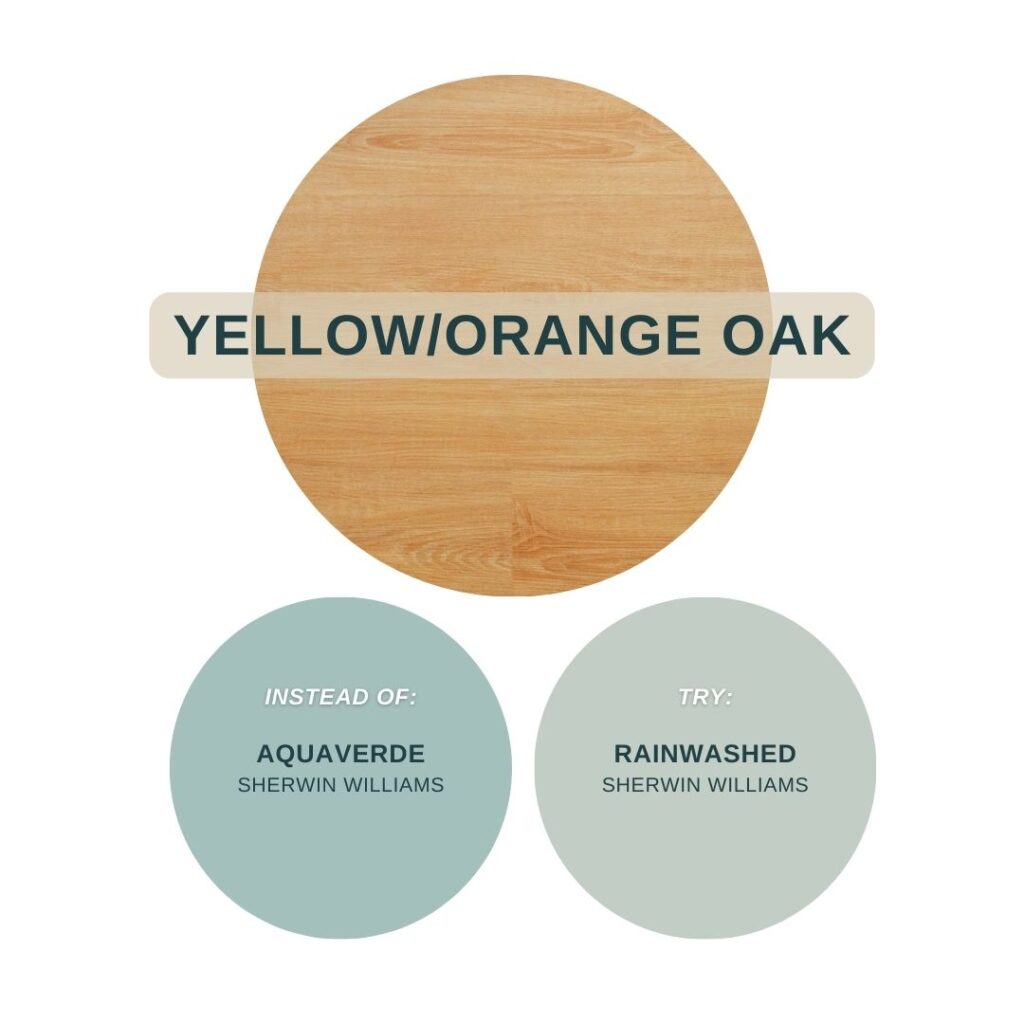
🟡 If your trim or cabinets are yellow-toned oak
Aquaverde’s cool blue-green undertones can clash with the warm orange of golden oak, making both feel louder and less intentional.
✅ Try instead: Rainwashed (SW 6211) – still coastal, but softer and more forgiving next to warm wood.
Love this idea? Keep it handy.
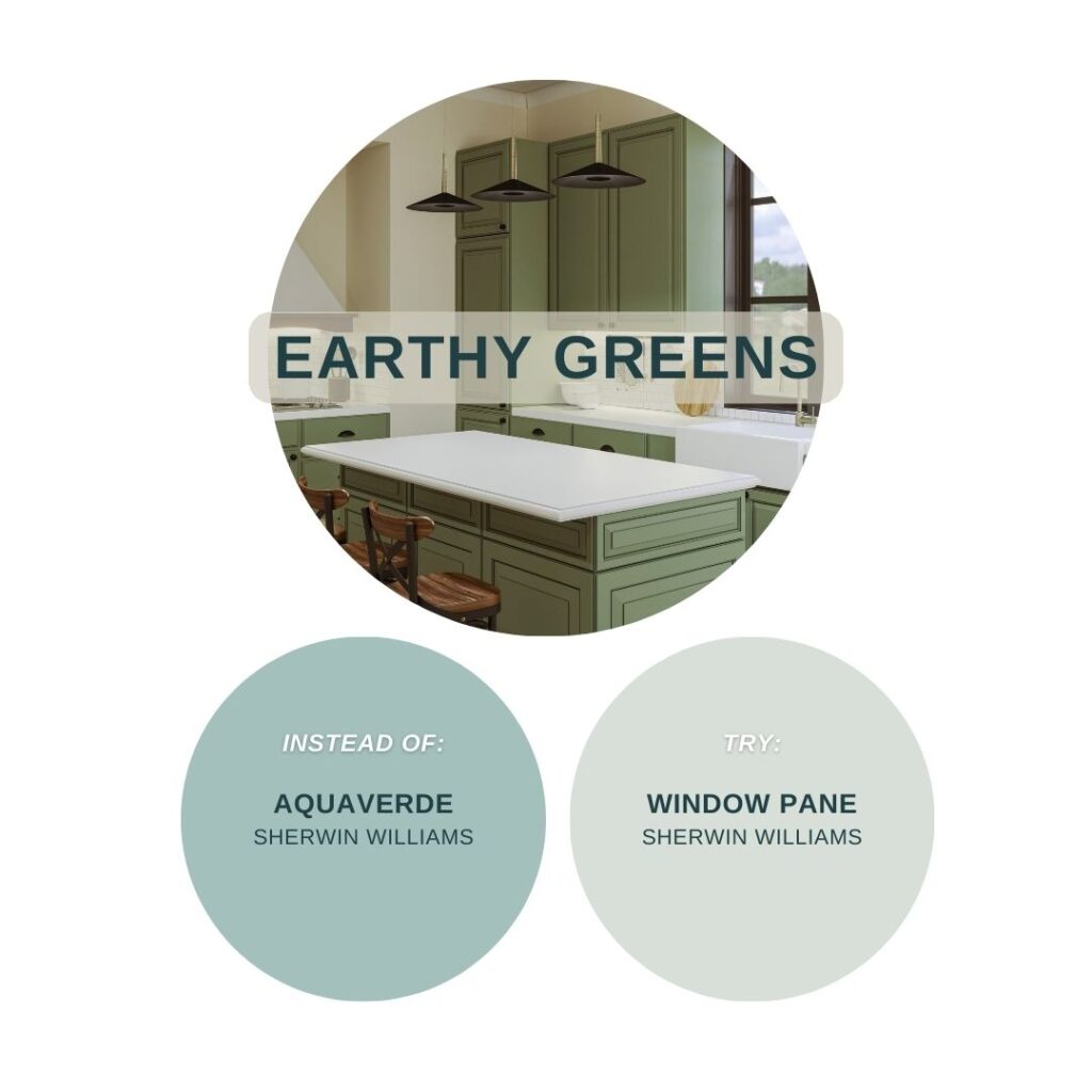
🌿 If your space already features a deep, earthy green or hunter green
Layering strong greens in one space can feel visually unsettled.
✅ Try instead: Window Pane (SW 6210) – pale and breezy, this barely-there green gives contrast without the competition.
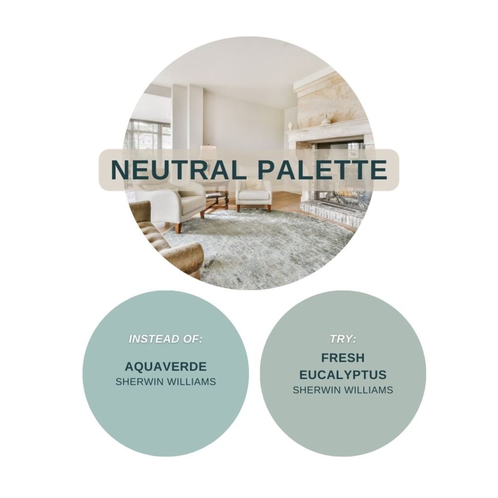
🤍 If you’re going for a completely neutral, tonal palette with no color variation
Aquaverde will pop more than you probably want.
✅ Try instead: Fresh Eucalyptus (SW 9658) – a calm sage-like green that reads more like a neutral.
🖤 If your space leans heavily modern or industrial with black and chrome finishes
Aquaverde’s laid-back, natural feel may not play well with sleek, high-gloss surfaces.
✅ Try instead: Sea Spray (SW 9651) – lighter and cooler, this one blends more easily into clean-lined spaces.

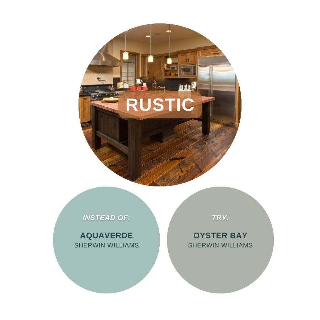
🪵 If your room is rustic with red-toned wood and heavy finishes
Bold colors like Aquaverde can feel too crisp or coastal when surrounded by cherry cabinets, deep stone, or dark, heavy decor.
✅ Try instead: Oyster Bay (SW 6206) – a muted, grounded green-gray that adds color without contrast.
So Where Does Aquaverde Shine?
Aquaverde has strong blue-green undertones and moderate saturation—vibrant, but not neon. It bridges warm and cool elements beautifully and looks amazing when paired with:
- Soft whites like Alabaster or Greek Villa
- Warm metallics like brushed brass or gold
- Light woods like white oak or driftwood
- Natural textures like linen, cane, or rattan
It can absolutely work with gray-washed woods, cool taupes, or even matte black—as long as the contrast feels intentional. In those combos, Aquaverde brings a crisp, coastal feel that can even read a little spa-like depending on the light and finishes around it.

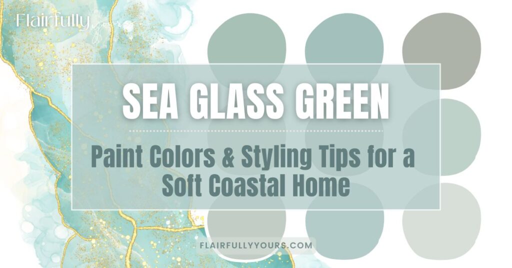
Want More Sea Glass-Inspired Paint Colors?
If Aquaverde caught your eye, you’ll love the full blog post I created on coastal greens. It features 9 of my favorite sea glass-inspired shades—from soft and subtle to bold and breezy—plus real-life styling tips, pairing ideas, and paint picks to help you see how they all work in your home.
→ [Read the full blog guide for even more coastal color inspiration]
Want a Handy Cheat Sheet You Can Actually Use While Picking Paint?
Aquaverde is just one of the 9 shades featured in my Sea Glass Green Quick Reference—a free printable guide that includes:
✔️ All 9 paint names + Sherwin-Williams codes
✔️ HEX codes for digital planning
✔️ Coordinating whites, neutrals & accent colors
✔️ Styling tips you can save or screenshot
✨ [Grab the Quick Reference Guide here] —perfect for your next trip to the paint store (or just pinning to your planning board!)
It’s free, printable, and perfect for planning your next paint decision (without standing in the paint aisle second-guessing every swatch).


How do you feel about Aquaverde as a home office color? Only top half of wall. Bottom is chair railing and bead board in white. Thank you!
Love that idea! Aquaverde can be a gorgeous choice for a home office—especially just on the top half. With the white beadboard and chair rail below, it’ll feel crisp and fresh without overwhelming the space. The green-blue tone adds just enough color to keep things interesting, but still feels calming and focused (which is perfect for a workspace). If your room gets natural light, Aquaverde tends to glow beautifully during the day too. Let me know if you want pairing suggestions for decor or accent colors!