Flairful Hues: Sage Color Palette Guide
Hey there, Flairful Fam! Last time, we kicked off our Flairful Hues series, diving into the wonderful world of color palette inspiration to make your home décor decisions a breeze. Today, let’s explore a hue that’s both tranquil and adaptable: the sage color palette.
This post will explain why sage is a great shade to consider for your space; which areas of your home (including indoor and outdoor) to use sage; how to incorporate sage as a neutral or as an accent color; and how to select the right tone of sage to coordinate with your existing surroundings. Plus a bonus Sage Color Pairing Freebie!

Explore sage’s versatility in home decor with our sage color palette guide. Tips, room inspiration, and color pairings await!
Why I’m Obsessed with a Sage Color Palette: It’s All About Versatility
You know me, always on the hunt for colors that can play nice with just about anything! That’s why I’m totally crushing on Sage right now. It’s like the chameleon of colors – it can cozy up to practically any hue or finish without breaking a sweat.
Here’s the deal: Sage’s natural vibes make it a total breeze to pair with other pieces of nature-inspired décor. Think real or faux plants, earthy textures like rattan or wicker, or even a touch of rope or jute for that beachy, laid-back feel. It’s like bringing a slice of the great outdoors right into your home – without the bugs or unpredictable Wisconsin (in my case) weather, of course!
Plus, let’s talk about its transition game – it seamlessly moves from holiday hues to spring freshness and even into fall foliage without missing a beat. Whether you’re decking the halls with boughs of sage during the festive season, adding a breath of fresh air to your space come springtime, or cozying up with warm, earthy tones as the leaves start to turn, sage is the ultimate multitasker.
So, if you’re anything like me and love mixing and matching your décor to create a space that’s uniquely you, then sage is definitely your new bestie. Trust me, once you start experimenting with this versatile hue, you’ll wonder how you ever lived without it!
Working a Sage Color Palette Into Your Surrounding Finishes
To seamlessly integrate sage into your color palette, especially when working with wood finishes, follow these simple steps:
1. Identify Your Wood Tones:
Take a close look at the woodwork in your space, including trim, flooring, cabinetry, and doors. Determine whether they lean towards warm tones like oak, cherry, or pine, which typically have reddish or golden undertones, or cool tones like maple, ash, or birch, which tend to have grayish or ashy undertones.
2. Match Undertones:
Once you’ve identified the undertones of your wood finishes, select a sage color that complements them. For warm-toned woods like oak or cherry, consider sage shades with warm undertones leaning towards yellow or gold, such as sage green with hints of honey or mustard. For cooler-toned woods like maple or ash, opt for sage colors with cooler undertones like gray or blue, such as a dusty sage or a soft sage with subtle gray undertones.
3. Test Before Committing to Your Sage Color Palette:
Before committing to a sage color palette, be sure to sample, sample, and sample some more! Test the sage color alongside your wood finishes in various lighting conditions to ensure harmony. Try painting small swatches on the wall or using peel-and-stick samples to see how the sage complements the wood tones before making your final decision.
4. Experiment with Accessories:
If you’re feeling unsure about diving into sage-colored walls or investing in large sage furniture pieces, start small. Try adding some sage accents like throw pillows, curtains, or cute decor items.
Here’s a simple trick: follow the 60-30-10 rule, which I introduced in How To Find Your Color Palette.
Think of your color scheme like a recipe. Your main ingredient (your existing wood finish, existing wall or cabinet color, for example) makes up 60% of your color scheme. Then add about 30% sage color as your secondary flavor, and sprinkle in about 10% of an accent color, like a pop of coral or navy.
This creates a balanced mix that works with your wood tones and adds just the right touch of sage to your space. Easy peasy, right? Plus, it’s a fun way to experiment with color without making any permanent changes!

5. Consider Lightness vs Darkness:
The shade of sage you choose can significantly influence the overall mood and vibe of your space. By adjusting the lightness or darkness of sage, you can create different atmospheres to suit your preferences and style.
If you prefer a serene, airy ambiance, opt for a lighter shade of sage. Lighter sages pair beautifully with light or washed woods, creating a sense of openness and tranquility. These softer hues evoke feelings of calmness and relaxation, perfect for spaces where you want to unwind and rejuvenate.
On the other hand, if you’re looking to make a bold statement and add depth to your decor, consider a darker shade of sage. Darker sages create a more dramatic effect, especially when paired with rich, dark wood finishes. This contrast adds sophistication and visual interest, infusing your space with warmth and elegance.
Choosing the right shade of sage isn’t just about what you like; it’s about creating a space that feels like home every time you walk in. Sure, you might be drawn to a deep, rich sage, but do you really want to be surrounded by it day in and day out?
Think about the vibe you want to create – just because you adore a cheery cherry red doesn’t mean it belongs on every wall. (It might be fabulous on your lips, nails, or clothing, but…) Take the time to envision how each shade will make you feel in your space. After all, your home should be your sanctuary, reflecting your unique style and bringing you joy every day.
Trying to make sage green work in your space? This guide on choosing the best paint color will help you make sure the tone plays well with everything else in the room—especially wood, trim, and natural light.
Using Sage as a Neutral Color
Sage exudes tranquility, making it an ideal choice for those seeking to bring a touch of nature indoors without overpowering their space. Here’s how you can leverage sage as a neutral in your home:
Main Color in Open-Concept Spaces:
If you have an open-concept home, consider painting the main areas with a muted sage tone. This color can seamlessly flow throughout your space, acting as a calming backdrop for your entire home.
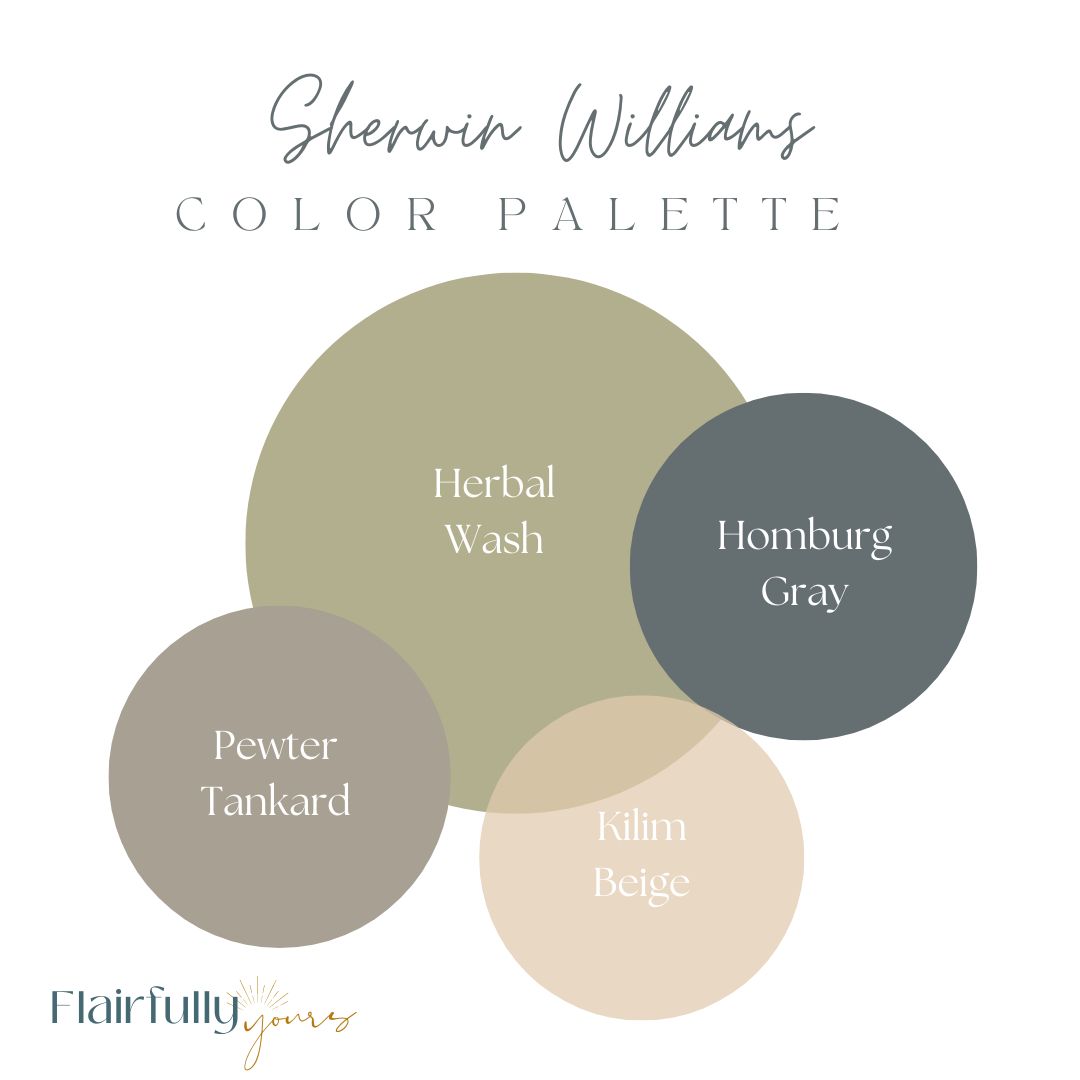
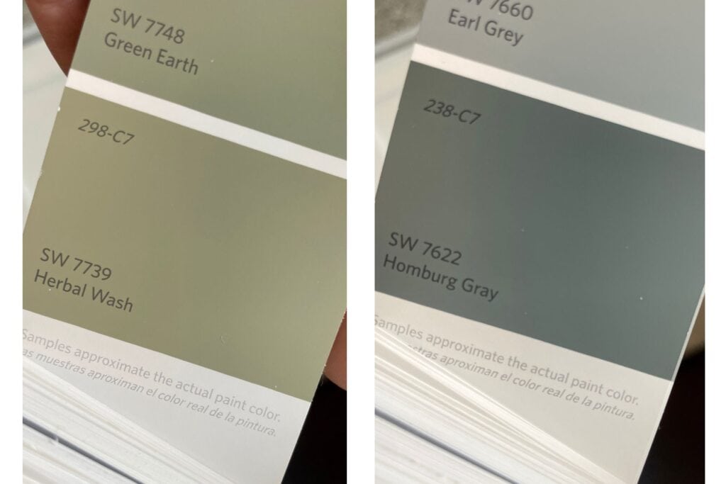
Sherwin Williams Herbal Wash served as my main floor neutral for many years. It blended beautifully with my dark wood floors, white woodwork, and accent paint colors of Pewter Tankard, Homburg Gray, and Kilim Beige.
Takeaway: Opting for sage as your main color creates a cohesive and harmonious feel, tying your living spaces together effortlessly.
Complementary Colors:
While sage serves as your neutral base, you can introduce complementary colors on adjacent walls or through accent pieces to add depth and interest to your space. Consider shades like greige, soft blush, peach, muted dusty blue, or soft aqua that complement the undertones of sage.
Takeaway: Experimenting with complementary colors allows you to personalize your space while maintaining a cohesive aesthetic.
Bold Pairings:
For those seeking a more daring look, don’t hesitate to pair sage with bold colors like navy or deep green, or even rusty brown. These contrasting hues can create striking focal points and add character to your decor scheme. For instance, I used the sage color in Sherwin Williams Herbal Wash throughout my main floor, adjacent to a kitchen accent wall of the deep moody blue/green of Sherwin Williams Homburg Gray.
Takeaway: Mixing sage with bold colors adds visual interest and personality to your space, allowing you to express your unique style.
By incorporating sage as a neutral in your home, you can achieve a serene and balanced environment that reflects the beauty of nature while showcasing your personal taste and style.
Exploring Neutrals Alongside Sage
If you’re loving the calming vibes of sage green, you might also appreciate how a neutrals color scheme can add a sophisticated and serene touch to your space.
Neutrals pair beautifully with sage and can help create a harmonious, balanced environment that feels both fresh and timeless.
Check out my post on Neutrals Color Scheme Ideas to Refresh Your Decor for tips on layering textures, adding metallic accents, and incorporating bold focal points into your neutral palette with a hint of coastal flair.
Using Sage as an Accent Color
Now let’s take sage to the next level – as an accent color that adds that extra oomph to your space. To get you started, here are some practical and specific ways to make sage shine as an accent color in your space.
Love this idea? Keep it handy.
Layer with Texture:
Bring depth and dimension to your decor by layering sage accents with different textures. Think cozy knit throw pillows, woven blankets, or textured curtains in shades of sage. The interplay of textures adds visual interest and creates a cozy, inviting atmosphere.
Takeaway: Mix and match textured sage accents to add depth and coziness to your space.
Pop of Color:
Add a playful touch to your decor with pops of sage in unexpected places. Try incorporating sage-colored accessories like vases, picture frames, or decorative bowls to infuse your space with personality and charm. These subtle pops of color draw the eye and create focal points that spark conversation.
Takeaway: Use sage-colored accessories to add whimsy and personality to your decor. Bonus: this is a relatively low-cost and low-commitment way to try out the color.
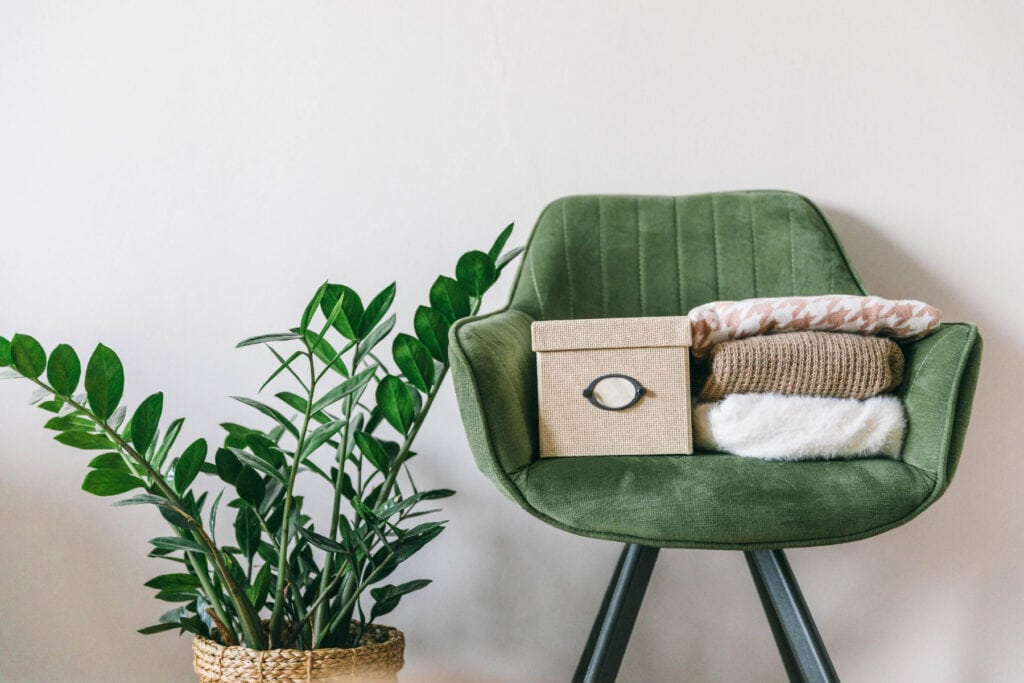
Statement Furniture Piece:
Make a bold statement with a sage-colored furniture piece as the centerpiece of your room. Whether it’s a sage green sofa, armchair, or ottoman, a statement furniture piece in sage adds instant style and sophistication to any space. Pair it with neutral accents for a timeless look or mix it up with complementary colors (we’ll get into those later) for added drama.
Takeaway: Incorporate a statement furniture piece in sage to anchor your decor and make a lasting impression.
Accent Wall Drama:
Create visual interest and drama with an accent wall in a rich sage hue. Whether you opt for a deep, moody sage or a soft, muted shade, an accent wall adds depth and personality to your space. Pair it with complementary decor in lighter tones to balance the look and create a cohesive design scheme.
Takeaway: Paint an accent wall in sage to add drama and personality to your space.
Nature-Inspired Accents:
Embrace the natural beauty of sage by incorporating nature-inspired accents into your decor. Think botanical prints, leafy green plants, or earthy ceramics in shades of sage. These organic elements bring a touch of the outdoors inside, creating a serene atmosphere.
Takeaway: Use nature-inspired accents in shades of sage to bring a sense of calm and tranquility to your space. Don’t be afraid to explore patterns to accomplish this. Fabrics are a perfect place to start!
Embrace a Sage Color Palette: Room-by-Room Inspiration
Alrighty, now that we’ve covered the basics, let’s dive into some real-life examples of how you can sprinkle some sage magic into your life.
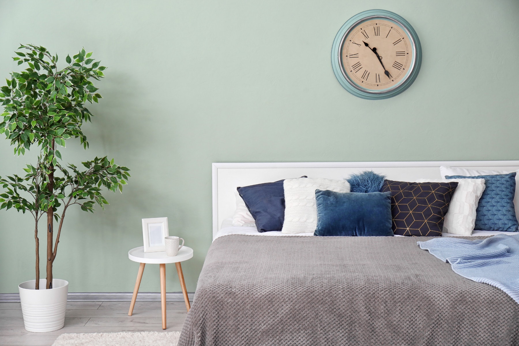
Bedroom Bliss:
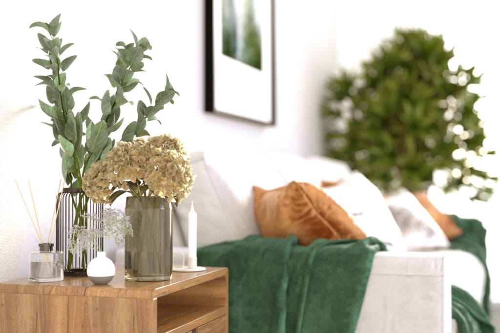
Let’s start with your bedroom – the ultimate relaxation zone! Grab a can of soft sage paint and give one wall behind your bed a gentle brush. Instant serenity! Then, layer on some sage-colored bedding – think fluffy throws and dreamy pillows. Voilà! You’ve created your own cozy oasis where you can snuggle up and drift off into dreamland.

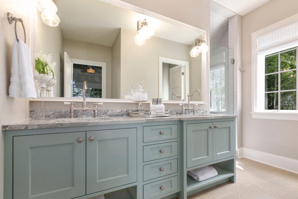
Bathroom Spa Vibes:
Ah, the bathroom – your personal spa retreat! Picture this: creamy white walls adorned with hints of sage. Add some sage towels, bath mats, or even a cute shower curtain.

Want to take it up a notch? Bring in some nature-inspired textures like wood, rattan, or bamboo in your accessories – they’ll give your bathroom that extra dose of zen.
Living Room Lovin’:
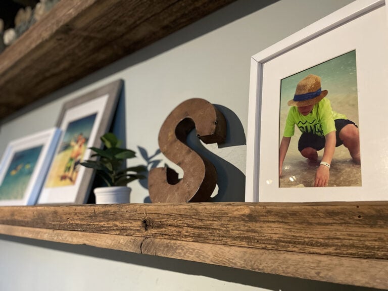
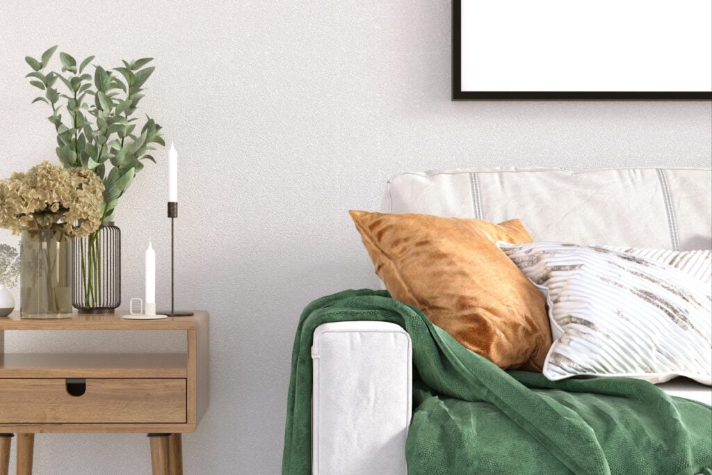
Now, let’s talk about your living room – the heart of your home! Sprinkle some sage love here too. Toss some sage throw pillows on your sofa and hang up some breezy sage curtains. Finish off the look with a few sage accents – maybe a cute vase (like this gorgeous sage and gold vase set,) some wall art, or sage ceramic planters with your choice of live or faux foliage. Ah, can’t you just feel the stress melting away?
Kitchen Calmness with Sage:
Let’s whip up a kitchen that’s as stylish as it is serene with several ideas for incorporating your new sage color palette.
Sage Cabinets: Imagine stepping into your kitchen and being greeted by the soft, soothing hue of sage cabinets. It’s like a breath of fresh air! Pair them with creamy white countertops for a clean, classic look that exudes elegance. Add some brushed gold or matte black hardware for a touch of sophistication.

Sage Backsplash: Picture this: a stunning sage backsplash that adds a pop of color and personality to your kitchen. Pair it with crisp white cabinets and marble countertops for a timeless, luxurious vibe. Want to get creative? Mix in some subway tiles in varying shades of sage for a subtle ombre effect.
Sage Accessories: Now, let’s sprinkle some sage love throughout your kitchen with accessories! Hang some sage-colored towels from your oven handle for a stylish yet functional touch. Add a few sage-toned canisters or sage-colored crock filled with wooden spoons and utensils to your countertops for a rustic charm.
And don’t forget to lay out a sage table runner on your dining table to tie the whole look together. Oh, and how about some upholstered seating in a soft sage fabric in a solid or fun pattern? It’ll add a cozy, inviting feel to your kitchen – perfect for lingering over morning coffee or whipping up a delicious meal.
Outdoor Oasis:
Ready to refresh your outdoor oasis? Sage is a fantastic choice for patio furniture cushions, benches, rugs, and planters, effortlessly blending into the natural surroundings. Then, add pops of coral, purple, or bright yellow for extra summery flair.
Imagine this: a jute and black striped rug gracing your front porch, topped with a sage door mat. The doormat harmonizes seamlessly with your sage-painted front door, adorned with sleek black hardware. Complete the look with a sage-painted wooden rocking chair or bench, or opt for natural wood tones.

Fill your terra cotta planters with coral geraniums and purple petunias, accented by sage-colored ivy and ferns. For the finishing touch, toss a few throw pillows in coral and a cream-and-sage palm print fabric for a cozy, inviting vibe.
Conclusion and Color Pairing Freebie
And that’s a wrap, Flairful Fam! We’ve journeyed through the lush world of sage green, discovering its amazing adaptability and calming vibe along the way. From using it as a soothing background to making it pop as a vibrant accent, I’ve dished out all the tips and tricks you need to infuse your space with your favorite shade of sage.
Ready to take the stress out of choosing colors? As a little treat, I’m throwing in a freebie download packed with simple yet stunning color pairings to effortlessly elevate your space. Let’s make your décor decisions a breeze together! Grab your Sage Color Pairing Guide here:
Color Palette Recommendations
Want to explore more color schemes for coastal-inspired spaces? Check out my guide on home color schemes for coastal interiors.
Feeling inspired but still need a nudge in the right direction? No worries! Just shoot me a message about personalized color advice.
Have a hue you’d love to explore? Email me with your request for our next Flairful Hues feature color.
So what are you waiting for? Let’s sprinkle some sage into your life and watch your space bloom with personality. Happy decorating, my fellow flair-seekers! Be sure to check out How To Find Your Color Palette for more helpful tips in your color selection process.