How to Decorate Using Tonal Layering: A Coastal Design Hack
Do your pillows, rugs, and décor look nice individually, but your room never feels finished? You love coastal style, but aren’t sure how to decorate so colors and textures work together without guessing.
You’re not alone.
Most people think a space needs bold colors or statement pieces to feel “designed.”
The truth?
There’s a simple system that adds depth, flow, and polish — and it works for any room. It’s called tonal layering.
What Is Tonal Layering (And Why It Works)
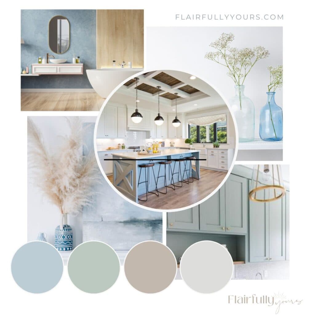
Tonal layering is a simple principle: stack light, medium, and dark shades from the same color family, plus textures, to create depth, dimension, and visual flow.
Think of it like layering an outfit: a soft cream tee → light denim jacket → muted teal scarf → navy boots. Each piece adds interest while staying in the same color story. Your room works the same way.
Why it works:
- Depth: Different tones prevent flat, boring rooms
- Flow: Your eyes naturally move through the space
- Balance: Light lifts, dark anchors
- Cohesion: Everything feels intentional, not random
Why Your Coastal Room Might Feel Flat or Disconnected
Your home might feel disconnected if:
- You’re mixing colors that don’t complement each other
- Accent pieces and furniture weren’t chosen with a plan
- Open layouts make it hard to know which colors flow from room to room
- You want depth and interest, but are afraid of adding “too many” colors
Tonal layering fixes all of these problems by stacking variations of the same color family — from light → medium → dark — and adding texture for depth.
Step-by-Step: How to Decorate Using Tonal Layering
1. Start With What You Have
- Pick 3–5 items from your room: pillows, throws, rugs, artwork, or small décor.
- Find a common color family: soft blues, muted greens, sandy neutrals, or soft grays.
Examples
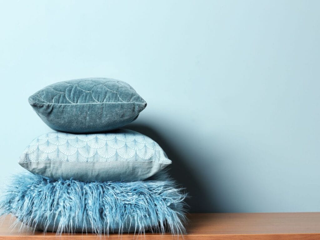
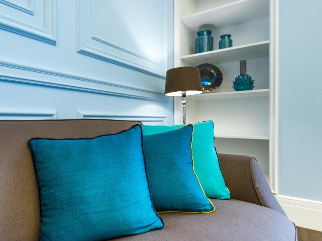
- Blue Family: Sky blue pillow (light) → Aqua throw (medium) → Navy pillow or décor piece (dark)
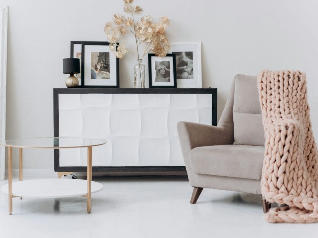
- Neutral Family: Pale sand pillow (light) → Warm beige throw (medium) → Taupe décor item (dark)
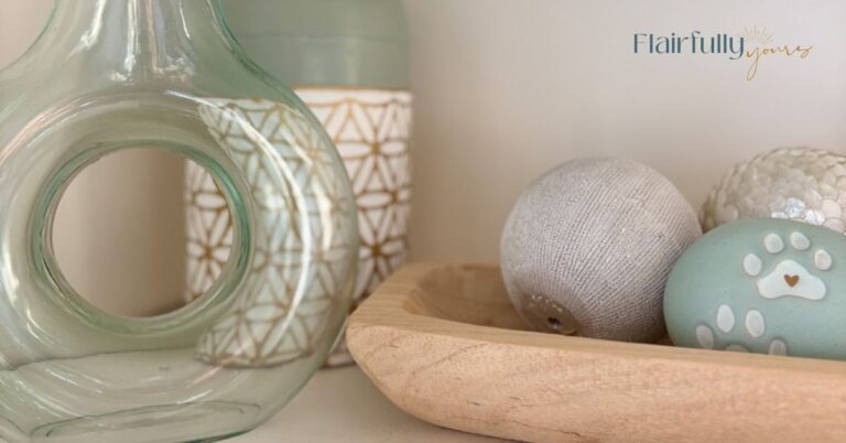
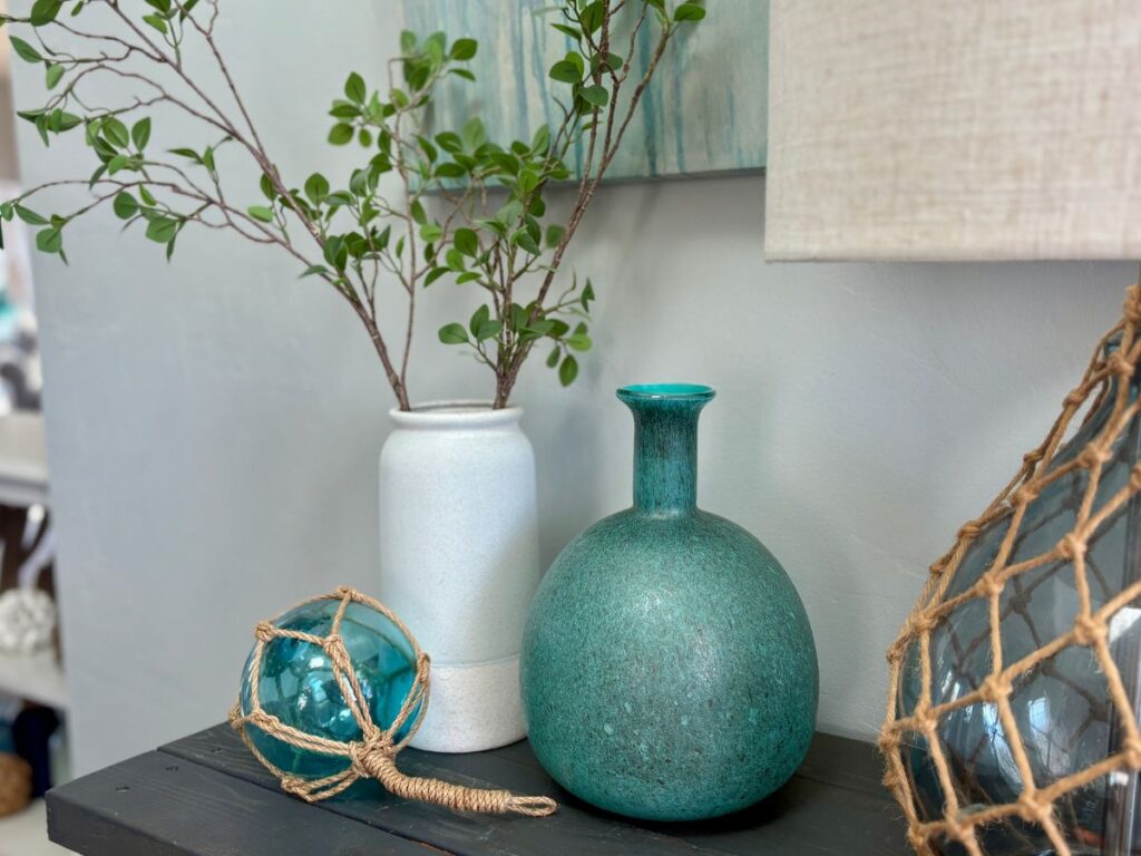
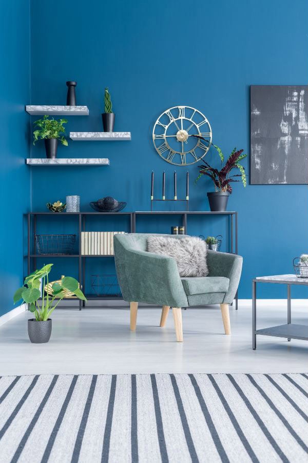
- Green Family: Soft mint pillow (light) → Sage throw (medium) → Olive ceramic or vase (dark)
Tip: All items should be variations of the same color, not completely different hues.
2. Arrange From Light → Dark
Organize your items by light → medium → dark.
This creates depth and prevents the room from feeling flat.
Example (Blue Family)
- Light: Sky blue pillow
- Medium: Aqua throw
- Dark: Navy artwork
3. Evaluate & Adjust
Ask yourself:
- Do all the pieces feel connected?
- Is one item too bright or contrasting?
- Does anything feel out of place?
Swap or shift any piece that doesn’t fit. Even one small change can make the space feel curated and intentional.
Love this idea? Keep it handy.
4. Add Texture for Coastal Depth
Texture brings your layers to life. Try:
- Linen pillows
- Woven baskets
- Matte ceramics
- Soft cotton throws
Example (Blue Family)
- Sky blue linen pillow (light, soft fabric)
- Aqua knit throw (medium, texture)
- Navy matte vase (dark, adds contrast)
Texture works like an amplifier — it makes your colors pop and keeps the room from feeling one-dimensional.
Who Will Benefit Most From Tonal Layering
- Afraid of “too many colors” – Layering variations in the same family adds interest without overwhelming.
- Want a simple decorating roadmap – Pick a color family, rank light → dark, and everything works together.
- Craving flow across rooms – Open layouts or multiple spaces feel harmonious.
- Small or cozy spaces – Adds richness and sophistication without shrinking the room.
- Need decorating confidence – Stops second-guessing pillows, rugs, and paint choices.
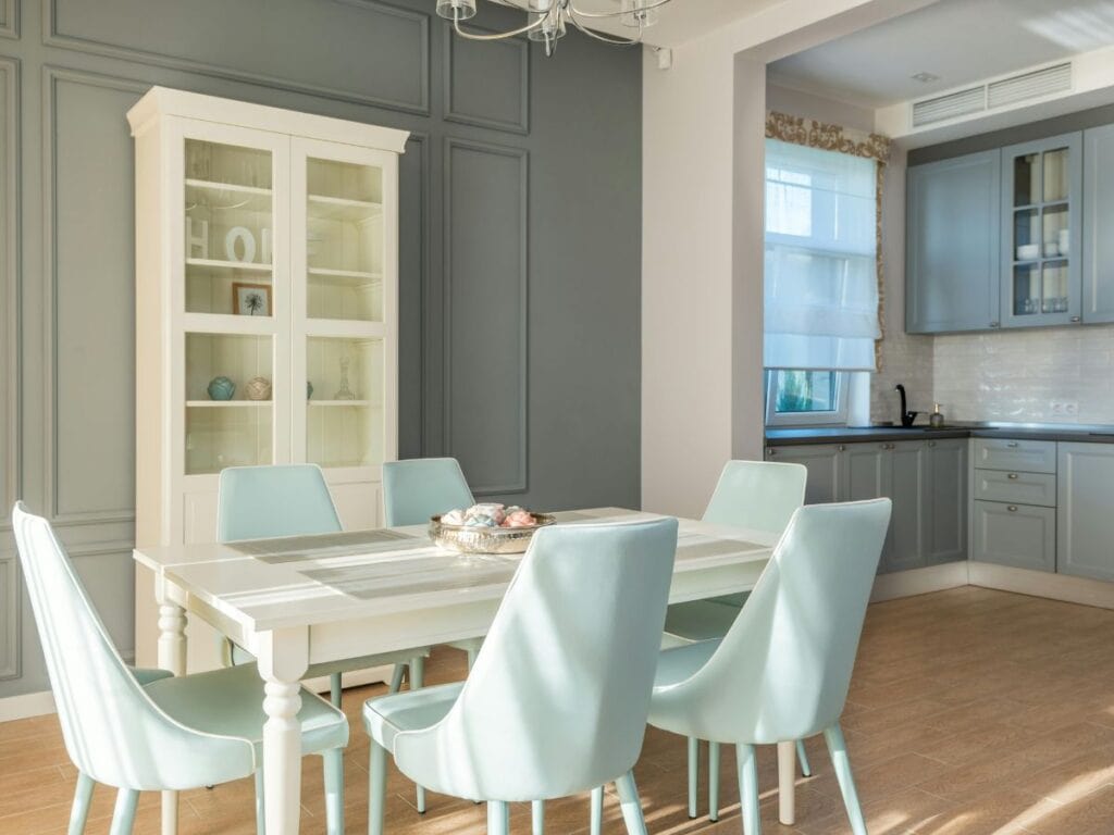
Applying Tonal Layering to Coastal Paint +Walls
Tonal layering works beautifully with walls and trim too.
Stick to the same principle: light → medium → dark within one color family.
| Room | Color (same family) | SW Paint Code | Why It Works |
| Living Room | Soft airy blue (light) | Sea Salt | Sets a light, coastal base |
| Hallway | Medium muted blue | Retreat | Smooth transition between spaces |
| Dining Area | Deep navy accent (dark) | Salty Dog | Anchors the space, adds visual depth |
| Trim | Soft white | Alabaster | Keeps contrast crisp and airy |
Stuck on colors? Grab my free Top Coastal Colors guide to see the best shades for walls, trim, and more.
Or want done-for-you palettes? The Coastal Color Kit gives you 6 coastal palettes with everything you need to update your space!
Quick Weekend Challenge
This weekend, try this tonal layering hack and see how easy it is to learn how to decorate with flow and style.
- Pull 3–5 items from your room.
- Arrange them from light → dark within a single color family.
- Swap anything that feels off.
- Add texture.
- Step back — your room now looks polished, layered, and intentional.
Example (Blue Family)
- Pillows: Sky blue → Aqua → Navy
- Accessories: Linen throw → Woven basket → Matte navy vase
- Walls: Sea Salt by Sherwin Williams (light)
- Trim: Alabaster by Sherwin Williams (soft white)
Even a small adjustment like this instantly makes a space feel curated and coastal-ready.
Key Takeaways: Why Tonal Layering Complements Coastal Decorating
- Layering shades + textures adds depth, contrast, and flow
- Works in any room, small or large
- Perfect for anyone wanting confidence and simplicity in decorating
- Apply to pillows, décor, furniture, and paint for a polished, intentional look
- Turns any room into a curated coastal space
Go a Step Further…
Want a step-by-step roadmap for coastal colors that work together? My Coastal Color Kit gives you six curated palettes, including paint shades, décor pairings, and textures — so your home always feels intentionally layered and polished.