Best Paint Color? Don’t Even Grab a Swatch Until You Do This
Ok you guys, I’m gonna spill my big secret—the key to choosing the best paint color.
Ready?
It’s not starting with your favorite shade of blue or that trendy hue you saw on Pinterest.
The real magic happens when you first get clear on the feel you want for the space. Airy and calm? Cozy and inviting? Fresh and playful?
Name it. Picture it. Only then start building your paint color—and everything else—around that vibe.
Here’s what usually goes wrong…
We pick a color we love on its own. It looks great on a paint chip, or in a photo we saved.
But then we get it up on the wall and… something’s off. Not because the color is “wrong,” but because it didn’t actually match the vibe we were after.
Or it was the right color, just the wrong amount of it—too bold, too heavy, too much. That color we loved suddenly feels loud and bossy instead of relaxing or stylish.
Why? Because color doesn’t work in isolation.
Color Never Exists in a Vacuum
The biggest struggle people have with choosing interior paint color is not realizing how much lighting, texture, and surrounding finishes affect how a color actually looks.
You might love a sage green swatch in your hand. But in your room? It could lean neon, muddy, or totally disappear.
Natural light, floor tones, tile undertones, even ceiling height—all of it changes what that paint will actually do once it’s on the wall.
That’s why it’s so important to view your paint color in context—everything from your lighting to your flooring and finishes affects how it actually reads once it’s up on the wall.
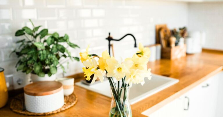
Want to stick with white but soften the feel? Try Shoji White SW 7042 or White Duck SW 7010 —they both have a touch of warmth that works beautifully in coastal homes. Alabaster SW 7008 and Greek Villa SW 7551 are also tried-and-true options if you want a soft, clean white that’s not too crisp.
Craving a little more contrast? Go for a whisper of color with Sea Salt SW 6204, Oyster Bay SW 6206, or Silver Strand SW 7057. These gentle coastal hues pair effortlessly with white cabinetry and warm woods without ever feeling heavy.
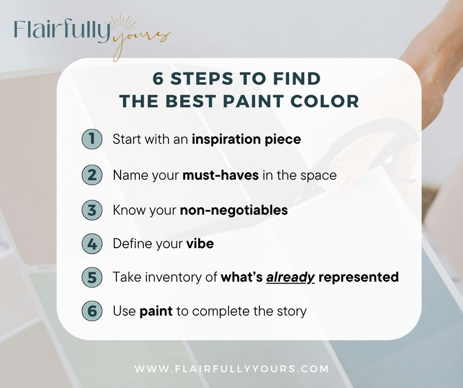
Before You Pick Your Paint: 6 Steps to Find the Best Paint Color
Want to actually love the color once it’s on your wall? Don’t guess and hope for the best—use this quick checklist to make sure it works with your space, not against it.
It’s a foolproof approach for choosing interior paint colors that feel cohesive and intentional—especially if you’re decorating a coastal home or dealing with a paint color for an open floor plan.
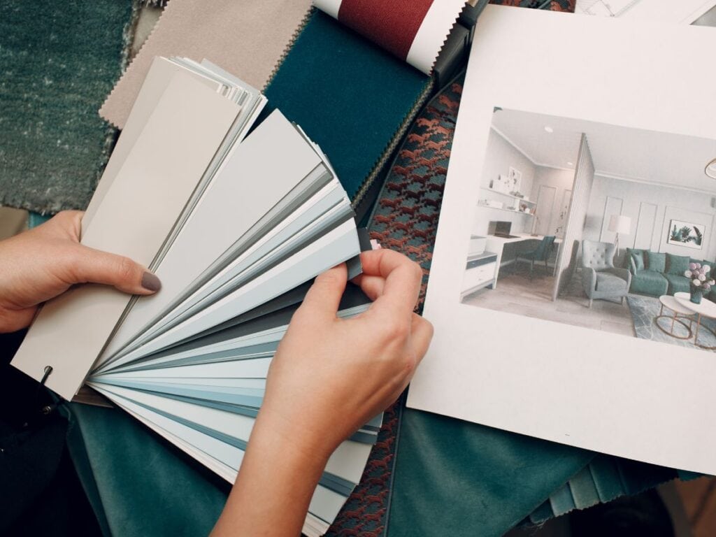
1. Start with an inspiration piece
Start with something that already inspires you—a favorite fabric, photo, or a styled mood board like the one below—and use it to build your interior paint color palette. It takes the guesswork out and helps you stay true to the feeling you want in your space.
Maybe it’s the green from a velvet chair, the muted blue from a pillow you love or the warm taupe in a woven fabric swatch—your best paint color is the one that pulls those pieces together and finishes the story..
2. Name your must-haves
What do you definitely want to work into the space? Think big items—your sofa, a piece of artwork, your fabulous light fixture, a favorite rug.
Any paint color you choose needs to complement those things, not clash with them.
3. Know your non-negotiables
What can’t or won’t be changed—like flooring, tile, countertops, or trim?
These set the tone (literally) for what undertones and saturation will work best.
Oh—and if you’re still figuring out where the furniture is going, start there. This layout planning tip will save you from picking a perfect color… for the wrong setup.
4. Define the vibe
Choose a few guiding words when you think of your dream space. For example: light and airy, rich and warm, fresh and coastal, moody and bold.
This helps you steer your paint color decisions toward the feeling you actually want in the space—not just a random color you like.
5. Take inventory of what’s already represented
Look at your inspiration piece: are there any colors or tones that already show up in your room?
For example, if the artwork includes warm wood and you already have oak floors or maple cabinets, you don’t need to match those on your walls. Overusing one tone can throw the balance off. Let your paint fill in the gaps instead.
6. Use paint to complete the story
Now ask: what’s missing? Does the space need softness? Contrast? A calming touch?
Choose a paint color that fills the gap—whether that’s a subtle neutral, a breezy blue, or a grounding darker shade. This is where the magic happens.
Feeling the weight of alllll the design decisions?? My Building or Renovating a House Checklist walks you through every step — from organizing samples to making confident color calls.
👉 Grab it here before your next trip to the paint store.
Want to See These Steps in Action?
Let’s break down three real-life color palettes using the exact six-step method from above. These examples will help you understand how to work with the vibe, what to look for in your own space, and how to use paint to complete the look.
🌊 Light & Breezy: The Dreamy Hues Palette
Color mix: Whispery sky blue, seashell peach, misty taupe, sandy beige, and pale driftwood.
Vibe: Airy, relaxed, and soft—great for bedrooms, guest rooms, or anywhere you want to exhale. A gentle, textural palette that plays well with warm whites and pale woods while keeping things calm and coastal.
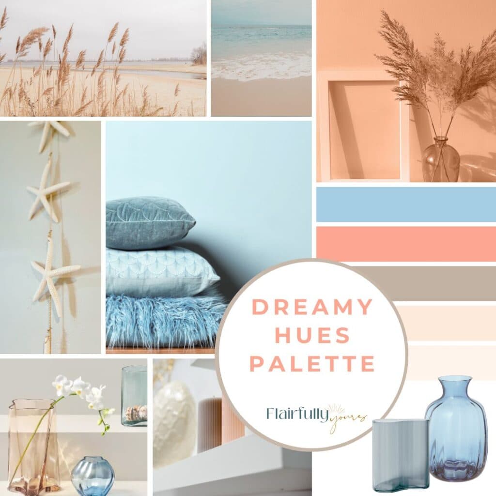
How to use it:
- Inspiration piece: The starfish, dried grasses, and watercolor textures set the soft, breezy tone.
- Must-haves: Already have light wood floors or natural fiber rugs? Great—they echo the sandy neutrals here.
- Non-negotiables: Creamy off-white trim or cabinetry? Or beige undertones in fixed elements like carpet or tile? No problem—this palette plays nicely with warm undertones.
- Color already represented: If you already have lots of warm beige (rattan, wood tones, linen textures, for example,) skip matching it again on your walls.
- Paint picks: Try a soft, whispery sky blue like Sleepy Blue SW 6225 or Windy Blue SW 6240 on the walls to keep things feeling light and airy. If you’re leaning peach, look for a subtle glow—Lotus Petal SW 6615 or Cosmetic Blush SW 7110 are beautiful without being overpowering. Even Incredible White SW 6628 or Peach Blossom SW 6331 (used sparingly) can add that soft, warm glow without the room feeling “colorful.”
- Bonus tip: Want a touch of contrast without going bold? Bring in the coral tone through small, swappable accents—like a stripe in a throw pillow, a subtle print in your fabric choices, art, or even a candle. It adds just enough warmth to round out the palette while still feeling soft and effortless.
👉 Loving this palette? Check out my Lake House Color Palette guide for even more soft blues and sandy tones.
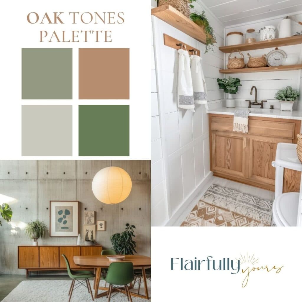
🌿 Natural & Grounded: The Oak Tones Palette
Color mix: Sage green, warm clay, creamy greige, and deep botanical green.
Vibe: Warm, grounded, and collected—perfect for embracing golden oak without feeling stuck in the ’90s. Ideal for homes with oak cabinetry or furniture you’re keeping. This palette balances the warmth with calm, earthy tones.
Love this idea? Keep it handy.
How to use it:
- Inspiration piece: A mix of oak textures, shiplap, and nature-inspired prints.
- Must-haves: Golden oak cabinetry, trim, or furniture you plan to keep.
- Non-negotiables: Warm-tone floors, beige or red oak, or cream-colored tile.
- Color already represented: The wood tones in your space already bring in that warm clay color—no need to match them again on your walls.
- Paint picks: Use a muted sage like Liveable Green SW 6176 to tone down the warmth and give golden oak a more modern, pulled-together feel. Want something a bit deeper? Try Sensible Hue SW 6198 or Green Onyxx SW 9128 both are soft, earthy greens that balance oak’s golden tones without going too bold. If you’re after a more subtle contrast, Chatroom SW 6171
is another solid pick—it plays well with both warm whites and natural wood finishes. Say you don’t have a lot of warm tones already in your space. In that case, you may wish to echo the clay tones in this palette for your wall color. Go for Deer Valley SW 7720—a warm, grounded neutral that brings in just enough depth without overwhelming the space. - Bonus tip: Break up all the wood with matte black or aged bronze lighting and hardware for instant contrast.
👉 Working with warm wood tones? Check out this sage green palette breakdown—it’s full of ideas for complementing oak finishes without feeling dated.
🌊 Fresh Coastal: The Sea Tones Palette
Color mix: Deep ocean blue, soft coastal aqua, creamy white, and driftwood beige.
Vibe: Crisp, clean, and refined—with a hint of sea breeze. Perfect for kitchens, bathrooms, or living spaces with light cabinetry and cool finishes. This palette keeps things coastal without veering into beachy clichés.
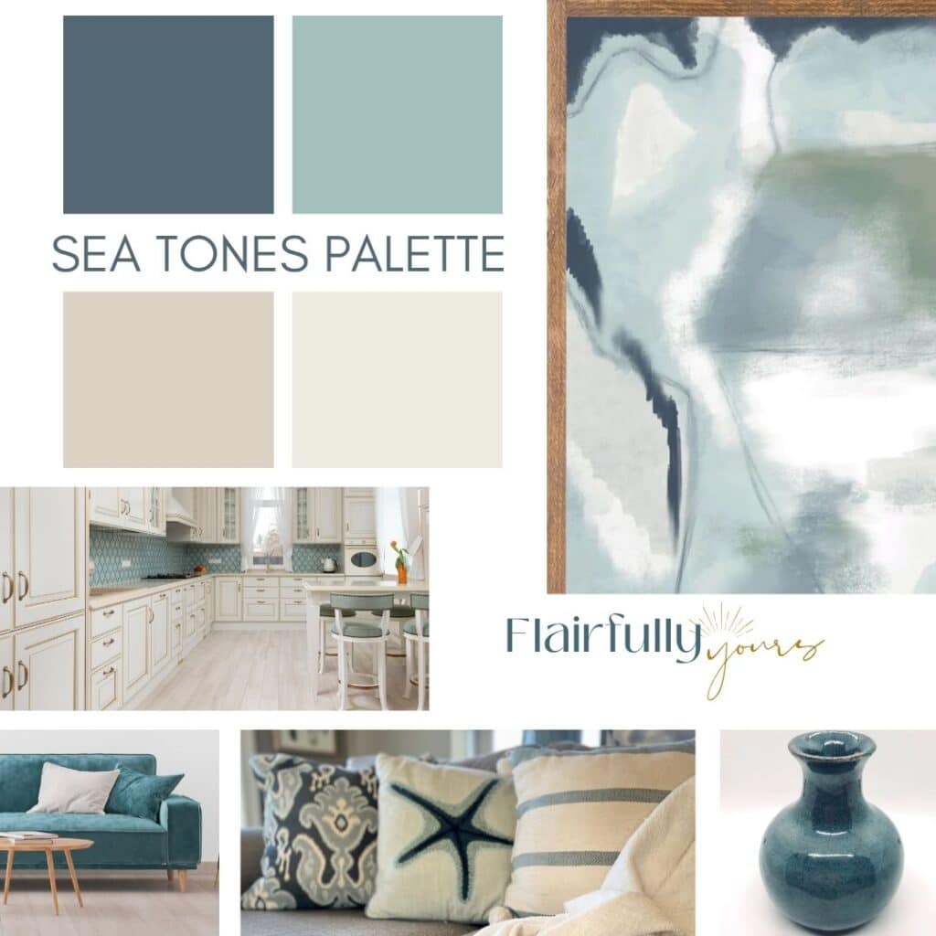
How to use it:
- Inspiration piece: That ocean-layered abstract art you can’t stop staring at, or a curated cluster of sea glass vases in varying blues and neutrals.
- Must-haves: White or off-white cabinetry, quartz or marble-look counters, or cool-toned backsplash tile.
- Non-negotiables: Flooring in pale wood, greige tile, or light oak that’s staying put.
- Color already represented: If your space already has a lot of creamy whites or pale wood—like white cabinets, trim, or light floors—let those be your foundation. No need to repeat those tones on the walls. Instead, bring in soft blues or aquas for contrast so the room feels layered, not flat.
- Paint picks: Let a soft aqua like Aquaverde SW 9051 or Tidewater SW 6477 bring color to the walls while keeping things light and breezy. Want a slightly moodier (but still coastal) option? Try a soft slate blue like Stardew SW 9138—it adds gentle contrast while staying calm and refined. Prefer to keep the walls light? Go for a neutral like Neutral Ground SW 7568 or Alabaster SW 7008 to let your ocean-inspired accents take the lead. (Or copy my pick and go with Silver Strand SW 7057 to go with that exact print in the concept board!) All of these work beautifully with creamy cabinetry, pale flooring, and sea-glass textures. And if you’re looking for a cabinet color in this family, my go-to is Niebla Azul SW 9137—a bit deeper than Stardew but still totally at home in a coastal palette..
- Bonus tip: Want to ground the space a bit? Try a deep ocean blue—like Sherwin Williams Naval—on a kitchen island, vanity, or accent cabinet. It adds contrast and depth without taking over the whole room. And if you’re craving a sophisticated moody blue that still works beautifully in coastal homes, don’t miss my full guide to Homburg Gray SW 7622—one of my all-time go-to coastal colors.
👉 Loving this artwork? See how I used it in my breakfast nook makeover—it’s the starting point for one of my favorite coastal palettes.
Or glam it up with a few hints of gold — I’ve got the perfect inspiration in my Coastal Glam Color Palette. Ooo la la, it’s a good one! ✨
Need more color inspiration to spark your perfect vibe?
I’ve pulled together 7 Coastal Paint Color Combos that go way beyond the usual blue-and-white. If you’re picking paints, you’ll want to peek at these. → Check them out here.
Real-Life Example: When My “Perfect” Color Missed the Mark
(and How to Avoid Common paint color mistakes)
Let me save you from making the same mistake I did.
I was all set to turn our bedroom into a calm, airy retreat. Soft beige and aqua were the plan. I had the bedding, the pillows, and the perfect artwork—an abstract watercolor swirl of tan and aqua that totally captured the vibe I wanted.
Naturally, I picked Sherwin Williams Drizzle to match the darkest aqua in the print for an accent wall.
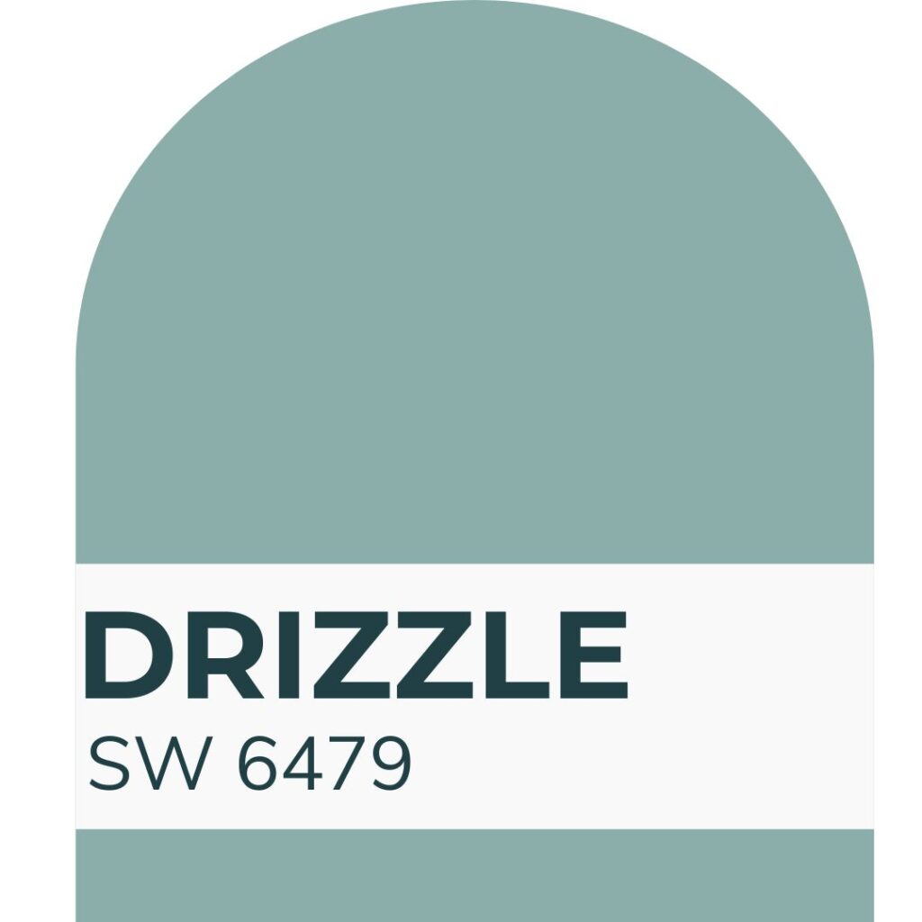
Big mistake.
That Drizzle wall was bright. Like, tropical resort meets dental office bright.
Drizzle looked perfect in theory—but it overwhelmed my bright, airy bedroom. I was going for relaxed. Instead, it felt sharp and overwhelming. A classic case of context changing everything.
The problem? It wasn’t just the paint color—it was the context:
- My furniture was bright white
- The room gets tons of natural light
- The remaining walls were Kilim Beige SW 6106, which felt flat and blah next to such a loud color
Turns out, what I really loved was the feeling of the artwork—not the most saturated shade in it.
So I regrouped. I swapped Drizzle for Oyster Bay, a softer, more muted greenish-blue—and it was perfect. (Seriously, I still smile every time I walk into that room.)

Bonus twist? I used the leftover Drizzle paint in my boys’ bathroom, where the warm wood cabinets and lack of natural light completely transformed it. In that space, Drizzle looked balanced and fresh.
Same color, totally different vibe—and finally, the right one.
👉 Want more room-by-room tips for capturing the right vibe? Check out my post on creating a coastal vibe in your home.
What If You Don’t Like Your New Color?
Sometimes… we just miss.
The color is up. The cabinets are installed. The sofa is delivered. And your stomach sinks because it’s not what you hoped for.
Before you panic—or start pricing out a redo—pause and ask:
Is the issue the color itself…
or is it how it plays with everything around it?
Often, it’s not that the color is wrong.
It’s that the contrast is off.
Too bold? Not bold enough?
Too cool next to warm finishes?
Too soft to hold its own in the room?
The fix might not be repainting or replacing the main thing.
It might be as simple as tweaking the supporting cast—like adding lighter accents, swapping a rug, or bringing in artwork that balances the tone.
Try this first:
- Room feel too dark? Add a neutral rug, swap in crisp towels or throw pillows, and bring in reflective pieces like mirrors or glass-based art. Even a bright lampshade or lighter wood frame can lift the vibe.
- Don’t overlook your lighting itself. Fixtures and bulb type change how paint colors look more than anything. If you’re second-guessing your paint color, check out my guide to the best coastal lighting fixtures before repainting.
- Too bright or bold? Ground it with natural textures—think a jute ottoman, warm wood pictures frames, woven shades, or a chunky knit throw in a creamy tone. Matte finishes on decor or hardware can help calm the space too.
- Still not sure? Don’t repaint just yet. Bring in a new piece of art, layer in a rug, or try rearranging your furniture. Sometimes one or two well-placed items are all it takes to bring a color into balance.
- And if your paint still looks completely different depending on the time of day, it’s not you — it’s your lighting. Paint That Changes Color walks you through what’s really happening (and how to fix it).
Example:
Say you picked a deep blue for your bathroom vanity, inspired by a gorgeous photo on Pinterest.
But your bathroom feels too dark now.
Turns out, the inspiration photo had:
- Huge windows
- White oak floors
- Bright white shiplap
Yours has a charcoal gray floor tile and minimal natural light. Of course it feels heavier.
Instead of repainting, try:
- Swapping in a white rug and white towels
- Hanging light-colored art with big white mats and clean frames
- Upgrading your light fixture to something brighter
Small tweaks can shift the balance and rescue a color that just needed better contrast.
Takeaway Box: When to Pivot—and When to Rework It
🎯 Before you label a color choice a failure:
- Check your lighting at different times of day.
- Add lighter (or darker) contrast with art, towels, or décor. Mirrors can work wonders for bouncing light around a dim space!
- Shift the balance with accessories or furniture arrangement
- If needed, test a lighter or softer version of the same color. Or try it on just one or two walls instead of repainting the entire room. Sometimes that’s all it takes.
Still Feeling Stuck in your search for the best paint color?
You might need to back up and get clear on your decorating style first.
Getting clear on your vibe—your true coastal style—makes picking colors so much easier. It’s the key to finding coastal home paint colors that actually work with your lighting, layout, and the rest of your space.
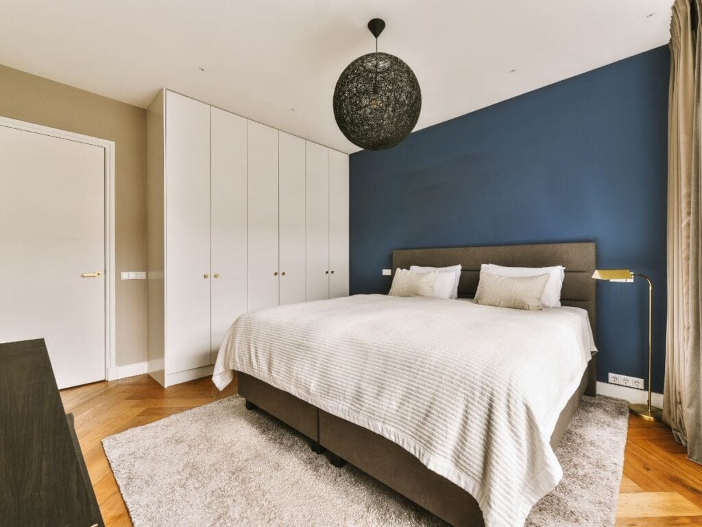
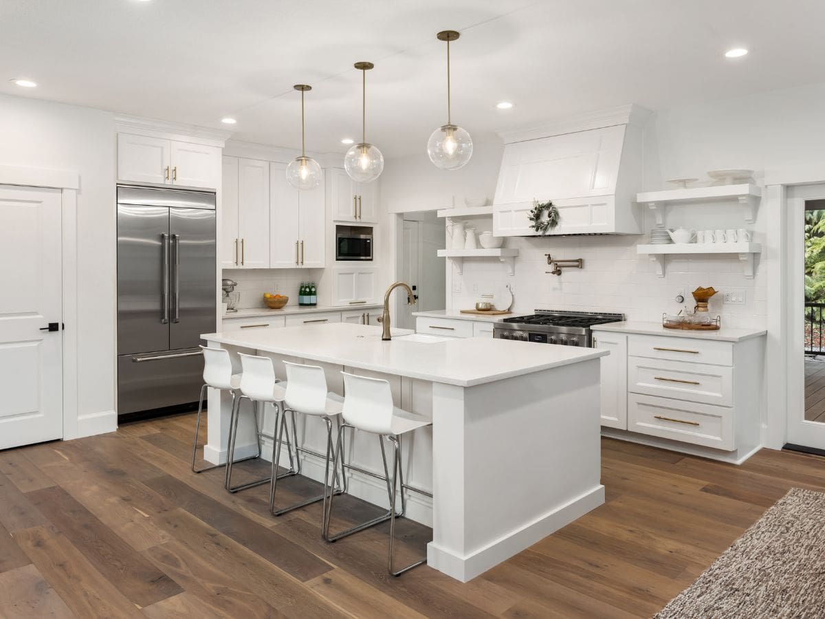
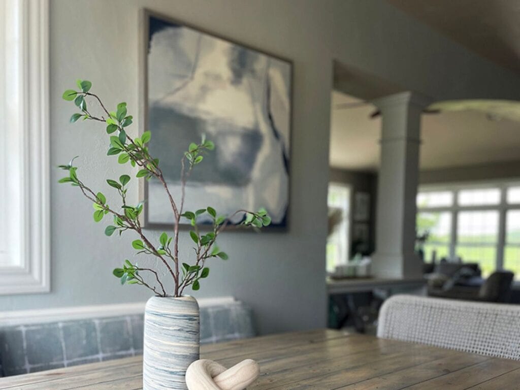
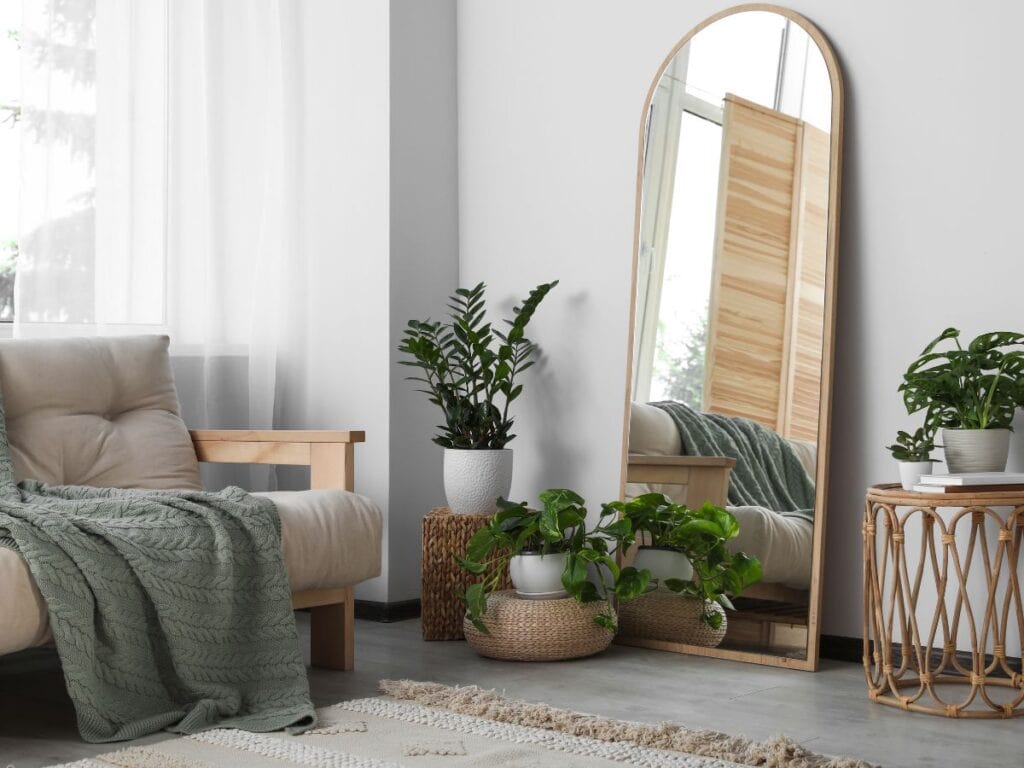
Not every room needs bold paint to feel styled—the space below pulls a single color from the artwork to guide accessories, creating a cohesive feel even with white walls.
Not sure whether you’re more Calming Coastal or Lakehouse Coastal, for example?
👉 Head to this post on defining your coastal vibe—it’s packed with signs to look for, common style mix-ups, and simple ways to uncover what fits you best.
Need Help Pulling All Your Design Decisions Together?
Guess what—I’ve got something really helpful for your project!
Feeling the weight of alllll the design decisions that come with paint? My Building or Renovating a House Checklist walks you through every step — from organizing samples to making confident color calls.
💡 Check out the 9 simple steps in the post, and be sure to grab your Starter Kit so you can follow along.👉