Brighten Up: How to Add Pops of Color with Accent Decor
Sometimes, a room just needs something. It feels a little flat, a little meh—but a full redesign isn’t happening anytime soon.
The good news?
A simple pop of color worked into your accent decor can give your space instant energy, warmth, and personality—without the hassle of repainting walls or overhauling decor.
Let’s talk about why this works, how to do it the right way, and a few pro tips to make it feel natural and cohesive.
Why to Use a Pop of Color in Your Accent Decor (Without Overpowering Your Space)
✔ Adds instant personality – Even the most neutral-loving decorators need a little contrast to keep things interesting.
✔ No commitment required – Unlike paint or big furniture changes, swapping in colorful accent décor is low risk, high reward.
✔ Works in every design style – Whether your home is coastal, modern, boho, or traditional, adding a color pop just works.


👉 Want to make sure your color choices flow beautifully in your home? Check out my Guide to Home Color Schemes for Coastal Interiors for tips on picking the perfect shades that work seamlessly together.
How to Do It: The Right Way to Add a Pop of Color with Accent Decor
The easiest way to make this work is by choosing one high-impact spot—something that naturally draws the eye.
1. Choose a single accent color
Keep it to one standout color so the look feels intentional rather than scattered.
2. Pick a high-impact spot
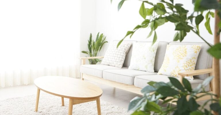
- Throw pillows & blankets – The quickest update with the biggest impact.
- A statement vase or tray – A quick way to bring color onto a shelf, console, or coffee table.
- Framed artwork or photography – This one’s so good! Find (or take!) photos that include even just a small occurrence of your accent color to tie it into your space.
- Book covers & magazines – Stack a few in your color choice on a coffee table or shelf for an effortless pop.
- Wallpaper backing for shelves – An easy (and renter-friendly) way to introduce color without a full commitment.


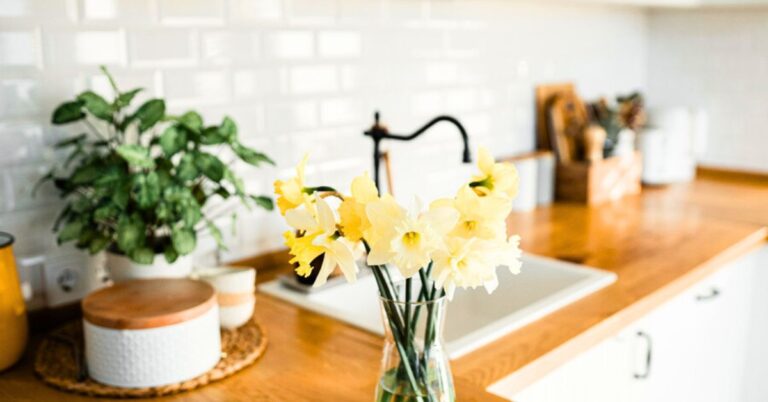
Framed photos do more than just capture memories—they can be the perfect way to sneak in pops of color! Here, hints of yellow from beachy snapshots pull the color scheme together without feeling forced.
👉 Looking for more shelf styling ideas? See how to make your displays pop with color and personality in my 7 Simple Shelf Styling Tips for a Home Décor Makeover.
Beyond the Basics: Creative (and Unexpected) Ways to Add Accent Decor
Swap Out Drawer Pulls
Think beyond decor! Replace the hardware on a console table, nightstand, or side table with ones in your accent color. It’s an easy, budget-friendly upgrade that makes a huge difference. (Aren’t these cool!!)
DIY Color Fixes
Got a piece of decor with a detail that’s almost right but not quite? A little craft paint can fix that. I did this with an oar in my powder room—it was the wrong shade of blue, so I grabbed leftover paint from my cabinet and gave it a quick refresh. Now, it fits perfectly.
Rethink a Table Runner
Can’t find one in your color? Use a scarf instead! A lightweight, flowy scarf in your accent color works beautifully as a table runner or draped across a console.

My Go-To Color Picks for an Effortless Pop
💙 Soft Coastal Blue – Feels calming and timeless.
🌿 Sage Green – A fresh, organic choice that pairs well with neutrals.
🧡 Coral or Terracotta – A fun contrast that adds warmth and energy.
If you’re drawn to soft greens, you’ll love my Sage Color Palette Guide—it’s full of ideas on how to incorporate this calming hue into your decor.
Or how about a sunny palette that includes coastal blues and soft orange accents? My Lake House Color Palette post breaks it down with Sherwin-Williams shades and room-by-room tips that make it easy to style your pops with purpose.
💡Pro Tip: Your accent color doesn’t have to be an exact match across different pieces. Shades and tones of the same color work together beautifully. A variation in hue adds depth rather than feeling too “matchy-matchy.”

If you’re feeling confident with pops of color and ready to mix it up, chartreuse + light blue is a fun coastal combo to try next.
Love this idea? Keep it handy.
My “Flair-Friendly” Rule for Adding a Pop of Color
Feeling color commitment issues? If you want a pop of color that feels fresh, not forced, here’s my personal trick: Match it to something you already love in your space!
- Have a piece of art you adore? Pull a color from it.
- Love your dishes? Try a shade from your favorite mug.
- Got a go-to outfit? Yep, that works too!
This way, your accent color already feels connected to you and your home. It’s not just a random trend—it’s something that makes you smile.


With blue being used as a primary color in this space, the orange pops are the perfect accent—bold, but not overwhelming! 💙🧡 The trick? Pull your accent decor colors from a bold statement piece—like this rug! 💙 + 🧡 = magic!
If you’re diggin’ the blue and orange combo, be sure to peek at my Lake House Color Palette guide features three breezy combos (with exact paint shades!) to bring soft orange, coastal blue, and sandy neutrals into any room!
How Many Times Should You Use Your Accent Color?
This depends on your space, but balance is key!
✔ In a large, open-concept space (like a kitchen and living room), three times may not be enough to make an impact. Try five occurrences of your accent decor color throughout the space.
✔ In a smaller room (like a bathroom or entryway), more than three could feel overwhelming. Stick to two or three well-placed touches to keep it feeling intentional and not overpowering.
Example:
- For a large living room, you might have: A throw pillow, a framed print, a ceramic vase, a patterned rug, and book spines in your accent color.
- For a small powder room, it could be: A soap dispenser, a hand towel, and a small piece of artwork.
Want to test a new color or try something fun for your table? This coffee table book decor trick is my favorite quick setup for freshening up your living room—without going full makeover mode.

The Key to Making Accent Decor Look Balanced
Once you’ve picked your accent color, the trick is to distribute it evenly so it feels intentional and cohesive—not clustered in one spot.
Instead of thinking in strict quadrants, consider breaking your space into sections based on how the room is used and viewed.
Look at different sightlines. Where does your eye naturally travel when you enter the room? Make sure the color appears in multiple places along that path.
Distribute color at different heights. A pop of color in a throw pillow (low), a piece of artwork (mid-level), and a vase on a shelf (higher up) keeps things feeling layered and dynamic.
Think about functional zones. If it’s a large open-concept space, place your accent color in different “zones”—like seating, shelving, and table surfaces—so it’s evenly dispersed.

Example: Using Coral as Your Pop of Color in Accent Decor
Instead of all your coral accents ending up on one side of the room, spread them out like this:
✔ On the couch: A coral pillow
✔ On the coffee table: A coral vase or decorative book
✔ On the wall: A framed print with coral tones
✔ On a bookshelf or side table: A small coral detail, like a ceramic dish or candle
Now, the color naturally flows throughout the space, rather than feeling like a single “hot spot” of color in one area.
💡Pro Tip: Step back and squint at your room. If your accent color feels concentrated in just one part of the space, move an item or two around until it feels more balanced.

Bonus: Make Accent Decor Flow from Room to Room
Want your home to feel even more polished? Don’t stop at just one room. Carry shades of your accent color into adjacent spaces for a subtle, whole-home flow.
🌊 If your living room has coastal blue pillows, bring a softer blue into the dining room with artwork or napkins.
🌿 If your bedroom has sage green accents, add a dusty green vase in the hallway.
🧡 If you love coral in the kitchen, introduce a terracotta planter in the entryway.
This technique keeps your home feeling connected and intentional without every room needing to “match.”
Bonus: It also makes it easier to swap or rearrange your accent decor when you’re ready for a refresh. Since the color carries through your home, pieces can move from room to room and still feel like they belong—no starting over needed.

💡Choosing colors for your home doesn’t have to be overwhelming! How to Choose Your Home Color Palette will give you simple, practical tips to make the process easier!
Now tell me—what color would YOU add to your space? Let me know!