Coastal Blues Inspire this Small Bath DIY Makeover
Step into a small bathroom that proves coastal blues and a little glam can go a long way. The goal? Create a calm, coastal-inspired space that feels fresh, inviting, and anything but cramped.

A mix of water-inspired hues and thoughtful finishes became my secret to pulling this look together. Here’s how you can create your own coastal-feeling bathroom—one simple, stylish detail at a time.
The Art of Crafting Coastal Color Palettes
The magic of coastal-inspired color schemes lies in capturing those airy vibes that transport you to your happy place by the sand and sea. But achieving the perfect balance of hues isn’t always a breeze, especially when it comes to coastal blues. Particularly the moody blue color palette you’ll see in this bathroom design.
The Importance of Undertones
When working with blues, it’s crucial to consider the undertones and ensure consistency throughout your palette. Take, for example, my deep moody blue vanity, which leans towards slate and green tones.

Now, picture finding a powder blue accent piece or hand towel when you’re out shopping. At first glance, it might seem harmless, but when you bring it home and place it alongside the slate/green blue tones of the vanity and wall tile, the clash becomes apparent.
To sidestep this, stick to tones with a shared undertone and compare them side by side to guarantee harmony.
The same principle applies to finding the right wood tone. A slight variation can make all the difference, with tones that are too warm veering towards orange (more about this later) and those too cool appearing drab.
Use a Concept Board
To streamline your selection process, create a concept board with sample pieces of each color element. This visual aid will help you determine if your chosen shades and tones meld together seamlessly. Or if any piece feels out of place against the rest of the colors.
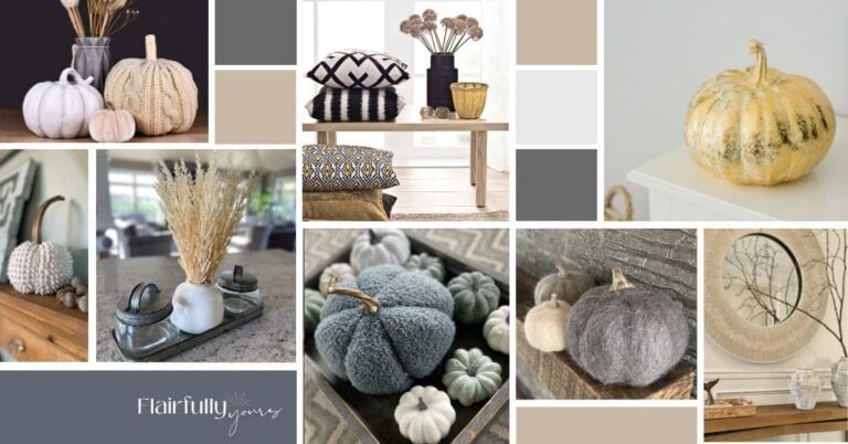
Want to see how coastal blues play with other colors? My Lake House Color Palette includes three paint combos with specific shades, wallpaper and fabric pairing ideas, plus plenty of styling inspo!
For more tips on finding your perfect color palette, check out my post on Flairful Hues: How to Find Your Color Palette.

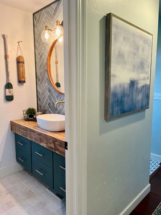
Feature Wall Ideas: Stunning Glass Tile Backsplash in Coastal Blues
Let’s talk about the star of the show in this powder room: the stunning glass tile backsplash.
This pretty glass tile was a perfect find at my go-to tile source: Tile & Stone Gallery.

The moment I laid eyes on the AKDO Beacon 3″ X 12″ Carbon Art Glass Tile, I knew it was the one! Its natural reflectiveness not only makes spaces appear larger and brighter, but also adds a subtle shimmer that catches the eye.
Perfect for this space, its semi-transparency delivers an airy vibe and showcases varied shades of coastal blues. The texture and color variation give movement and truly symbolize the sea.
Enhance Your Small Bath with Reflective, Airy Tiles
Compared to solid subway tiles, this semi-transparent option creates a much lighter, airier feel, enhancing the overall ambiance of the room.
I opted for a timeless herringbone pattern, my go-to for rectangle tile, to give the backsplash a classic yet modern look. The crisp white grout enhances the fresh, clean, and airy ambiance.

Tile Installation Challenges
My husband, who’s my resident tile expert, tackled the project. He’s installed all the tiling (and re-tiling) in our house: floors, backsplashes, and fireplace surrounds. Its always a learning experience, and this project was no different!
While the delicate nature of the thin, wavy glass of this tile was exactly what drew me to it, it also posed some challenges during the project! Cutting such delicate material proved to be quite a task.
Initially, both a saw and a crimp were too strong for the job. However, after some trial and error, we finally found success when my husband stumbled upon a stained glass cutter at a craft store.
Despite the hurdles, we persevered, though not without sacrificing a fair share of tiles along the way. We came darn close to not having enough tile at the end!

Tile Ordering Tip:
Always follow the suggested overage amount when you order tile!
Feature Item Selection Tip:
When incorporating specialty features like tile into your room design, it’s crucial to select them before choosing paint colors and accent décor pieces. Why? Because paint can be matched to anything!
DIY Floating Vanity: How to Maximize Space with Custom Cabinetry
For this half bath, maximizing space was key. To create the illusion of more floor space, I opted for a floating vanity that spans the width of the room. Crafting a custom piece was essential, and my husband took on the challenge.

While I really wanted the look of drawers, that’s where he drew the line, preferring to stick to cabinet door functionality. To compromise, we designed the cabinet doors to look like drawers with a split-panel design and strategically placed drawer pulls.

Since this was a floating vanity, we lost 8” inches (of potential storage) under the vanity. To optimize the height to fit items under the sink, we made the center cabinet to utilize full height. The outer two cabinets included a shelf to split the space.

The middle cabinet features a full height space for taller items.
Painted with Sherwin Williams Still Water for a Coastal Touch
The choice of paint color was inspired by the glass backsplash tile. Sherwin Williams Still Water, with its calming ocean-inspired hue and subtle green-gray undertones, perfectly complements the tile.
And contrary to what you might think, I didn’t choose this color simply because of its name! Though, I must admit, it’s quite fitting for the coastal vibe I was aiming for!
For more coastal-inspired DIY projects, be sure to read my guide on creating a coastal breakfast nook. It outlines five steps to transform your dining space into a cozy, seaside retreat.

Choosing the Perfect White Wall Color: Sherwin Williams Rock Candy
To complement the striking slate blue glass tile backsplash and the rich moody blue of the vanity, I opted for white walls throughout the remaining space.
The choice of fresh white for the walls, door, and trim, along with the presence of a window, worked wonders in creating an open, airy feel despite the small footprint of the room. (If you’ve ever debated whether white trim is right for your home, check out my post on choosing white trim—it breaks down what works best with different wall colors and lighting.)
I’ll confess something: selecting the perfect shade of white for these walls was perhaps one of the most challenging paint decisions I’ve ever made—and I’ve made quite a few! White paint can be deceptively tricky, as it’s crucial to pinpoint the undertone that will achieve your desired outcome.
In this case, I was aiming for just the slightest hint of blue while still ensuring the space didn’t veer into an all-blue palette. Conversely, a warm, creamy white with gold or pink undertones wouldn’t have harmonized with the stone tile floor nor the gray-blue backsplash tile I’d selected.
Thus began the process of testing swatches and observing how they interacted with the room’s various lighting conditions throughout the day.
Paint Selection Tip:
Remember: always test your paint colors in your space before making a final decision, as lighting can significantly influence how a color appears. Never choose a paint before seeing it in your space!

After testing numerous (as in, MANY) color swatches and observing how they looked in the various lighting conditions throughout the day, I settled on Sherwin Williams Rock Candy—a crisp, clean white with just a subtle nod to the blues present elsewhere in the room.
For more tips on choosing the right colors and creating a cohesive palette, check out my finding your color palette post.
Weathered Wood Counter: Budget-Friendly DIY Project
The thick weathered wood countertop was the anchor of my half bath makeover—a vision that sparked the entire design concept. But achieving the perfect look was no walk in the park—it had to meet two critical criteria:
- Strike the right balance to give the appearance of a substantial piece without breaking the bank. After all, the essence of the design revolved around creating the illusion of a thick wood countertop.
- Find the ideal wood grain and tone to mimic weathered wood, adding beachy character and coastal charm to the space.
Love this idea? Keep it handy.
Given the snug dimensions of the room, a custom solution was necessary. My husband took on the challenge, opting to craft the countertop himself.
Crafting the Wood Countertop
To keep costs manageable, we knew that sourcing a single piece of wood large enough and with the required thickness was out of the question. Instead, we pieced together two smaller sections. Attaching 2”x6” perpendicular to the top surface (made from a raw 2″x16″) to achieve the desired depth.

If you’re interested in more budget-friendly home improvement ideas, you might enjoy my article on easy home bathroom facelifts. You’ll see many great tips for refreshing your space without breaking the bank.

But the real adventure began when it came time to achieve the perfect weathered color. Our initial attempt left us with a shade that veered far too orange, resembling oak—a far cry from the aesthetic we envisioned. After experimenting with various stain colors and ultimately starting from scratch, we found ourselves back at square one. Ready to tackle attempt #2.
Surprisingly, this redo turned out to be a blessing in disguise. By sanding the wood down a bit further, we uncovered a lighter, more ashy color. Once stained, it perfectly complemented our vision.

Staining Tip
Here’s a nugget of wisdom from our experience: when staining a project, always use a sample piece of the exact same wood to test different stain colors. Not only does this save time and frustration in nailing down the right stain color, but it also: 1) Allows you to refine your staining technique (for example, using brush vs cloth.) 2) Helps determine the optimal number of coats needed to achieve your desired look.
Natural Stone Tile Flooring: Channeling a Coastal Texture and Tone
Let’s set foot into the world of flooring! The goal: to infuse this small room with the cozy coastal charm of the great outdoors. Imagine stepping into your bathroom room and feeling as though you’ve been transported to a seaside retreat, surrounded by the soothing tones and natural textures of the coast.
And what better way to achieve this than with textured tiles?

Discovering the perfect flooring was nothing short of serendipity, thanks to my trusted tile source mentioned earlier for my backsplash endeavor. While collaborating with Tile & Stone Gallery, they truly grasped my vision and proposed a stunning natural stone tile available in 4”x8” dimensions, boasting an array of captivating designs.
What made this find even more remarkable was its immediate availability in their inventory. A significant advantage, particularly as construction supplies face extended lead times. These tiles were originally intended for a new construction project that hit a standstill and were fortunately available for purchase. The convenience of walking out of the store with my chosen tiles on the same day was nothing short of extraordinary!

These versatile gems not only elevate the aesthetic appeal of your space but also offer durability and visual allure—a true win-win combination! For added visual interest, consider laying them in a crosshatch pattern. This enhances the coastal vibe by creating a sense of depth and movement in the small space.
Special Considerations with Unglazed Natural Stone
However, it’s important to note that unglazed natural stone tile, while exquisite, is prone to staining. Despite this knowledge, I decided to proceed given the smaller dimensions of the room. There were a few heart-stopping moments, such as when an overflowing plant tray left behind a deep, brassy orange stain on the tile beneath it—a sight that nearly brought tears to my eyes!
Thankfully, I discovered a secret weapon for banishing stains: my homemade stone poultice, crafted using hydrogen peroxide. When opting for natural stone, it’s crucial to exercise caution and take proactive measures to safeguard against staining by applying an appropriate sealant.
Coastal Chic Finishes & Accessories: Bringing the Palette to Life
Accessories make the space, don’t they? From wood accents to touch-of-glam brushed gold hardware, here are a few ways to sprinkle a little coastal magic throughout your space.
Champagne Bronze Accessories Deliver Coastal Glam
Let’s add a touch of beachside sophistication with some brushed gold or bronze accessories to compliment the coastal blues. Now, you might hear terms like ‘brushed gold’ and ‘brushed brass’ thrown around, but they actually refer to different tones. Similarly, ‘champagne bronze’ and ‘brushed champagne’ have their distinctions. For example, brushed gold boasts a warmer, brighter shade, champagne bronze offers a more subdued, matte finish. (Champagne Bronze is generally my favorite.)
Here’s what you’ll find in this powder room design:
- 6” Brushed Champagne Bronze Cabinet Pulls
- Delta Brushed Champagne Towel Ring
- Delta Champagne Bronzed Toilet Paper Holder
- Delta Wall Mount Faucet in Champagne Bronze

Wall Mount Faucet
Let’s talk about that wall mount faucet for a moment—doesn’t it look fabulous? Opting for this unique feature allowed me to infuse my personal style into the space while also addressing practical concerns. Given the limited depth of the countertop, a wall mount faucet proved to be a savvy space-saving solution, ensuring a better fit for the sink.

But here’s the thing to consider: a wall mount faucet, especially when installed into a tile backsplash like ours, comes with its own set of considerations (i.e. it’s a risk!)
While it undeniably adds to the aesthetic appeal and saves valuable space, it also presents potential repair challenges in the future. If there’s an issue with the faucet down the line, guess what? Yep, it may require removing the tile. Despite this, the visual impact and space-saving benefits were too good to pass up!
Wood-framed Coastal Bathroom Mirror
The wood frame of this mirror was a perfect complement to the countertop. Given the abundance of square lines in this small powder room—from the window and door frames to the artwork and countertop—a round mirror provided a soft balance, breaking up the angularity of the space.

Statement Worthy White Vessel Sink
Opting for an oval shape was a strategic decision to ensure the sink fit seamlessly within the space. When selecting a vessel sink, pay attention to the depth of the bowl. With 2 teen boys and a wood countertop, I erred on the side of a deeper vs shallow vessel sink in an attempt to keep more water IN the sink than out.
The Ruvati 19”x14” Vessel Sink in White Oval, paired with a Brushed Champagne Pop Up Drain strikes the perfect balance of functionality and style.
Water-Inspired Coastal Wall Décor
Adding a personal touch to the space, the wood oar and buoy wall décor pays homage to my family’s love of water. Its bare wood finish effortlessly ties together the countertop and mirror frame, lending a cohesive feel to the entire room.
However, achieving the perfect hue sometimes requires a bit of DIY magic. Case in point: the decorative oar didn’t quite match the desired coastal blue palette, prompting a simple hand-painting session using the same paint as the cabinetry.

Taking center stage above the toilet is a larger framed ocean print captured during a family trip to Puerto Vallarta—a triple threat in terms of purpose. Not only does it introduce the ideal blue color and undertone, but it also enhances the intentional coastal ambiance while evoking nostalgic memories from our travels.
A gentle reminder to make use of those cherished photos tucked away in your phone gallery—they might just be the perfect addition to your home décor!
Rounding out the wall ensemble is the Sail Away wood sign, featuring a timeless Tom Petty lyric—a thoughtful gift from a dear friend who understands my style perfectly. Its presence adds a touch of whimsy and warmth to the space, tying together the desired atmosphere effortlessly.

For those interested in similar stunning wood wall art pieces, I highly recommend checking out Joyfully Said. Not only are the designs exquisite, but you also have the opportunity to customize each piece to suit your space perfectly, from size to color. It’s truly a treasure trove of inspiration!

Final Tip for a Cohesive Design
Tackling the challenge of selecting elements for a design and curating the perfect mix can be daunting. One strategy to overcome this hurdle is to aim for at least three instances of each texture or element. This approach ensures a cohesive and visually pleasing result, making the design process a breeze.
In this powder room makeover, we’ve navigated this process by seamlessly incorporating wood tones in the countertop, mirror frame, and wall décor. Likewise, we’ve integrated multiple instances of champagne bronze accents, such as cabinet pulls, towel rings, and faucet fixtures. Thus, creating a consistent and elegant look.
Additionally, black metal details are strategically placed throughout the space, adding depth and cohesion. These elements appear in the vanity light fixture, door hardware, and countertop accessories, unifying the design.
More Inspiration
Thanks for joining us on this journey into coastal chic! We hope you’re feeling inspired to channel those seaside vibes in your own home.
Whether it’s a moody blue vanity or a custom weathered wood countertop, each detail can transform your space into a coastal retreat. Remember, incorporating elements like brushed gold, black metal, and natural wood in multiples can create a harmonious and inviting design.
For more coastal inspiration and to see more Sherwin Williams coastal colors, check out my 5 Steps to a Coastal Breakfast Nook Makeover and my guide on affordable home improvement with an easy bathroom facelift.
If you’re dreaming of another small bath glow-up but want to try something warmer, I’ve got just the thing. See how to pull off teal + coral in a way that still feels calm and coastal. Includes specific paint shades!👉 Read it here
Stick around for more tips, tricks, and décor adventures—I’ve got plenty more inspiration to help make your home as beautiful and unique as you are.
As always, I love to hear from you! Reach out with questions anytime!

As an Amazon Associate, I earn commission from qualifying purchases.