How To Avoid Overdoing Coastal Decorating with This One Simple Rule
Love the look of coastal decorating but worried your space might end up looking like a beach-themed gift shop? You’re definitely not alone.
If you’re craving that calm, relaxed lake-life vibe—but your space feels more chaotic souvenir stand—this is for you.
Here’s one simple rule that makes your decor feel intentional—not overdone.

My Coastal Decor Beginnings (And What Not to Do)
Back in my post-college apartment days—when I didn’t quite know my personal style—I was already drawn to coastal decorating. I couldn’t resist the beachy textures, ocean blues, and all the sunny, airy vibes.
But I went way overboard.
Picture: dolphin figurines, bright teal throw pillows, seashells glued to random frames, and more nautical knick-knacks than a lighthouse souvenir shop. I thought I was creating a dreamy coastal retreat, but it felt… busy. Loud. Not calm or collected.
Sound familiar?

Chances are, if you’re drawn to coastal decorating, it’s because you love that breezy, relaxed feeling of waves and warm sunshine. But when we try to add everything that looks beachy, it stops feeling serene and starts feeling overwhelming.
Stop wrecking your coastal vibe! Get the full scoop on mistakes to avoid and fixes to make here!
That’s exactly why this little decorating rule became my go-to.
What Is the “One Bold, Two Calm” Rule?
It’s the trick I wish I had years ago. Here’s how it works:
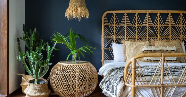
➡️ Choose one bold coastal-inspired piece to make a statement.
➡️ Then layer in two calm, grounding elements to balance the look.
That bold piece brings the personality. The calm pieces bring the peace.
Think of it as a built-in editing tool for coastal decorating—a way to add interest without veering into “nautical overload.”

How to Use It in Your Home
The One Bold, Two Calm trick works whether you’re styling a shelf, refreshing a corner, or planning out a full room. It’s all about choosing one piece to grab attention. Then soften the look with two quieter elements that let it breathe.
Let’s say you’re drawn to a bold blue cabinet—something like Still Water by Sherwin-Williams. (I used it on my bathroom vanity—see it here!) Let that be your bold piece, then balance it with two softer, grounding elements.
- Rope-wrapped vase
- Woven runner in sandy tones

Or maybe you find a large framed coastal print. Something with soft blues, watery brushstrokes, or a shoreline scene—and you just have to hang it. Go for it! Just be mindful of what surrounds it:
- Hang it above a light wood console
- Add a woven tray with neutral accents or a simple ceramic lamp
Now your bold piece gets the attention it deserves—without tipping into “beach rental” territory.
And here’s another easy one:
Styling a shelf or counter? Let’s say your bold piece is a vivid sea glass-inspired bowl in rich blue or green. Instead of pairing it with a matching tray, and a vase in the same color (which might compete), give it room to shine by surrounding it with:
- Small, soft white ceramic vase (maybe with a sprig of greenery)
- Stack of folded neutral-toned hand towels or a pale wood bead strand
These calmer pieces bring in texture and softness without adding more color or shine—so the sea glass bowl becomes the star.
The Best Place to Start? One Piece You Love
This rule works in any room—and it works whether you’re starting from scratch or updating what you already have.
Not sure where to start? Try this:
Bold: a navy striped rug, a patterned barstool cushion, or a painted nightstand in sea green (I suggest Rainwashed by Sherwin-Williams—it’s gorgeous!)
Calm: a rattan pendant, neutral ceramic lamp, or linen curtain in warm white.
Start with something you love, then add two softer pieces to support it. That’s the One Bold, Two Calm rule in action.

My Best Tip for Choosing Colors (That Most People Skip)
Ok you guys, I’m gonna spill my big secret—the key to choosing colors.
Ready?
It’s not starting with your favorite shade of blue or that trendy paint you saw on Pinterest. The real magic happens when you first get clear on the vibe you want for the space.
Airy and calm? Cozy and inviting? Fresh and playful?
Name it. Picture it. And then build your colors—and all your finishes—around that.
So often we pick a color we like in isolation, and end up wondering why the finished room doesn’t feel quite right. It’s usually because that color didn’t actually match the vision we had in our heads. But when your vibe leads the way? That’s when it all starts to click.

🌿 Mood Words to Guide Your Style
Here are a few vibe-setting mood words that can help guide your color and texture choices:
- Airy and calm → soft blues, linen textures, natural wood, and lots of negative space
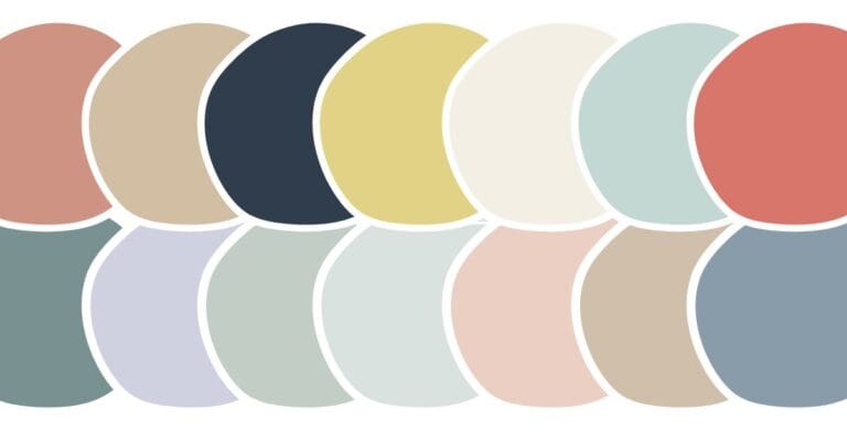
- Fresh and playful → bold accent colors (like coral or aqua), fun prints, and layered textures. (You’ve gotta check out my Lake House Color Palette here!)
- Cozy and inviting → warm neutrals, soft knits, rustic wood tones, and a lived-in feel
- Light and minimal → pale woods, creamy whites, and unfussy silhouettes with a coastal twist
- Lakey and lived-in → casual layers, sandy tones, relaxed fabrics, and a mix of old + new
Knowing the feeling you want will make every choice—from paint to pillows—so much easier.

Want more color help?
If you’re figuring out how to layer colors that feel calm and coastal, these posts might be just what you need:
- Warm Tones vs. Cool Tones
- Guide to Home Color Schemes for Coastal Interiors
- Neutrals Color Scheme Ideas
- 5 Color Combos for Your Coastal Kitchen Decor
Now Let’s Put It Into Practice… Room by Room
Let’s walk through what One Bold, Two Calm can look like in real life, room by room.
Love this idea? Keep it handy.
(Spoiler: this is where you start feeling way more confident in your choices.)
Coastal Decorating In the Kitchen
Bold doesn’t always mean big, especially in the kitchen where cabinets, counters, and appliances already set the tone.

So instead of trying to compete with those, pick one standout decor element to layer in—like a coastal-patterned runner, aqua stool cushions, a bold blue tray, or a colorful sea glass bowl displayed on the counter. Then, balance it with:
- Neutral-toned dish towels (think sandy beige or off-white)
- A rattan tray or woven utensil holder

✨ Quick Tip: If your kitchen already has a bold backsplash or colorful lower cabinets, let that be your “one bold,” and keep any decorative styling simple and calm.

Coastal Decorating In the Entryway
Spot a bold patterned rug that makes your heart skip a beat? That’s your one bold. Let it set the tone as you pair it with:
- Light wood console table with clean lines
- Simple round mirror with a natural frame
Now you’ve got just enough color and personality to welcome guests—without shouting “beach theme incoming!”
Coastal Decorating In the Bathroom
A bathroom vanity in a coastal blue like Still Water or Gale Force makes the perfect bold starting point. (See how I used it in my powder room.) Balance that saturated tone with:
- Soft white or natural-toned towels
- A simple wood-framed mirror or pale ceramic accessory
✨ Helpful Hint: If you’re keeping your finishes light, your bold could even be a single vibrant decor piece—like a patterned shower curtain or ocean-inspired art print.

Coastal Decorating on Open Shelves
Open shelving is where this rule truly shines. You don’t need much to create a styled moment—just one bold piece with personality. Think:
- Mix-and-matched blue and green ceramic mugs
- Stack of turquoise glass bowls
- Vintage aqua cake stand
- Or even a framed photo where a vibrant color pops
Once you’ve picked your bold, anchor it with two calm elements like:
- Neutral woven basket
- Light wood riser or cutting board, or
- Simple matte vase with soft greenery
✨ Styling Tip: If you’re working with open shelves or creating little moments around your home, apply the “one bold, two calm” rule to each shelf or styled area—not for every item you place on the shelf. It’s about balance in the whole vignette, not micromanaging every single piece.
Quick Takeaway: Bold vs. Calm Coastal Decorating Ideas
Need a jumpstart? Here are a few of my favorite mix-and-match bold + calm pairings to get you started.
BOLD Coastal Decor (Choose One)
- Ocean-inspired statement art (→ get inspoired on choosing Coastal Wall Decor)
- Colorful coastal throw pillows
- Blue or sea green painted furniture
- Coral-patterned table linens (→ see this Lake House Color Palette with coastal blue + soft orange)
- Large woven starfish wall art
- Sea glass centerpiece bowl (→ see Sea Glass Decor)
- Nautical stripe rug or runner
- Bright blue cabinet or vanity (try Hyper Blue!)
- Hurricane candles with colored glass
- Vintage bottles in vivid coastal tones
- Bold patterned trays (→ Kitchen Countertop Decor Ideas)
CALM Coastal Decor (Choose Two)
- Natural jute or rattan
- Soft wood tones
- Pale or neutral ceramics
- Linen throws or curtains
- Driftwood bowl with smooth stones (→ I’ve been obsessed with this one)
- Simple glass jars with pale sea glass
- Neutral bead garland
- Rope-wrapped vase (→ Twine Wrapped Decor)
- Soft, abstract or watercolor art
- Woven baskets
- Light textured pillows
- Cream-toned table runner
Remember
Your bold doesn’t have to be bright. It just needs to stand out.
And your calm elements? Let them bring texture, softness, or a sense of balance—not more visual noise.
Wondering what counts as a bold accent? Lemon yellow is one of my favorites for coastal spaces—it’s vibrant but easy to layer in small doses. Check out these lemon yellow decor ideas for coastal homes for inspiration.
Why the One Bold, Two Calm Rule Works (and Why You’ll Love It)
✔️ Keeps you from overdecorating – We’ve all been tempted to keep adding “just one more” shell or stripe.
✔️ Simplifies decisions – No more second-guessing if that pillow matches or if your shelf feels too full.
✔️ Creates a soothing rhythm – Your bold decor pieces get the spotlight, and the rest brings softness and flow.
Here’s a helpful mindset reset to try when your space starts feeling a little too busy…

Whether you’re decorating a lake house, freshening up a guest bedroom, or tweaking your mantel, this approach keeps things calm, clean, and unmistakably coastal.
Two of My Favorite Tricks for Coastal Decorating


Final Thoughts on Your Coastal Decorating
Decorating your home with a coastal feel shouldn’t be stressful. The One Bold, Two Calm rule gives you the freedom to add flair without the fear of going overboard.
Whether you’re into lake house vibes or beachy touches, this little formula makes coastal decorating so much easier.
It’s a super simple decorating trick:
➡️ Choose one bold coastal-inspired statement piece to add personality.
➡️ Pair it with two calmer, more understated items to bring the balance.
It’s the rule I wish I had back when I was hot-gluing seashells to everything in sight.
Before you go, here are the top things I want you to remember about using the One Bold, Two Calm rule: