
How To Choose Your Home Color Palette
Struggling to nail down your perfect home color palette? You’re in the right place! In this post, I’ll walk you through simple, practical steps to help you confidently choose a color palette that brings your vision to life.
Whether you’re refreshing a room or starting from scratch, you’ll learn how to avoid overwhelm and create a cohesive look that feels like you. Let’s make those color dreams happen.

You see, it’s not just about paint swatches or throw pillows for me. It’s a journey that began long before I even realized its significance in my life…
Quick Storytime:
Believe it or not, my fascination with color harmony traces back to my high school days. Picture this: a young me, pouring endless hours into tackling a term paper for my Advanced Comp class with Miss Siebert. (And we’re talking the old-school method here: handwritten outline, index notecards, rough draft, and proofreading marks — there most certainly was no AI or Grammarly then!)
The topic? The meaning of color. Little did I know then just how much that seemingly mundane assignment would shape my future.
Fast forward to today, and here I am, a marketing professional, graphic designer, and passionate blogger about decor and all the hints and hues of color. (Equally ironic is that my Creative Writing teacher used to tell me I should think about a writing career. As a teen, that was the LAST thing I wanted to do! Yet, here I am a blogger and marketing professional that writes content for a living.)

The Struggle with Home Color Palette Choices:
Let’s talk about something we’ve all experienced at one point or another: the struggle of choosing the perfect paint color. You know the drill—you have a vision in mind, you pick what seems like the perfect shade of paint, and then… disappointment. It just doesn’t look the way you imagined. Sound familiar? You’re not alone.
For many, making color selections ends up being all stress and no fun. You might envision a soft blue for your bedroom walls, only to find it feels too cold and sterile once applied. You might think pretty pink pillows will freshen your couches but they actually end up looking like a tween girl bedroom.
These missteps can be disheartening, leaving you questioning your eye for color and leading you to dislike your space even more than you did before!
And trust me, I have had my fair share of misteps (and the subsequent repainting) along the way! Finding a yellow for my boys’ bathroom when we built our house kicked my butt! It has been beige with a beachy aqua accent wall ever since!

Adding to the complexity — factors like woodwork, flooring, furniture, décor and existing color schemes often get overlooked in the excitement of choosing a new hue. You might fall in love with a trendy shade of green, only to realize it clashes horribly with your warm-toned wooden floors.
Learn more about working a color like Sage Green into your existing surroundings in the Flairful Hues: Sage Color Palette Guide post.

Learning from Personal Color Mishaps
After a paint job gone wrong or after bringing home your new furniture you find that it doesn’t match your space AT ALL… you might swear off certain colors altogether.
Perhaps you tried to achieve the trendy “greige” look, only to end up with a room that felt as cold and lifeless as concrete.
But here’s the thing: it’s not that color doesn’t work; it’s that particular shade within a color family didn’t work with the surrounding lighting and elements. Fear not! There’s always a fix!
Color is a powerful tool, but mastering it requires careful consideration and attention to detail.
Whether you’re revamping your living room décor, reupholstering a well-loved piece of furniture, simply choosing new kitchen linens or refreshing your wardrobe, here are a few tools and insights to help make the perfect color pairings.

Practical Tips To Find Your Home Color Palette
1. Follow the 60-30-10 Rule (… with a Flairful Twist!)
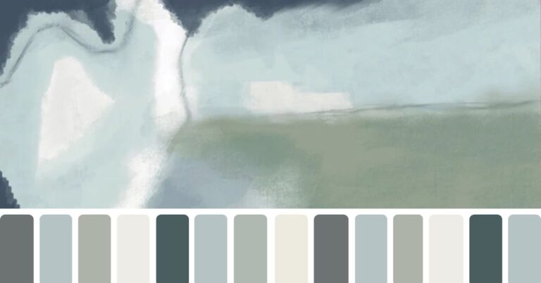
When decorating a room, start with a 3-color palette and use the 60-30-10 Rule: allocate 60% to your primary color, 30% to a secondary color, and 10% to an accent color.
But here’s the fun part: I like to take it one step further and add a fourth hue to the mix for extra depth and dimension! This could be a neutral to ground the palette, a metallic for a touch of glam, or even a second accent color to give your space more personality.
For example, if your palette is navy, white, and gold, you could sprinkle in a soft gray or muted beige to tie everything together.


Incorporating a fourth hue gives you more flexibility while still keeping your color palette cohesive and polished. So don’t be afraid to play with that extra pop—it’s where the magic happens!
💡Pro Tip: Incorporating a fourth hue gives you more flexibility while still keeping your color palette cohesive and polished. Start small—think throw pillows, candles, or picture frames—and let that extra hue add a little pop where you need it most. Don’t be afraid to experiment; it’s where the magic happens! Once you’re confident, layer it into bigger elements like rugs or curtains for a look that feels bold yet beautifully balanced.
2. Go for Vibe
Before diving into your color palette, pause and ask yourself: What vibe am I really after? It’s not just about the color—it’s about the feeling you want your space to evoke. Is it the crisp clean lines of a minimal, modern look? The layered coziness of a boho retreat? Or maybe the airy, laid-back feel of a coastal escape?
If you’re still wondering whether coastal style actually works for your home — or if it just looks pretty online — I’ve written a guide that helps you determine the best fit for your space. This can make all the difference before you dive into color decisions. 👉 Is Coastal Style Right for Your Home
Here’s the trick: Start with an image in your mind (or even better, an inspiration photo). Look beyond the colors. What is it you’re drawn to? Is it the textures—the way woven baskets soften a room? The contrast of light and dark tones? Or maybe it’s the overall balance and flow. Dig deeper to uncover what’s really resonating with you, and let that guide your choices.

For example, when I revamped my breakfast nook, I wasn’t just looking for blue. I wanted to infuse a hint of coastal charm, which led me to incorporate soft blues alongside natural woods and woven textures. The result? A space that feels light, fresh, and pulled straight from the shore. Want the full details? Check out my blog post, 5 Steps to a Coastal Breakfast Nook Makeover to see how it all came together.
💡Pro Tip: If you’re not sure where to start, think about a space or design you already love. Break it down: Is it the way the colors play together, the balance of light and dark, or maybe the way a certain accent ties it all in? By focusing on the vibe, you’ll uncover what truly speaks to you and can create a space that feels authentically yours.
3. Start with an Inspiration
Choose an item that you absolutely adore—something that perfectly reflects the vibe you’re aiming for—and let it serve as the focal point for your decisions. This could be a striking piece of art, a bold rug, a quirky piece of furniture, or even a photo from a magazine or Pinterest that captures your vision.
Take a moment to ask yourself: What is it about this piece that you love? Is it the color? The texture? The way it makes the room feel inviting or energized? Once you identify what draws you in, use it as your design compass.
For example, when I gave my bathroom a refresh, everything was inspired by a light, airy backsplash tile in coastal blue. The soft hue immediately brought to mind the peacefulness of the ocean, and I carried that vibe into the rest of the space with paint colors, decor accents, and even the towels. Curious to see how it turned out? Check out the transformation here.

Love this idea? Keep it handy.
💡Pro Tip: Once you’ve found your inspiration, pull out two or three key elements—like a standout color, pattern, or texture—and repeat them in subtle ways throughout the space. This keeps everything feeling cohesive and intentional.
4. Harmonize with Neutrals
Neutral colors like white, beige, gray, and taupe act as the foundation of your home color palette, setting the stage for accent colors to shine.
By using neutrals for larger elements like walls, furniture, or flooring, you create a cohesive backdrop that makes it easy to layer in personality with smaller, colorful details.
Want to change things up down the road? Neutrals give you the flexibility to swap out accent pieces like pillows, curtains, or rugs without having to overhaul the entire space.

Looking for more ways to make neutrals anything but boring? Don’t miss my post on Neutral Color Scheme Ideas for tips on blending textures and adding depth to your neutral base.
💡Pro Tip: Add subtle interest by mixing different finishes and materials in your neutrals. For example, pair a plush cream area rug with sleek gray cabinetry or a textured taupe throw with smooth white walls. These small touches keep your neutrals from feeling flat and make your space feel polished and thoughtfully designed.
5. Play with Texture
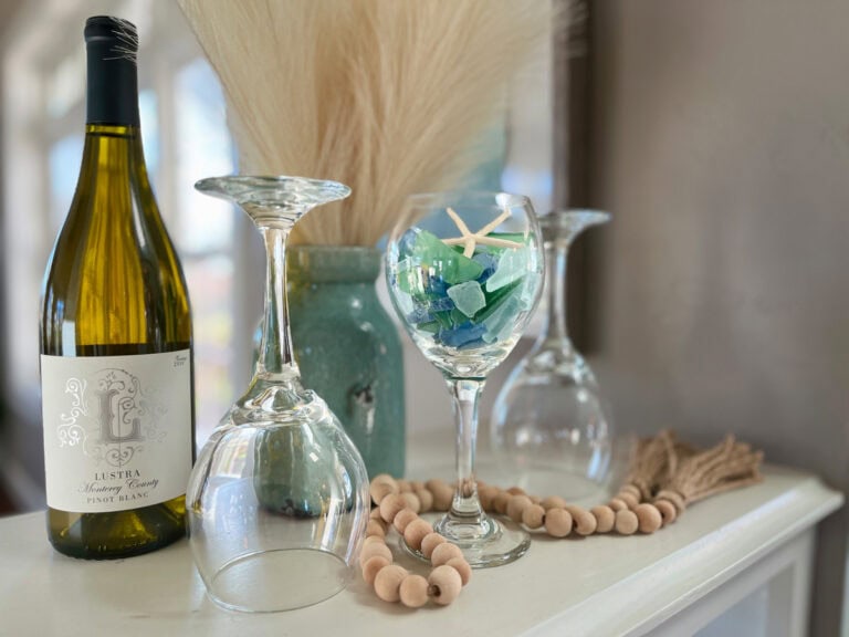
When your home color palette leans monochromatic or minimal, texture is your secret weapon for keeping things visually interesting. Whether it’s a woven seagrass basket paired with a glossy ceramic vase or a plush velvet pillow nestled on a crisp linen sofa, these textural contrasts bring depth and life to your space—without needing to add extra colors.

And let’s talk about a little glimmer of gold, because I’m all for it. Whether it’s cabinet hardware shimmering against beachy blues or a gilded picture frame nestled among coastal whites, those metallic touches add just the right amount of sparkle to keep your palette from feeling flat.
In my Coastal Christmas Decor: 3 Holiday Color Palettes post, I styled a flocked garland with glittery gold ornaments and creamy candles on the mantle. The mix of textures—soft faux greenery, metallic shimmer, and warm candlelight—creates a cozy yet polished look. See the full setup here.
💡Pro Tip: Pair matte finishes with glossy accents, like a matte black light fixture alongside a gold-rimmed mirror. Or layer fabrics—think a chunky knit throw over a leather chair or a light linen table runner with a metallic centerpiece. These small details can take your room from simple to sophisticated in no time.
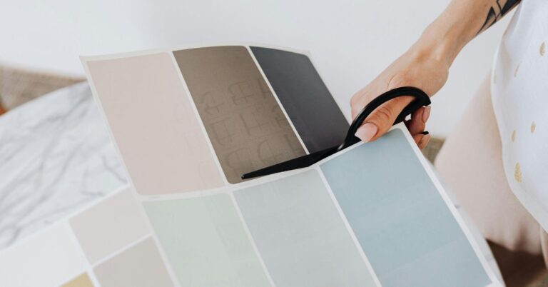
6. Try Before You Buy
In other words… samples, samples and more samples!
Don’t skip the step of testing paint samples, fabric swatches, or clothing items in various lighting conditions before committing to a color scheme. Trust me, it may seem like a time-saver to skip this step, but more often than not, you’ll end up spending even more time redoing a project that didn’t turn out as expected.

Sherwin Williams peel and stick samples are a lifesaver. These real-paint samples let you test colors in multiple spots around your home and in different lighting—without marking up your walls. They’re perfect for visualizing how a shade will look before taking the plunge.
💡Pro Tip: Leave your samples in place for at least a few days to truly get a feel for them. Observe how they look in natural daylight, evening light, and under artificial lighting. Place them near key elements in your room, like furniture, cabinetry, or flooring, to see how the colors complement your space. This extra time can save you from making a costly color mistake—and help you fall in love with the perfect hue.
💡Pro Tip: Not loving how your samples are looking on the wall? It might not be the color—it could be your lighting, trim, or other finishes shifting the vibe. Here’s a helpful breakdown of how to get your paint color right before you commit, especially if you’re trying to work around existing elements in your space: How to Choose the Best Paint Color for Your Home.
7. Balance Bold and Subtle
When playing with bold or vibrant colors and patterns, balance is everything. Ground those attention-grabbing hues with softer, more neutral tones to keep the space (or outfit!) feeling harmonious instead of chaotic.
Think of it as a spotlight: the bold elements should shine as accents or focal points, while the subtler tones provide the stage.
For your home, this might look like a statement rug, bright throw pillows, or a piece of eye-catching artwork paired with neutral furniture and walls.
In your wardrobe, it’s like letting a colorful scarf or patterned shoes do the talking while the rest of your outfit stays simple and polished. It’s all about letting bold elements pop without overwhelming the entire look!
💡Pro Tip: If you’re hesitant about going bold, pair vibrant pieces with softer shades in the same color family for a cohesive look. For instance, a deep navy couch pops beautifully against pale gray or soft blue walls and feels perfectly grounded when complemented with cream or beige decor accents.
By keeping the palette within a similar family, your bold choices feel intentional and polished without overpowering the space.

8. Feel the Flow
One of my go-to tricks for creating a home that feels polished and harmonious is to keep colors, textures, or patterns flowing seamlessly from room to room. It’s not just about a cohesive look—it also makes choosing décor so much easier.
And here’s the real magic: when your pieces work together, you can rearrange them from time to time to completely refresh your space without spending a dime.
In my home, I’ve tied together coastal hues and textures with subtle but intentional touches. For example, the capiz shell light fixtures twinkle in my dining room, office, and upstairs hallway, creating a cohesive thread of soft, shimmering elegance. My weathered wood bathroom vanity echoes the earthy tones of our fireplace mantle, while accents like the natural rope balls, seagrass baskets, and macrame wall hangings subtly reinforce the theme.


Flowing coastal charm! ✨ These capiz shell chandeliers in my dining room and office tie beautifully to the matching fixture in the upstairs hallway, creating a thread of shimmering elegance that flows seamlessly throughout my home.
💡Pro Tip: Choose one “hero” color or signature element – like natural wood finishes or coastal textures – to weave through your spaces. If blue is your thing, play with different shades—like deep navy in the living room, a breezy aqua in the bathroom, and muted denim in the bedroom. It’ll create a flow that feels cohesive yet totally effortless!
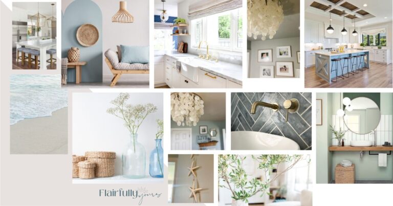
Exploring Different Vibes to Find Your Home Color Palette
Choosing the right home color palette is all about creating a space that feels like you. Whether you’re drawn to soft pastels, rich earthy tones, or bold, vibrant hues, the goal is to set the mood you want for your home. Think of it as defining how your space makes you (and others) feel.
Here are some helpful reads to guide you on your home color palette journey:
- How to Choose the Right Trim Colors for Your Coastal Home: Don’t forget about the trim! Trim color plays a crucial role in bringing together your whole coastal look.
- Home Color Schemes for Coastal Interiors: A complete guide packed with tips and 4-color palette ideas to help you achieve a cohesive coastal-inspired look.
- Beach House Exterior Colors: 8 Coastal Palettes That Just Work: If you’re choosing exterior colors soon, these 8 palettes will help you skip the overwhelm and pick with confidence.
- 5 Color Combos for Your Coastal Kitchen Decor: Stylish and practical ways to bring breezy, seaside-inspired hues into the heart of your home.
- Neutrals Color Scheme Ideas: Discover how to layer textures, add metallic accents, and make neutrals anything but boring.
- Warm Tones vs. Cool Tones: Not sure whether to go with cozy, inviting hues or refreshing, tranquil shades? This guide breaks it down for you.
- Get Inspired: Peek inside my own home’s paint palette and discover even more color ideas.
Wrapping Up Your Color Journey
Ready to start curating a home color palette that feels uniquely yours? Whether you’re drawn to bold, energizing hues or calming, tranquil shades, this is your invitation to embrace the power of color in your space.
Have a specific color in mind you’d love to explore? Let me know—I’d be thrilled to feature it in an upcoming post! Shoot me an email and let’s make it happen.
Color is more than a tool—it’s a way to tell your story and shape your space. I can’t wait to see what beautiful palettes you create!
Up Next: Sage Green
Don’t miss my next feature: Sage Green—a color that’s versatile, soothing, and perfect for any style. You’ll find tips on how to incorporate it into your space: Flairful Hues: Sage Color Palette Guide.


I love your story in this blog Wendy! This is going to help me with my office design that you know I’ve been struggling with!! I’ll be trying out those paint and stick samples as well. 🙂
Awww, thanks so much, Denise. I hope you found a burst of inspiration as your perused the blog. Reach out ANY TIME for help;)