Paint That Changes Color? Here’s What’s Really Going On (and How to Fix It)
If Your Paint Looks ‘Off,’ It’s Not Your Eyes
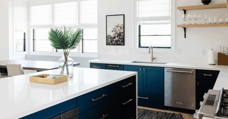
Paint color looks different in your home than it did at the store? Or your best friend’s house? Heck, even from your bathroom to your living room? You’re not imagining it — your lighting can make it look like you have paint that changes color.
Every paint color shifts under different light, and every room in your home has its own light personality. But don’t worry, this isn’t about memorizing color theory. I’ll walk you through what’s happening and what to tweak so your walls look the way you actually want them to.
Step 1: Understand Why Paint Color Looks Different in Your Home
Each room has its own light story depending on which way it faces — and that affects how every color reads.

North-facing rooms
→ Cool, gray-blue light makes paint feel more muted.
👉 What to do: Choose warmer colors (creams, beige, greige) to balance the chill.
South-facing rooms
→ Warm, golden light makes colors look brighter or a touch yellow.
👉 What to do: Cooler tones (muted blues, greens, grays) help calm that glow.
East-facing rooms
→ Sunny mornings, flat afternoons.
👉 What to do: Pick mid-tone shades that still feel alive when the light fades (like Oyster Bay or a cozy warm gray).
West-facing rooms
→ Shadowy mornings, fiery sunsets.
👉 What to do: Go for colors that stay steady—soft neutrals that don’t go orange by evening.
🕓 Takeaway: Always look at paint samples at multiple times of day. The same color can shift wildly from morning to night.
Step 2: How Room Lighting Affects Paint Color
Ever notice how your paint looks one way during the day and totally different once the lamps come on?
Artificial light can completely change the way your walls read after sunset — sometimes making them feel warmer, cooler, or even like a whole new color.

Different light bulbs give off different color temperatures (measured in Kelvins), and that number tells you whether the light will make your paint look soft and golden or crisp and cool.

Here’s what’s really happening:
- Warm White (2700–3000K):
Adds a cozy, golden warmth that flatters most colors — especially creamy whites, beige, and muted greens. It’s perfect if your goal is a soft, relaxed vibe.
(Think: lamps in living rooms and bedrooms — they make paint feel comforting and calm.) - Neutral White (around 3500K):
Keeps colors balanced and natural, giving you the truest sense of how your paint actually looks. Great for kitchens, offices, and main living areas where you want clarity without harshness. - Cool Daylight (4000–5000K):
Brings out blue or purple undertones, which can make walls look brighter — but sometimes a bit sterile. It’s great for task lighting or bathrooms where you need brightness, but not ideal for relaxing spaces.
👉 Try this:
If your “paint that changes color” moment happens mostly at night, swap just one bulb for a warm white (2700–3000K) and look again. You’ll know in seconds if your lighting is the culprit.
Once you’ve nailed down your bulb temperature and color, it’s worth thinking about how your actual light fixtures influence your space too.
If you love a coastal vibe, my Best Coastal Lighting Fixtures: Capiz, Woven & Glass guide walks through the prettiest fixture styles that add texture, warmth, and natural glow — without making your room feel harsh or overlit.
Step 3: Paint Color Changes Under Different Light — Here’s What to Do
Your paint finish affects how much light bounces around — and that can change everything. If it feels like you have paint that changes color throughout the day, it’s likely your sheen and light reflection working together.

- Low-sheen (matte or eggshell):
Absorbs light and softens glare. Ideal for bright, sunny rooms or spots with natural light pouring in. - Higher-sheen (satin or semi-gloss):
Reflects more light and can help a darker room feel brighter and more open.
If you’re stuck pairing your paint with flooring, cabinetry, and fixtures? The Build & Reno Interior Finish Guide helps you see how every finish works together so your colors flow from room to room and your lighting highlights the look you love.
👉 Quick tip
If your room feels flat or cave-like, go one sheen higher to catch more light.
If it feels shiny or intense, step down a sheen to mellow things out.

Step 4: Don’t Forget the Ceiling (It’s a Hidden Influencer)
Your ceiling is basically one big reflector—it can change how every color below it looks.

Here’s how different ceiling choices affect the feel and light in your space:
☀️ Bright Whites
(Examples: Extra White SW 7006 or High Reflective White SW 7757)
These have a high Light Reflectance Value (LRV), meaning they bounce a ton of light back into the room.
Great for darker spaces, but in very sunny rooms, they can sometimes create glare or feel overly bright.
🌤 Softer Whites
(Examples: Pure White SW 7005 or Greek Villa SW 7551)
Love this idea? Keep it handy.
Still bright, but with a hint of warmth that diffuses harsh sunlight.
This choice creates a soft, balanced glow—perfect if you want brightness without that blinding midday reflection.
🌙 Tinted Ceilings
(A lighter version of your wall color—like Oyster Bay SW 6206 walls with Sea Salt SW 6204 ceiling)
A tinted ceiling feels cozy and cohesive, helping small rooms feel taller and calmer.
Try going 75% strength of your wall color or 1–2 shades lighter on the swatch deck for a subtle, lifted look.
🪄 Pro Tip:
Even a slight ceiling color tweak can dramatically change how your wall color reads—especially in rooms with strong sunlight or layered artificial lighting.
👀 If your color looks strange, glance up—the ceiling might be the secret influencer.
Now that you know how ceilings can shift the way light moves around a room, the next step is figuring out how to use that light to your advantage. Start with the feeling you want — bright and airy, soft and relaxed, crisp and clean, or moody and cozy — and build your choices from there.
Step 5: Match Your Lighting to the Vibe You Want
This is the fun part — deciding how you want your home to feel.
Lighting and paint can work together to create completely different moods, and once you know how to pair them, you can fine-tune every room to match your vibe.

☀️ Bright & Airy
If you love spaces that feel cheerful and open even after sunset, start with high-LRV whites such as High Reflective White (SW 7757) or Ceiling Bright White (SW 7007).
Pair them with warm-white bulbs (2700–3000 K) to mimic natural sunlight and keep the room glowing instead of harsh.
In darker rooms, a satin or semi-gloss finish helps bounce light around so everything feels bright and breezy.
🌿 Soft & Relaxed
For that calm, cozy, low-contrast look, choose muted tones like Sea Salt (SW 6204) or Drift of Mist (SW 9166).
Their gentle undertones stay soothing under warm bulbs (around 2700 K), especially with a matte or eggshell finish that softens edges.
This combo makes living spaces and bedrooms feel like a quiet exhale at the end of the day.
✨ Crisp & Clean
Prefer a polished, tailored feel? Stick with balanced whites such as Extra White (SW 7006) or Pure White (SW 7005).
Use neutral bulbs (around 3500 K) and a satin finish to keep the look fresh and clear without drifting into sterile.
It’s perfect for kitchens, bathrooms, and trim where you want clarity, contrast, and just a hint of sheen.
🌙 Moody & Cozy
If you’re drawn to deeper, more grounded spaces, reach for mid-tone hues like Oyster Bay (SW 6206) or Silvermist (SW 7621).
Under warm bulbs (2700 K) and a matte finish, these colors take on a soft glow that feels intimate and inviting — never dark or heavy.
Ideal for dining rooms, reading corners, or anywhere you want that “evening calm” energy.
🪄 Pro Tip
Lighting can completely change how a paint color reads — that’s why a shade that feels soft and airy in one room can look moody in another.
Once you align your paint color, finish, and bulb temperature with the feeling you’re after, your rooms will finally look as good as they feel.

Quick Lighting & Color Fix Checklist
Before you paint (or repaint,) do this quick lighting check. Its the easiest way to make sure your “perfect” color still looks perfect at night.
A few small tweaks (like adjusting bulbs or sheen) can completely change how your paint reads. Walk through this list before you pick up the roller and you’ll avoid those frustrating “wait, why does this look purple now?” moments.
- View samples in morning, afternoon, and evening light
- If your “paint that changes color” moment happens mostly at night, check your light bulbs — they might be casting a cool tint.
- Check your bulb temperature (Kelvin)
- Match sheen to your light level (higher for dark, lower for bright)
- Don’t overlook ceiling color — it affects reflection
- Align lighting with your vibe goals (bright, cozy, crisp, or moody)
- Always test paint next to trim and flooring — never floating mid-wall

Planning a bigger update or remodel? My Building or Renovating a House Checklist helps you track every finish and fixture decision so your rooms look cohesive from floor to ceiling.
Here’s the Thing
Lighting doesn’t ruin your paint color — it reveals it. Once you understand how lighting affects paint color in your home, you’ll finally choose shades that feel right in every room.
If you’re about to paint or start pulling finishes together, grab the free Interior Finish Starter Kit. It’s an easy way to compare samples side-by-side, test how they look in different light, and feel confident about your next color choice before you commit.
And if you’ve already painted and can’t quite figure out what’s off, that’s where I come in. My Color + Finish Strategy Session helps you pinpoint the real problem — whether it’s undertone, sheen, or lighting — so you can stop second-guessing and finally love the color you live with.