Building or Renovating a House Checklist: How to Organize Your Finishes
Building or renovating means making about a thousand decisions—and it’s no wonder your head’s spinning. When every finish feels high-stakes, one wrong combo can throw everything off. This renovating a house checklist takes the stress out of those choices so you can see everything together, stay organized, and finally feel confident saying, “Yes, this works.”
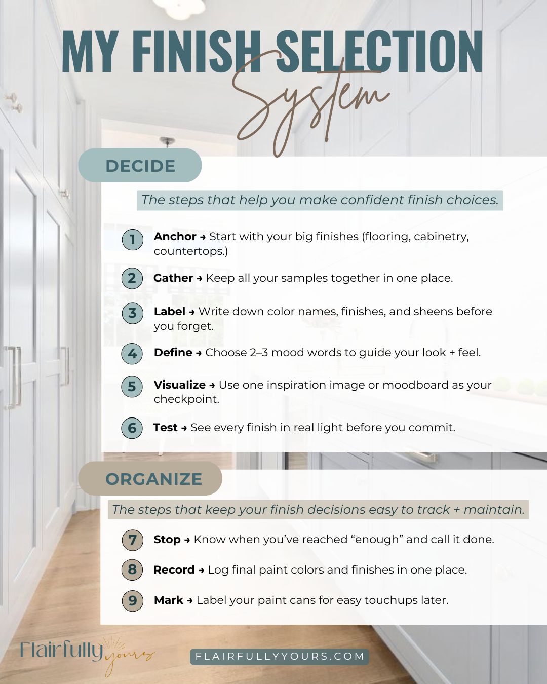
Your Building or Renovating a House Checklist: 9 Simple Steps
Inside this building or renovating a house checklist, you’ll find steps and tools to keep you organized through every stage of your home renovation. Especially when it comes to managing all those interior finishes. Instead of second-guessing every choice, you’ll know exactly what to focus on and when.
Here’s the truth: it’s not about finding the “perfect” finish first. It’s about having a simple system that helps you see everything together, stay organized, and make choices that actually work in your home.
Below, you’ll find 9 practical steps that take the guesswork out of choosing finishes. From flooring and cabinetry to paint colors and lighting—so your home looks cohesive and feels like you.
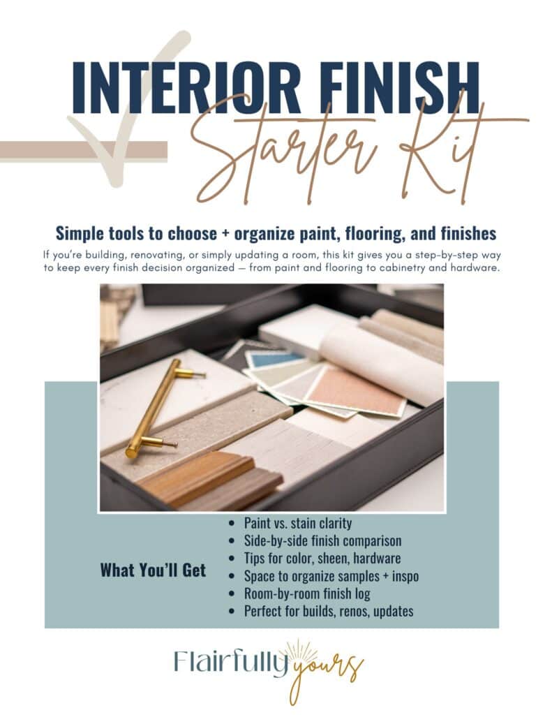
And if you’d like a printable companion to make it even easier, grab my free Interior Finish Starter Kit. It’s a separate download that pairs perfectly with this checklist, giving you one place to track all your final colors, materials, and finishes.
Step 1: Start With the Big Interior Finishes
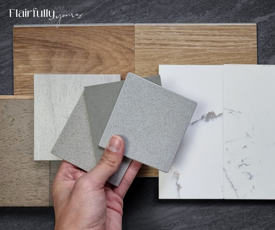
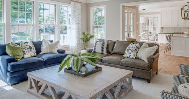
Don’t start with wall paint. Begin with the finishes that are expensive or hard to change: flooring, cabinetry, and countertops. These are your “anchor” choices—the ones everything else needs to complement.
It’s the biggest mistake I see people make when designing a space. Paint feels fun and easy to tackle first, but it’s also the step that can throw everything off if you start there. Just because you love a color doesn’t mean it’s right for your lighting, flooring, or style.
Even when I’m helping clients (or making decisions in my own home), I still get that “ooh, I just want to pick a color!” feeling. But I always start with the long-term finishes first. It’s the difference between a space that feels pulled together and one that feels “almost right.”
👉 Takeaway for you: Always let the most permanent finishes guide the rest. Paint can flex later—wood floors and cabinets can’t.
Step 2: Keep All Your Samples Together
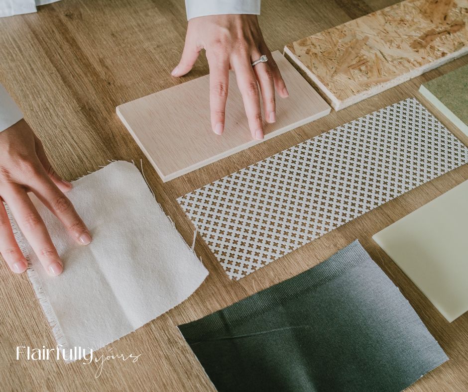
Whether it’s wood flooring planks, tile swatches, fabric snippets, or paint chips, keep them all in one easy-to-grab spot. Try a zipper pouch, slim bin, or small tote that travels with you.
It might sound basic, but it’s a total sanity-saver when you’re shopping for anything — towels, decor accents, or rugs (which, by the way, are one of my hardest things to choose!). Having your samples together makes it so much easier to visualize how new pieces will fit into your space.
Even if you’re shopping online, pull out your samples while you browse. Hold that paint chip or flooring sample next to your screen to get a sense of warmth, undertone, and contrast. It’s not perfect, but it’s a lot better than guessing. And it keeps you from falling for something that looks “close enough” in a photo but clashes in real life.
👉 Takeaway for you:
If you can hold them together in your hand, you can instantly tell whether the undertones play nice—or clash.
Step 3: Label Samples Before You Forget
You think you’ll remember. You won’t. Trust me on this one.
Label every sample the second you bring it home — flooring, tile, paint, fabric, all of it. Jot the color name, finish, and sheen right on the back, or snap a photo and note it in your phone while you’re still holding it.
It might feel unnecessary now, but fast-forward a few weeks into your build or reno when everything starts blending together, and you’ll be so glad you did. I can’t tell you how many times someone (me!) has said, “I’ll remember which white that was,” only to find themselves staring at four nearly identical paint chips later with zero idea which one was “the one.”
👉 Takeaway for you:
Label now, thank yourself later. No more standing in the paint aisle wondering, “Wait, was it Alabaster in satin or matte?” or “Did I want that in the laundry room or the master bath?”
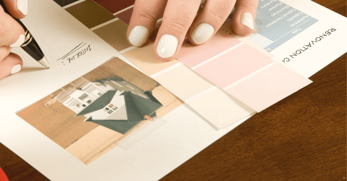
Once you’ve gathered and labeled your samples, it’s time to take a step back and look at the bigger picture. That’s where your inspiration image or moodboard comes in. It helps you see how everything works together before you lock in your final choices.
Step 4: Choose Mood Words as Your Guide

Before you start picking colors, jot down 2–3 words that describe how you want the space to feel. Breezy, cozy, calm, fresh, cozy, natural—whatever fits. Those words become your decision filter when you’re stuck between options that both look good.
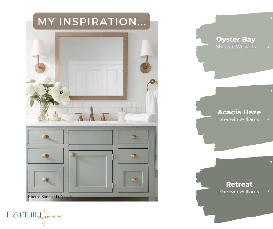
Case in point: our surprise bathroom renovation a few weeks ago (thank you, leaking toilet 🙃). Since it’s a windowless room, I wanted it to feel lighter and more open. Think soft beachy tones, sandy floor, white walls, and a vanity in that dreamy blue-green-gray family.
My first instinct was Sherwin Williams Oyster Bay—a calm, coastal hue I’ve always loved—but then Acacia Haze caught my eye… like realllly caught my eye! And to make things even trickier, Retreat was in the mix too—deeper, moodier, and full of that slate green tone that always pulls me in. I was so tempted to go darker, but when I looked back at my mood words—airy and relaxed—I knew that wasn’t the direction. I stuck with Oyster Bay, and it nailed the vibe I was going for.
👉 Takeaway for you:
Pick your mood words early and use them like guardrails. If a finish doesn’t match the feeling you want, it’s out—no matter how gorgeous it is on its own.
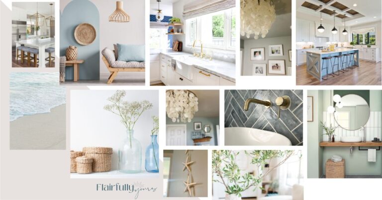
Step 5: Use a Visual Inspiration Checkpoint
One of the biggest challenges you’ll face when choosing interior finishes is that you’ll find a LOT of things you love. The problem? They don’t always love each other. That’s how you end up with a mix of flooring, cabinets, and tile that look great separately but clash once they’re all in the same room.
This is why I always keep one checkpoint image to ground my decisions. It could be a favorite photo you saved, a magazine tear-out, or a simple moodboard that captures the overall feel you’re after. That image becomes your north star — the look you come back to anytime you start second-guessing.
And let’s be honest: Pinterest can be both inspiring and overwhelming. If you’ve got 247 pins that all look a little different, it’s time to narrow down to one main reference that truly feels like you.
👉 Takeaway for you:
Before you commit to a finish, hold it up against your checkpoint. If it doesn’t fit the look you’re going for, it doesn’t belong — no matter how pretty it is on its own.
Love this idea? Keep it handy.
Step 6: Test Finishes in Real Light

Here’s the truth: every finish—paint, flooring, tile, cabinetry stain, countertop—looks different once it’s in your home. Lighting, wall color, and even the direction your windows face can completely shift undertones.
So don’t trust the showroom. Lay your samples out right where they’ll live—on the actual floor, up against your cabinets, beside the trim—and check them throughout the day. Morning light, evening light, lamp light… each one tells a different story.
This matters big time with wood tones and stains. What looked like a soft driftwood in the store can read orange or red at home. Same goes for countertops—the veining can pick up colors you didn’t expect once it’s next to your flooring.
I like to leave my samples out for a full day or two before finalizing anything. It gives you time to see how your choices interact in real life, not just under fluorescent lighting.
👉 Takeaway for you:
What looks perfect in the showroom can feel totally different under your own lights. Always test every finish—paint, stain, tile, and more—in your space before you commit.
Your Interior Finishes Are Coming Together — Now What?
Once you’ve tested your paint, flooring, and cabinetry finishes in real light, it’s time to shift from choosing to organizing. That’s where the next few steps in your Building or Renovating a House Checklist keep you stress-free.
Step 7: Stop at “Enough”
Here’s the thing: once you start choosing finishes, it’s way too easy to fall down the rabbit hole of “just one more.” One more tile sample. One more paint color. One more hardware finish you swear might be the one. But more isn’t better—it’s just confusing.
At some point, you’ve got to stop scrolling, stop saving, and decide. That’s where the magic happens—when you start editing instead of collecting. Once your finishes feel cohesive with your inspiration image and mood words, call it good.
If you struggle with knowing when to stop (trust me, I’ve been there), check out my post on how to avoid overdoing coastal decorating. It’s the same principle, just applied to finishes instead of decor. Because “too much of a good thing” is still too much.
👉 Takeaway for you:
Be the editor of your finishes. When your mix feels balanced and true to your vision, that’s your cue to stop. That’s when your home looks effortlessly pulled together instead of busy.
If you struggle to know when to stop, my ‘One Bold, Two Calm’ rule breaks it down simply—so your home feels cohesive, not cluttered.
Step 8: Record Your Final Paint Colors

One of the smartest habits I’ve built after years of home projects is keeping a running record of every finish in my house. But the paint colors? That’s the one I lean on constantly.
I refer back to my paint list all the time—for touchups when a wall gets scuffed, for matching trim or cabinetry later, and even when I’m picking new decor or fabrics and need to double-check undertones. Having the exact color names, sheens, and rooms saved means I never have to guess (or worse, repaint a whole wall because I grabbed the wrong “white”).
And let’s be honest—who actually remembers what color they painted their ceiling back in 2005? Exactly.
When we updated our bathroom after that unexpected leak (the same one from Step 5), I can’t tell you how many times I referred back to my notes. Once the new flooring went in, I pulled up my existing paint list to see what I’d used in nearby rooms before deciding on Sherwin Williams Oyster Bay for the vanity. That quick reference made the whole process so much easier—and kept the color flow consistent across spaces.
👉 Takeaway for you:
Start a simple note or spreadsheet now, or use the Paint + Finish Records Tracker inside my free Interior Finish Starter Kit. Room by room, jot down the paint color, sheen, and brand. You’ll thank yourself every single time you need to match, refresh, or plan your next project.
Still deciding on your perfect wall color? Read my guide on how to choose the best paint color for your home before you grab a single swatch.
Step 9: Mark Your Paint Cans for Easy Touchups

Obviously, keep your leftover paint for touchups—but don’t stop there. Make it easy on your future self. Always double-check that the label with the color name is still visible, and grab a permanent marker while you’re at it.
Here’s my hack: I write the room name + the date right on the lid. It takes ten seconds and saves hours of frustration later. Because trust me—five years from now, when you’re standing in the garage surrounded by half-empty cans that all look identical, you’ll be so glad you did.
I also like to note “wall” or “trim” next to it so I never wonder which surface it belongs to. Bonus: you’ll instantly know which paints are still fresh enough to use and which can finally go.
👉 Takeaway for you:
Label it now, love yourself later. No more mystery cans cluttering your basement or guessing which “off-white” you used in the hall.
Bringing It All Together
Building or renovating a home comes with a lot of moving parts, but staying organized doesn’t have to be one of them. With a few smart steps—starting with the big finishes, keeping samples together, testing everything in your real light, and tracking your paint colors—you’ll make confident decisions without the overwhelm.
This building or renovating a house checklist walks you through every major finish selection step. And my free Interior Finish Starter Kit gives you the printable version so you can keep it all organized in one place. Inside, you’ll find the same step-by-step process from this post plus a Paint + Finish Records Tracker for recording your colors and materials long after move-in.
👉 Download your free Interior Finish Starter Kit here. It’s the easiest way to stay organized, avoid costly mistakes, and actually enjoy the process of creating a home you love.