How to Choose the Right Trim Colors for Your Coastal Home
Trim colors are the unsung heroes of any room. They’re the final touch that pulls everything together and can take your coastal home from “nice” to wow.
Whether you’re looking to brighten a dark room, create contrast, or bring in that relaxed coastal vibe, the right painted trim color will completely change the mood of a space.
Here’s how to pick the interior trim color that works best for your style. We’ll look at 5 trim color families, including some you may never have thought of!
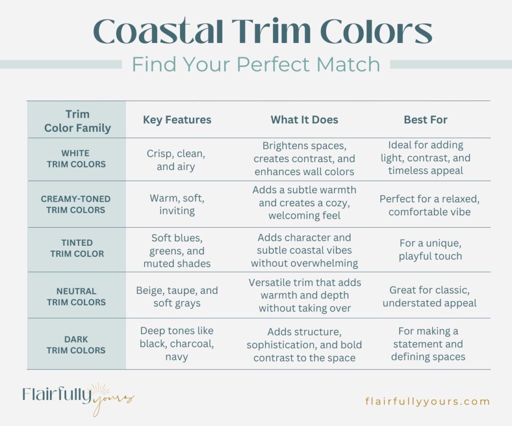
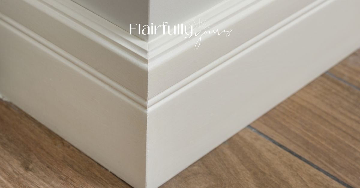
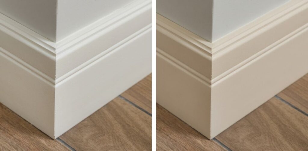
1. White Trim Colors: Crisp, Clean, and Airy
White trim is perfect for a fresh, open, and airy space. It’s timeless, versatile, and offers ultimate contrast with wall colors, brightening up a room while making it feel expansive and light.
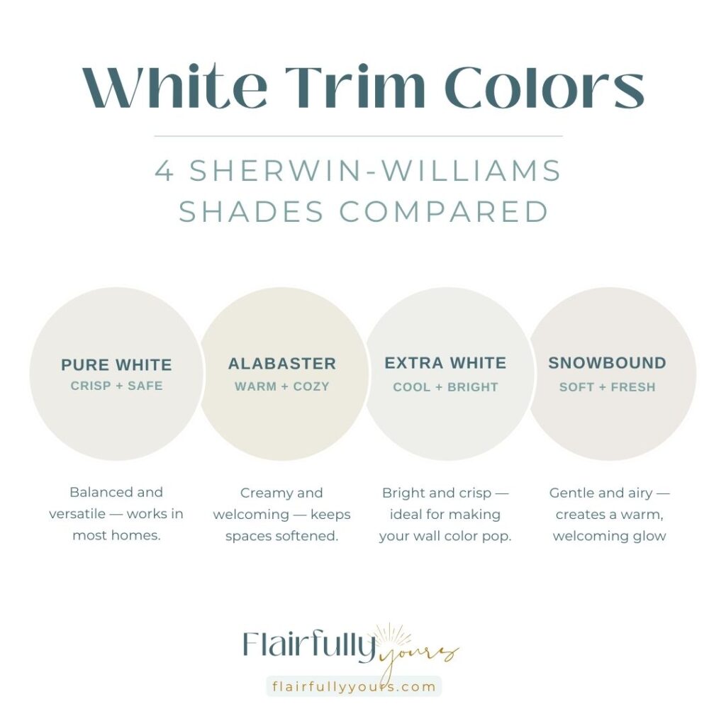
Suggested Sherwin-Williams Shades
- Pure White (SW 7005)
- Alabaster (SW 7008)
- Extra White (SW 7006)
- Snowbound (SW 7004)
When It Works
White trim is the ultimate classic, providing crisp contrast with any color palette. It helps light bounce around the room, making spaces feel open and expansive.
What It Does
White trim reflects light, brightens your space, and makes your walls feel more vibrant. It works especially well in spaces filled with natural light, enhancing any wall color.
What It Pairs With
Its versatility makes it a perfect match for just about any coastal color palette, enhancing the overall look while maintaining a crisp, fresh feel. Whether you’re working with light or bold wall colors, white trim will make your palette pop.
When It Doesn’t Work
White trim can feel too cold or bright against warm or earthy tones, or disjointed with dark, moody walls. It also doesn’t work well if the room has no other white elements, as it can look out of place.
This Is For You If…
You want that classic coastal vibe—the kind that feels fresh, breezy, and light-filled. If you’re aiming for a space that feels wide open and airy, white trim is your best friend.
If you’re looking for fresh, timeless white trim, I recommend Pure White (SW 7005) for a crisper, brighter look with a cool undertone, ideal for creating sharp contrast. Alabaster (SW 7008) offers a warmer, softer tone, giving your space a cozy, inviting feel without sacrificing brightness. Both work beautifully in coastal spaces!
Curious if white trim is the best fit for your home? Check out my article on Should You Choose White Trim?
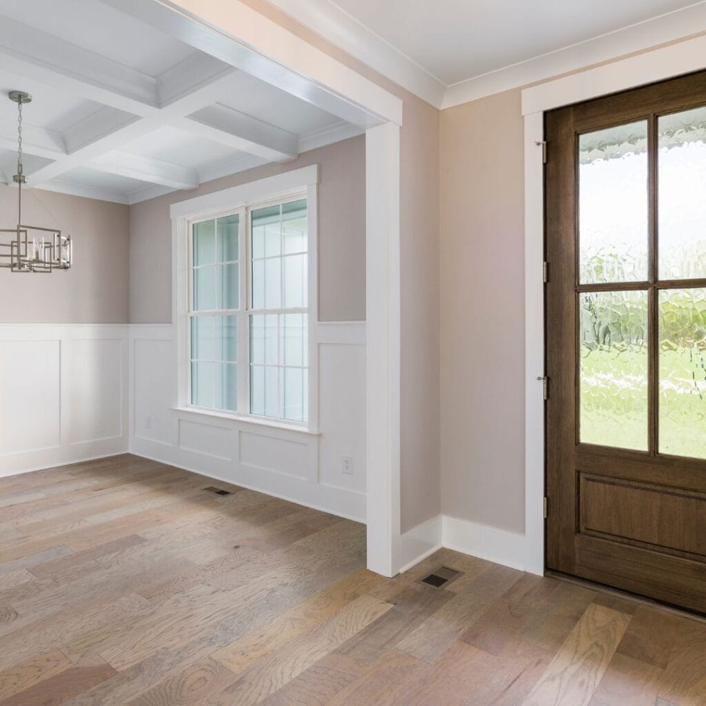
2. Creamy-Toned Trim Colors: Warm, Grounding, and Sophisticated
Creamy-toned trim brings contrast like white trim, but in a softer way, making the space feel gently warmed by the sun.
It creates a welcoming and relaxed atmosphere while maintaining the light, fresh feel of coastal design.
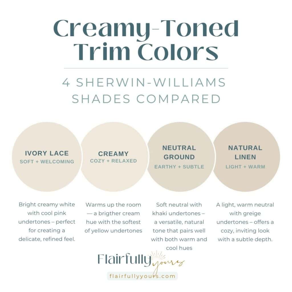
Suggested Sherwin-Williams Shades
- Ivory Lace (SW 7013)
- Creamy (SW 7012)
- Neutral Ground (SW 7568)
- Natural Linen (SW 9109)
When It Works
Perfect for creating cozy spaces without making the room feel heavy, especially in areas where you want to bring a gentle yet airy vibe.
What It Does
Creamy-toned interior trim adds a soft, sunlit warmth to the room, enhancing the space with a relaxed feel. It’s not as sharp as white trim, but still provides that refreshing contrast, making the room feel open and easygoing.
What It Pairs With
It blends effortlessly with coastal hues like soft blues and sandy beiges, bringing a relaxed beachy feel while maintaining a refined look. It also works beautifully with warm neutrals, light aquas, soft greens, and natural wood elements.
When It Doesn’t Work
Creamy trim isn’t the right choice if you prefer a crisp contrast or if you’re working with bold, cool-toned colors.
This Is For You If…
You want a cozy, sophisticated coastal look that’s still light and fresh.
If you’re after a cozy, sophisticated coastal look, I highly recommend Ivory Lace (SW 7013) or Creamy (SW 7012). These soft, warm tones are perfect for creating a grounded, welcoming atmosphere.
They pair beautifully with natural wood elements or soft greens. These creamy tones are especially effective if you’re aiming for an elegant coastal vibe, without the harsh contrast of white trim.
3. Tinted Trim Colors: Subtle, Playful, and Unexpected
Tinted trim brings personality and playfulness to a coastal space. It’s your way to make a statement without overpowering the rest of the room.
Whether you’re working with muted greens, soft blues, or sea-inspired shades, this interior trim family brings a touch of coastal charm while keeping the space feeling calming and refreshing.
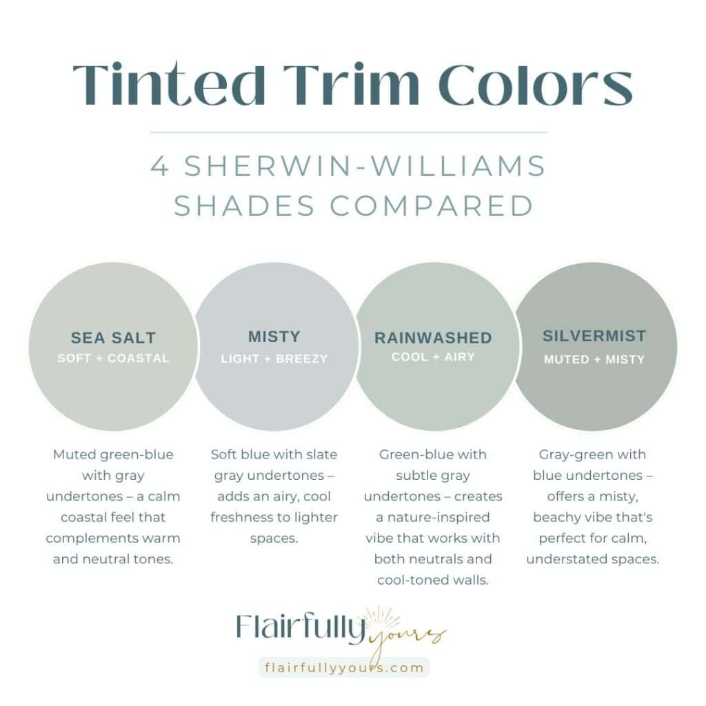
Suggested Sherwin-Williams Shades
- Sea Salt (SW 6204)
- Misty (SW 6232)
- Rainwashed (SW 6211)
- Silvermist (SW 7621)
When It Works
A great way to use tinted trim is by choosing muted, subtle shades that create a refreshing pop. The goal is to work with the wall color and not starkly contrast it like you can do with white trim.
What It Does
Tinted trim creates a noticeable feature without shouting. It brings visual interest to the room, making the trim a focal point while still allowing the space to feel balanced and organized.
What It Pairs With
Soft whites, light grays, and sandy neutrals on walls. These shades create a balanced, relaxed vibe that complements the trim without competing with it.
For a more cohesive look, pair the trim with matching doors. This adds a unified feel to the space while letting the trim make a subtle statement.
Alternatively, for a monochromatic look, try pairing the trim with wall colors in the same color family—either a few shades lighter or darker for a seamless, harmonious feel.
When It Doesn’t Work
Avoid using strong tinted trims in spaces that are already overly colorful or busy. Bold colors may compete with other elements in the room and disrupt the décor choices.
Love this idea? Keep it handy.
This Is For You If…
It’s perfect if you want to stand out a bit while still keeping things balanced and fresh. This trim adds character and interest without overpowering the space, making it ideal for those who want a unique coastal vibe that feels welcoming and distinctive.
If you’re looking for a trim color that brings the freshness of the sea into your home but doesn’t scream “beach house,” Sea Salt (SW 6204) and Misty (SW 6232) offer the ideal balance.
These muted tones make a statement in a quieter, more refined way. They work beautifully with natural light and complement a range of coastal palettes.
4. Neutral Trim Colors: Beige, Taupe, and Soft Grays – Warm, Grounded, and Elegant
Neutral trim colors like beige, taupe, and soft gray offer a more grounded, warm, and elegant feel compared to white or creamy trims.
Unlike white trim, which creates a crisp contrast, and creamy trims, which offer subtle warmth, neutral trims bring a more earthy, muted presence to your space. They work beautifully in open-concept areas and places where you want to maintain a polished yet cozy vibe.
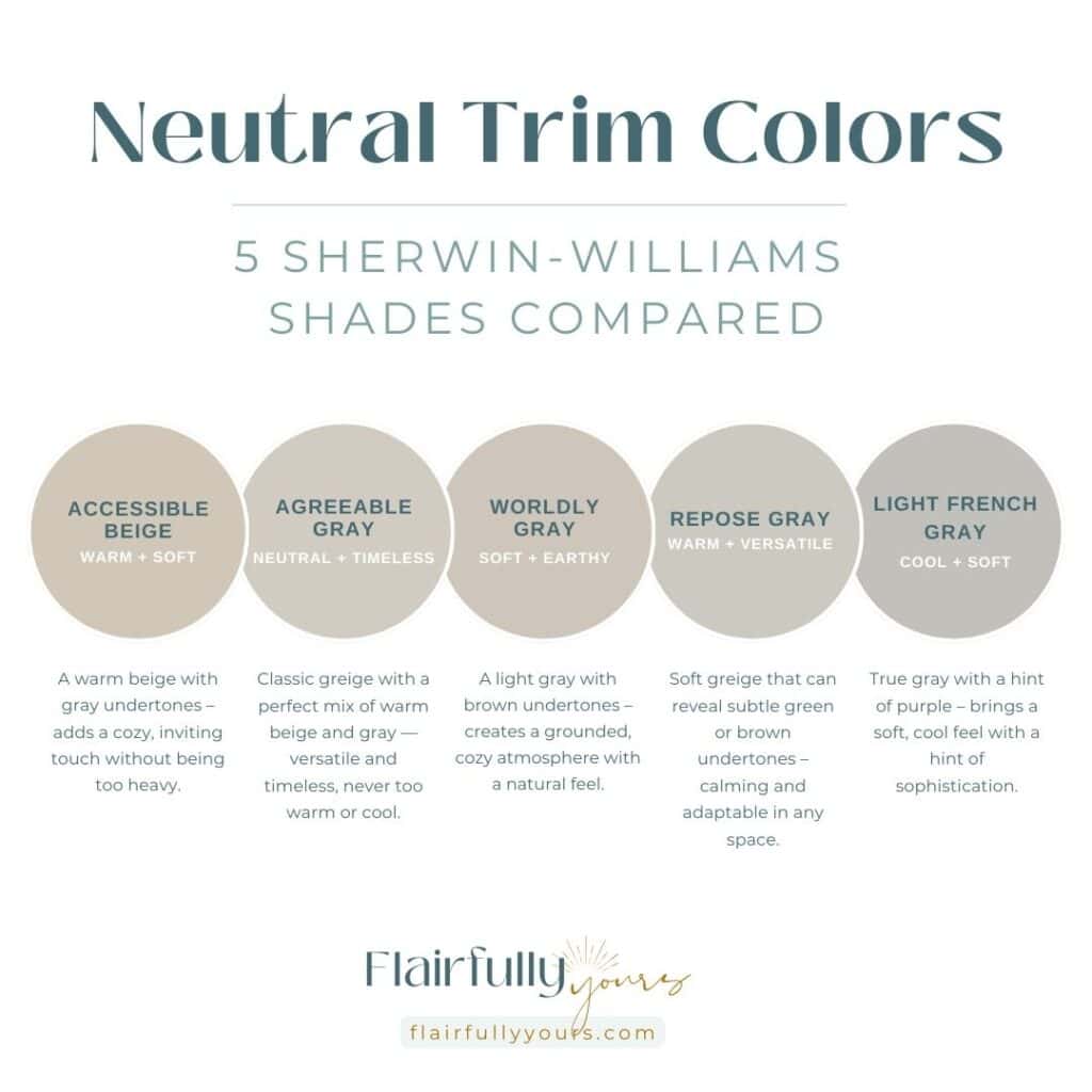
Suggested Sherwin-Williams Shades
- Accessible Beige (SW 7036)
- Agreeable Gray (SW 7029)
- Worldly Gray (SW 7043)
- Repose Gray (SW 7015)
- Light French Gray (SW 0055)
When It Works
Neutral interior trims are great quietly enhancing a space’s overall feel, allowing other design elements to stand out.
What It Does
Neutral trims soften the edges of a room and add depth without stealing the show. They offer a refined and understated elegance that enhances your design without feeling either too stark or too heavy.
What It Pairs With
Light, muted wall colors like dusty blues, soft greens, and light grays, as well as earthy tones like sandy beiges and warm neutrals. These lighter shades let the dark trim stand out while keeping the room balanced.
When It Doesn’t Work
Neutral trim isn’t the best choice if you’re looking for contrast or pop in your space. Of all the trim colors we’ve discussed, neutral tones offer the least amount of contrast, so if you want something that stands out or adds sharp definition, this may not be the right fit for you.
This Is For You If…
You want a timeless and warm look that doesn’t compete with your furniture or wall colors. Neutral trims work best in homes that favor warmth over contrast and don’t need the trim to be a focal point.
If you’re looking for go-to neutral trims, Accessible Beige (SW 7036) and Agreeable Gray (SW 7029) are excellent options.
Accessible Beige has warm undertones, making it perfect for creating a cozy, grounded atmosphere, especially in well-lit spaces.
Agreeable Gray offers a balanced mix of gray and beige, making it highly versatile and ideal for both bright and slightly darker rooms, adding warmth without feeling too heavy.
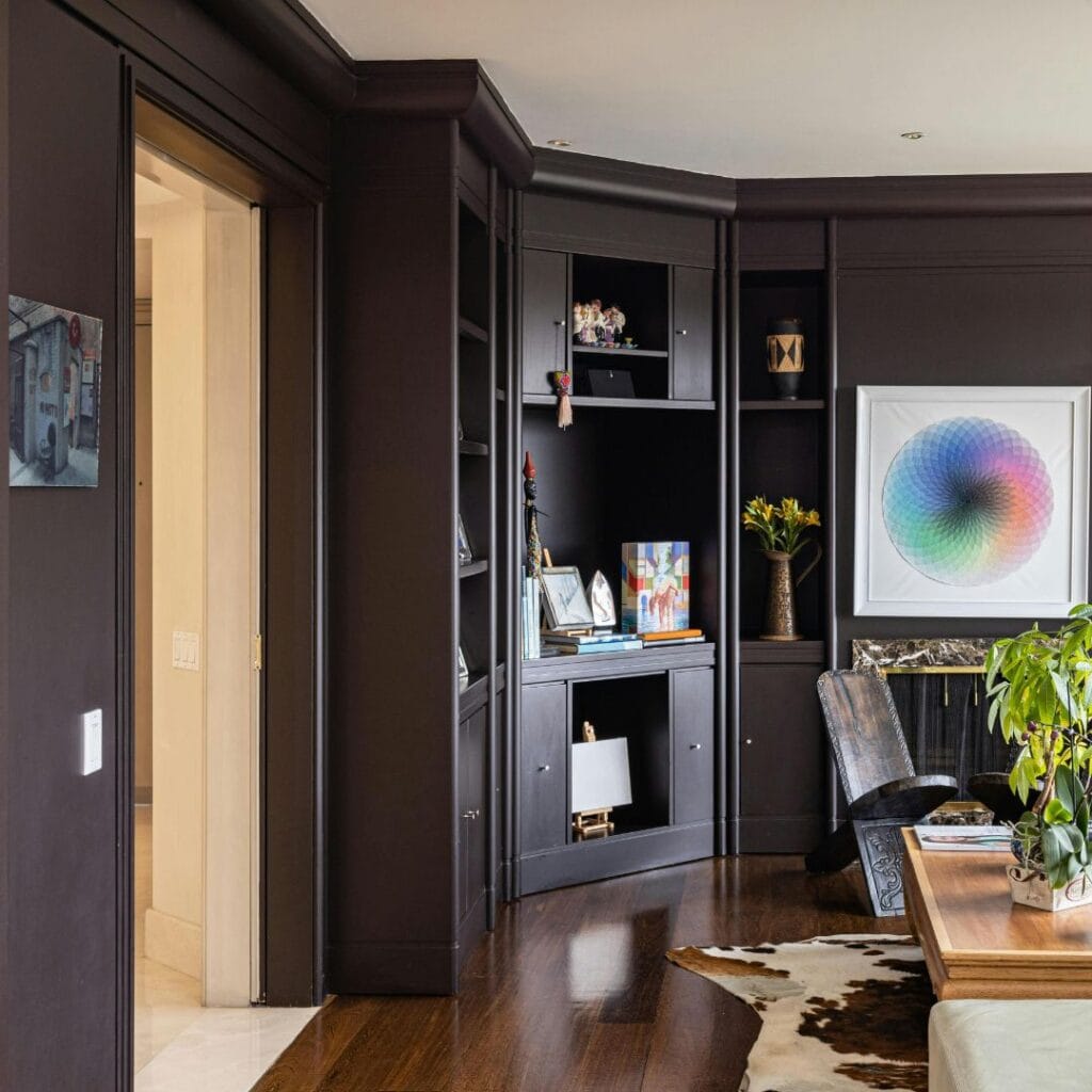
5. Dark Trim Colors: Dramatic, Grounded, and Sophisticated
Dark trim colors bring a bold contrast and adds structure to your coastal spaces. This interior trim style helps to anchor the space, creating a dramatic focal point that still feels grounded and refined.
It works especially well with high ceilings, adding a strong visual element to draw the eye.
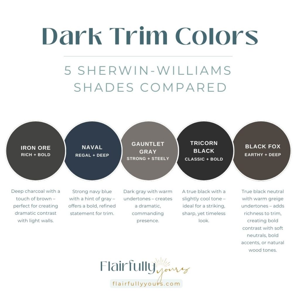
Suggested Sherwin-Williams Shades
- Iron Ore (SW 7069)
- Naval (SW 6244)
- Gauntlet Gray (SW 7019)
- Tricorn Black (SW 6258)
- Black Fox (SW 7020)
When It Works
Dark trim works best when you want to add dramatic contrast and structure to the room. Dark trim shines in spaces with high ceilings or open floor plans and plenty of natural light.
What It Does
Dark trim helps anchor the space, adding structure while making a dramatic statement. It’s also great for highlighting special structural features like windows, door frames, and architectural details.
What It Pairs With
Soft whites, light grays, muted blues, and natural wood accents. If you’re aiming for a more integrated look, try pairing dark trim with doors in the same color. This creates a less intense contrast than having dark trim as the only accent.
When It Doesn’t Work
Avoid using dark trim in low-light rooms or with dark walls, as this can make the space feel smaller or too heavy
This Is For You If…
You want to make a bold statement in your coastal space. Dark trim jives best in space that have other elements of lightness—whether that’s through light-colored walls, furniture, or natural light.
Iron Ore (SW 7069) and Naval (SW 6244) are striking dark trims that add contrast and depth.
Iron Ore, with its rich, warm charcoal hue, creates a grounding effect, while Naval, a deep navy with cool undertones, brings a refined elegance to the room.
Perfect for high-ceilinged or accent spaces, these trims ground the room and create an elegant, dramatic effect.
Final Thoughts on Trim Colors
The right interior trim color does more than finish the room—it defines your coastal home’s vibe.
Whether you prefer crisp white, warm creamy tones, or bold dark shades, your trim can make the space feel perfectly you.
Here’s a quick recap of the trim color families we’ve discussed—use this chart to find your perfect match as you finalize your trim choice!
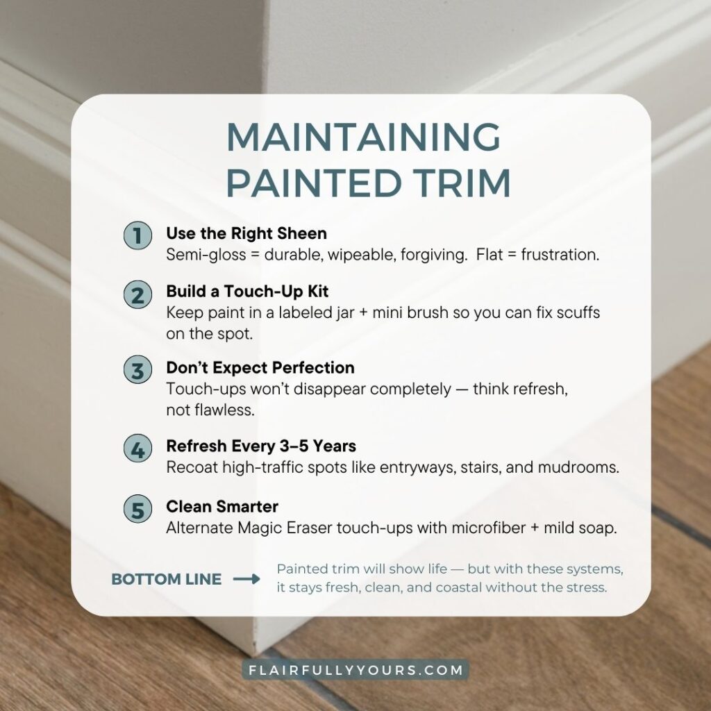
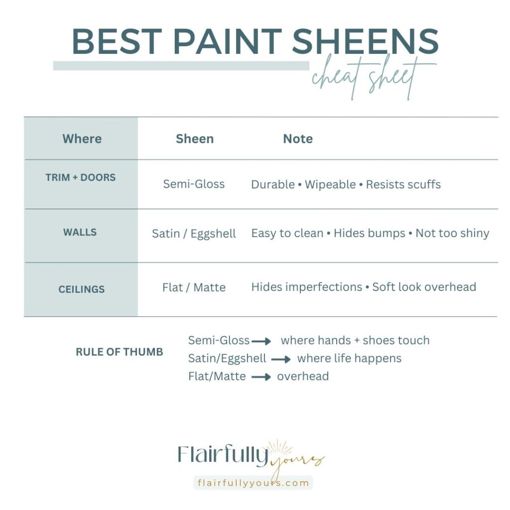
Trim Care & Maintenance:
And with a little care and the right maintenance, your trim colors will stay fresh and vibrant for years. Use these cheat sheets to choose the perfect sheen and keep your trim looking beautiful and easy to maintain.
Find Your Perfect Coastal Colors
Want to make your coastal home truly stand out? Grab my Top Coastal Paint Colors Guide and find the perfect shades to color your space.

Still feeling unsure about picking the right trim (or any paint color?) Don’t worry, you’re not alone!
If you’re having trouble choosing just one color, check out my guide on How to Pick a Paint Color When You Love Too Many for tips on narrowing down your options and finding the perfect hue that suits your home.