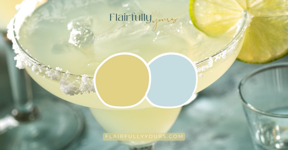
Try This Fresh Pop of Color: Chartreuse and Light Blue
Adding a pop of color sounds easy… until you actually try it.
Chartreuse feels fun but risky.
Light blue feels safe — until it fades into the background.
Together, this combo can feel fresh, coastal, and energizing — or completely out of control.
The difference isn’t your taste.
It’s placement, proportion, and repetition.

This guide shows exactly how to use chartreuse and light blue as a pop of color — in any room — without letting it take over your space.
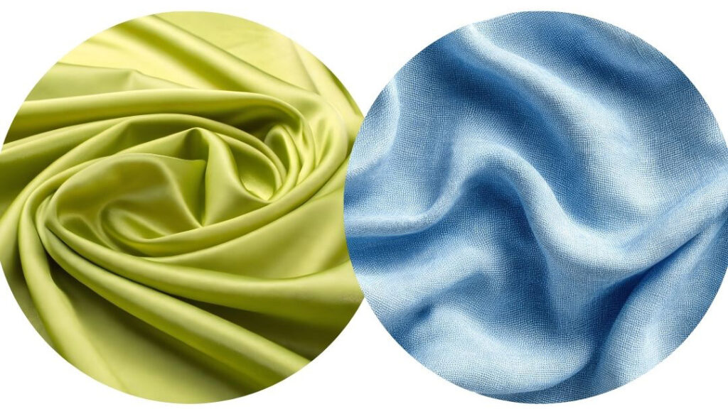
Why Chartreuse + Light Blue Works (When It Does)
This color pairing works because each color plays a very specific role:
- Chartreuse brings energy, lift, and personality
- Light blue adds calm, airiness, and balance
Chartreuse needs something cool and quiet next to it.
Light blue does that job beautifully.
When these two are used intentionally, the result feels playful and fresh — not loud.
The Biggest Mistake People Make With This Combo
The most common mistake isn’t choosing the colors.
It’s using them without boundaries.
What usually goes wrong:
- chartreuse is used too large
- the color is scattered randomly
- it’s mixed with other bold colors
This combo works best when it feels edited, not enthusiastic.
If everything is bold, nothing is bold.
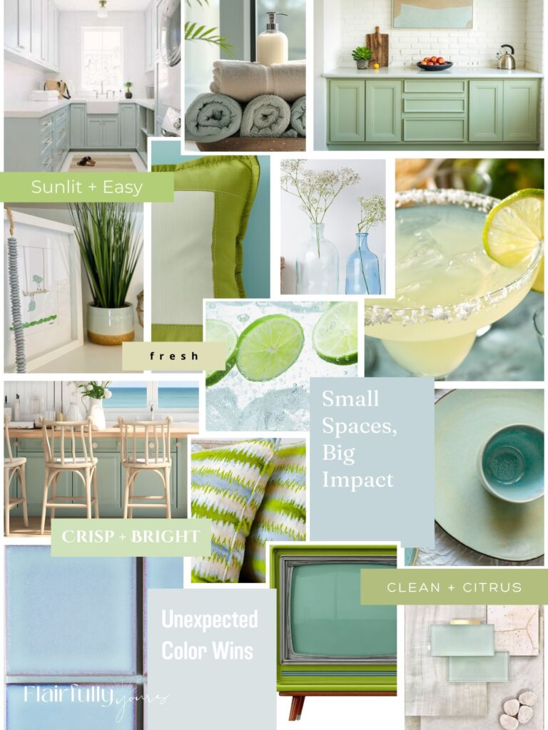
How to Use Chartreuse + Light Blue in Any Room
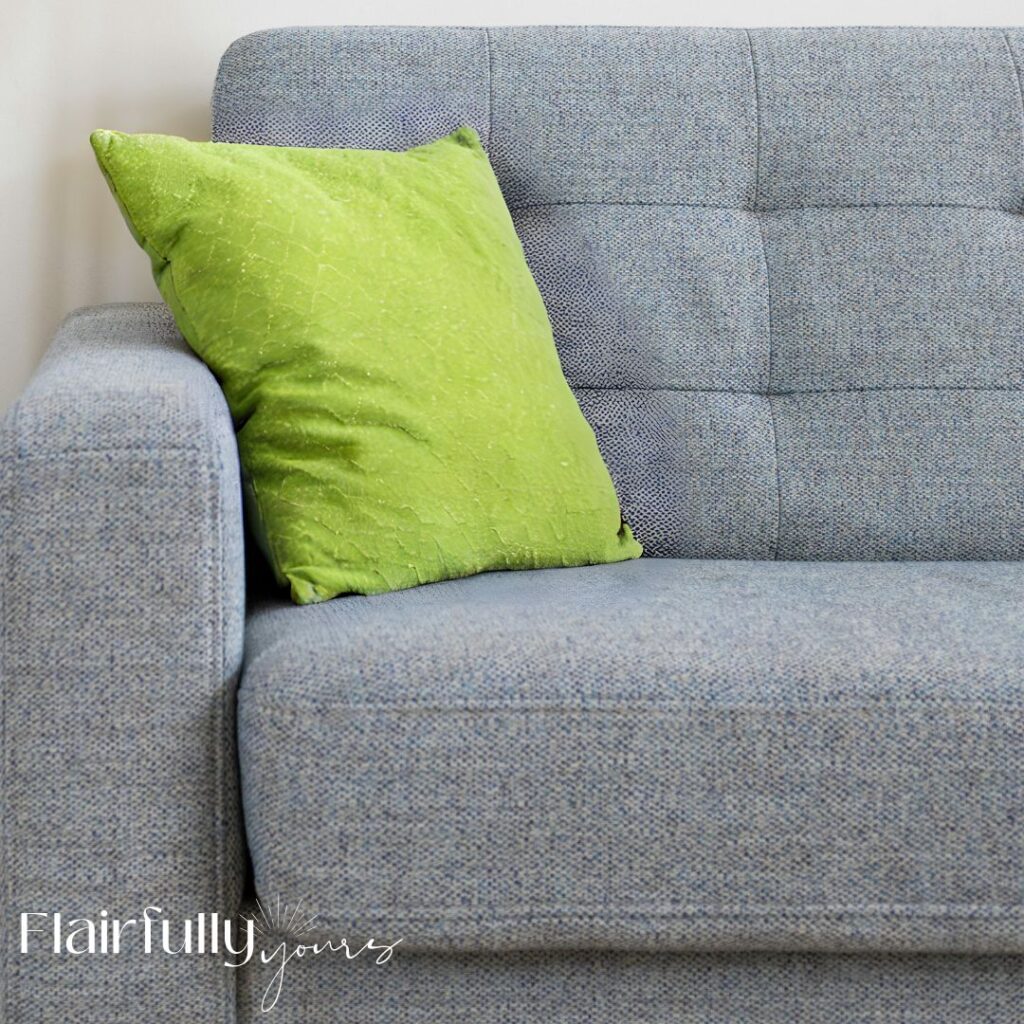
1. Living Rooms & Family Rooms
In living rooms and family rooms, chartreuse and light blue work best when they stay off the walls and live in layers you can move, repeat, and edit.
Chartreuse works beautifully in small but intentional hits:
Think spark, not surface area. Chartreuse should catch the eye and move it around the room — not dominate it.
Use it in pieces that feel layered, flexible, and easy to edit:
- Pillows (especially patterned or textured ones that mix chartreuse with blue or white)
- A throw draped over a chair, bench, or sofa arm to break up larger neutral pieces
- Tabletop accents like bowls, trays, or small sculptural objects
- Book spines or stacked books for subtle color repetition on shelves
- Small art or framed prints where chartreuse appears as an accent, not the main color
- Natural touches like plants, citrus, or pottery with yellow-green undertones
Chartreuse works when it shows up more than once, but always in small doses. Repetition creates confidence — size keeps it livable.
Light Blue does the grounding work:
Light blue is the calm counterbalance in this combo. It’s what gives chartreuse room to sparkle without taking over.
It works best in pieces that hold visual weight:
- Upholstered chairs or benches
- Curtains or soft fabric panels
- Larger decor pieces like table lamps, floor vases, oversized bowls, trays, or framed art where light blue is the dominant color
Because these pieces are bigger and more permanent, light blue keeps the room feeling cohesive and relaxed.
Soft furnishings — pillows, throws, curtains, rugs, and upholstered pieces — are also the safest place to introduce brighter color. Texture naturally softens bold tones, so the space feels lively and layered, not loud.
One simple rule that makes it work:
Repeat chartreuse at least three times around the room. When it shows up more than once, it feels intentional instead of accidental.
Light blue keeps everything calm and coastal, while chartreuse adds just enough energy to make the space feel fresh.
2. Kitchens
- Chartreuse: stools, towels, small appliances (tell me those aren’t cheerful), planters
- Light blue: runners, ceramics, subtle backsplash tones
And don’t overlook one of the easiest — and happiest — ways to use this combo in a kitchen:
mixing and matching blue and green dinnerware or glassware.

Think:
- light blue plates with chartreuse-toned glasses
- green bowls layered with blue napkins
- open shelving that lets those colors peek through
Because these pieces are small and repeatable, they add color without commitment — and they’re incredibly easy to swap seasonally.
White cabinetry acts as a buffer, keeping the combo light and fresh.
Think of this palette as orbiting the kitchen — not dominating it.
3. Bedrooms
Yes — this combo can absolutely work in bedrooms.
The key is layering, not limiting.
One important nuance here: bedrooms benefit from softer versions of both colors.
Think washed blues and gentle yellow-greens, not the brightest versions you’d use in a kitchen or outdoor space.
How to use it well
- Repeat chartreuse at least twice (lamp + pillow, art + throw)
- Let light blue do the calming work through bedding, walls, or larger textiles
- Choose softer tones of both blue and green so the room still feels restful
- Keep chartreuse in soft materials rather than hard finishes
How to Use Patterns (This Is Where the Magic Happens)
Patterns are one of the best ways to use this combo.

Patterns that work beautifully:
- blue-and-white prints with hints of green
- subtle geometrics
- soft florals
- small-scale coastal or botanical motifs
Patterns naturally diffuse bold color, helping it feel layered instead of loud.
What not to do:
- avoid multiple bold patterns at once
- skip high-contrast patterns in both colors
- don’t add sharp black
One patterned anchor + one or two solid supports = effortless balance.
4. Bathrooms
Bathrooms are one of the best places to use chartreuse and light blue — especially if you want a space to feel clean, energized, and coastal without being busy.
How to use this combo in bathrooms
- Chartreuse: towels, small art, soap dispensers, plant pots, or a patterned shower curtain
- Light blue: tile, wall color, or a soft blue-green vanity

Light blue sets a calm, spa-like foundation, while chartreuse adds just enough brightness to keep the space from feeling flat.
Why this works so well
- smaller rooms can handle higher color contrast
- white fixtures naturally balance bold accents
- reflective surfaces bounce color around, softening it
This makes bathrooms a great place to experiment — even if you’re cautious with color elsewhere.
What to avoid
- large chartreuse wall areas
- mixing in additional bright colors
- heavy black or dark metal finishes
If you want to see another bold coastal combo used successfully, this teal-and-coral bathroom example shows how strong color can still feel balanced and calm.
5. Outdoor Spaces
Outdoor spaces are the most forgiving place to experiment with chartreuse and light blue.
Natural light softens bold color, and surrounding greenery does a lot of the balancing for you.
This is also the place where you can lean a little brighter — or mix a few different tones — without worrying about overdoing it.

Easy, high-impact ways to use this combo outside:
- Patio furniture: chairs, benches, or stools in chartreuse or light blue — especially when water or sky is doing the balancing
- Cushions: mix light blue solids with chartreuse patterns, or layer a few shades of blue together
- Planters: choose pots or flowers with yellow-green foliage or blooms, and don’t be afraid to mix multiple chartreuse tones
- Lanterns: glass or metal accents in either color for evening glow
- Rugs: blue-and-white patterns with a hint of green help ground brighter accents
Love this idea? Keep it handy.
For planters, look for flowers and foliage that naturally lean chartreuse:
- sweet potato vine
- coleus
- lime-green euphorbia
Outdoors gives you permission to play. Brighter versions of chartreuse and blue feel right at home here, especially when they’re layered and repeated rather than perfectly matched.
Nature absorbs the brightness, letting bold color feel fresh and lively — not overwhelming — while light blue keeps the overall look relaxed and coastal.

One of the most natural — and lowest-commitment — ways to add a pop of chartreuse is through foliage.
Real or faux.

What to look for
- Chartreuse or yellow-green leaves (not deep grass or emerald green)
- Lighter, glowing greens that almost look sun-washed
- Varied leaf shapes to add texture without introducing another color
If the green leans yellow instead of blue, it will support this palette beautifully.
Great foliage options for that chartreuse look
These are especially effective for echoing the chartreuse tones in this combo:
Real plants
- Aloe (my favorite plant to keep on hand)
- pothos (especially neon or golden varieties)
- heartleaf philodendron (lighter, yellow-green versions)
- snake plant with yellow edges
- spider plant
- palms with lighter, yellow-green fronds
Outdoor or sunroom options
- sweet potato vine
- coleus
- lime-green euphorbia

Faux foliage
- look for pieces labeled chartreuse, golden, or yellow-green
- avoid anything described as emerald, forest, or blue-green
And yes — faux works completely fine here.
Tone matters far more than whether it’s real.
Where foliage works especially well
- kitchens
- bathrooms
- bedrooms
- outdoor spaces and sunrooms
Plants are a great way to repeat chartreuse naturally throughout a space without feeling like you’re “decorating with green.”
If you’re looking for more coastal-friendly plant ideas overall — including softer greens, relaxed silhouettes, and easy styling — this guide walks through a variety of options that work beautifully in coastal spaces:
Using Chartreuse + Light Blue as Paint Colors
These colors can work as paint — but only when they have clear roles.
Light blue sets the mood.
Chartreuse adds the spark.
When those roles are respected, this combo feels fresh and confident instead of overwhelming.

Light Blue as Paint (The Foundation)
Light blue is the workhorse in this palette.
It brings calm, airiness, and cohesion — which is exactly what allows chartreuse to shine.
This is the color that carries the space.
Light blue works beautifully on:
- bedroom walls
- bathrooms
- kitchens (especially with white cabinetry)
- small offices or reading nooks
If you’re unsure where to start, start here. A soft sky blue creates a relaxed, coastal base that can support brighter accents without feeling busy or flat.
Soft Sky Blue Paint Options

For this palette, choose blues that feel clear and sky-inspired — not gray or green-leaning.
If it reminds you of open sky, coastal glass, or water in bright sunlight, you’re in the right zone.
- Top Sail (SW 6217) – airy and light; a perfect whole-room blue that feels effortless
- Sleepy Blue (SW 6225) – soft, balanced, and unmistakably blue without feeling heavy
- Moonmist (SW 6231) – light and fresh with a gentle coastal feel
- Byte Blue (SW 6498) – brighter and more playful; great for accents, furniture, or small spaces
These blues stay clean next to chartreuse instead of turning muddy or muted.
Chartreuse as Paint (The Accent)
Chartreuse works best as paint when it’s treated as an accent — not the main event.
This is the color that energizes the space, not the one that carries it.
Chartreuse works best as paint when:
- the space is smaller
- the application is limited
- it’s balanced with white or light wood
Great chartreuse paint moments:
- a single accent wall
- the back of open shelving
- a mudroom, pantry, or laundry room
- furniture or built-ins
Avoid:
- painting all four walls
- using it in low-light rooms
- pairing it with other bold wall colors
Chartreuse should feel like a pop — not a takeover.
Citrus Green / Chartreuse Paint Options

For this palette, look for greens that lean yellow and citrusy, not muted or blue-green.
If it reminds you of aloe, lime peel, or sunlit foliage, you’re in the right zone.
- Lime Rickey (SW 6364) – fresh, cheerful, and perfect for accent moments
- Jardin (SW 6477) – softer and lighter; a great bridge green if you’re easing into chartreuse
- Lime Granita (SW 6715) – brighter and bolder; best used sparingly
- Chartreuse (SW 0073) – the bold anchor; use in very controlled applications
Start with the softer greens first.
Chartreuse doesn’t need to shout to be effective — repetition and placement do the work.
A Gentle Nudge if You’re Hesitant
If chartreuse still feels like a stretch, starting with a softer green is completely valid.
This sea glass green guide walks through calmer options that still feel coastal and fresh:
Why This Combo Is Best Used as a Pop — Not a Full Palette
Chartreuse and light blue shine when they’re allowed to sparkle — not when they’re asked to carry an entire room.
This pairing originally appeared in my roundup of coastal paint colors beyond blue and white, where I share several unexpected but very usable coastal color combinations:
And if you’re drawn to cheerful, energizing color, lemon yellow is another great example of how bright can still feel calm and coastal:
Final Takeaway
A pop of color isn’t about committing forever.
It’s about knowing:
- where to use it
- how often to repeat it
- and when to stop
Bold color doesn’t need permission.
It just needs a plan.
If you want help building that plan:
→ Top Coastal Colors — a free guide to coastal shades that mix and support each other easily
→ Color Confidence Toolkit — join the waitlist for a simple system to choose colors without second-guessing.