Fall Color Palette Ideas for Home Decor: 4 Coastal-Friendly Combos
When September hits, every store aisle turns into a sea of pumpkins and orange. Cute, maybe — but if your home leans coastal, that standard fall color palette can feel completely out of place.
The good news? You don’t have to force heavy orange and black into your home to make it feel seasonal. A fall color palette can still be warm, cozy, and coastal-friendly — all with a few simple swaps in your decor.
No paint cans or full makeovers required. These are palettes you can layer in with easy-to-find accents — pillows, throws, vases, napkins, baskets — that shift your home toward fall without fighting your coastal style.
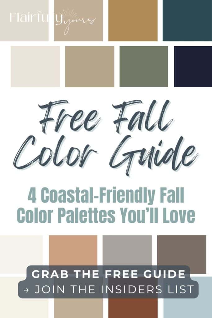
✨ Grab the Free Fall Color Guide
Love these ideas but want something you can save + reference later? Click to grab my Free Fall Color Palette Guide with all 4 coastal-friendly combos in one easy printable. Perfect to pin on your moodboard or keep handy while shopping.
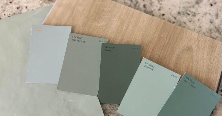
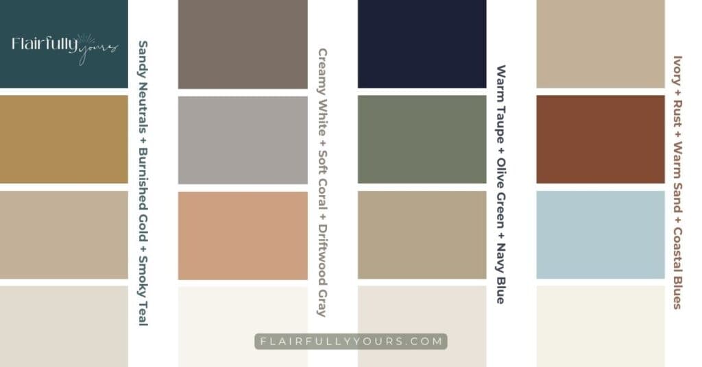
Fall Color Palette 1: Sandy Neutrals + Burnished Gold + Smoky Teal
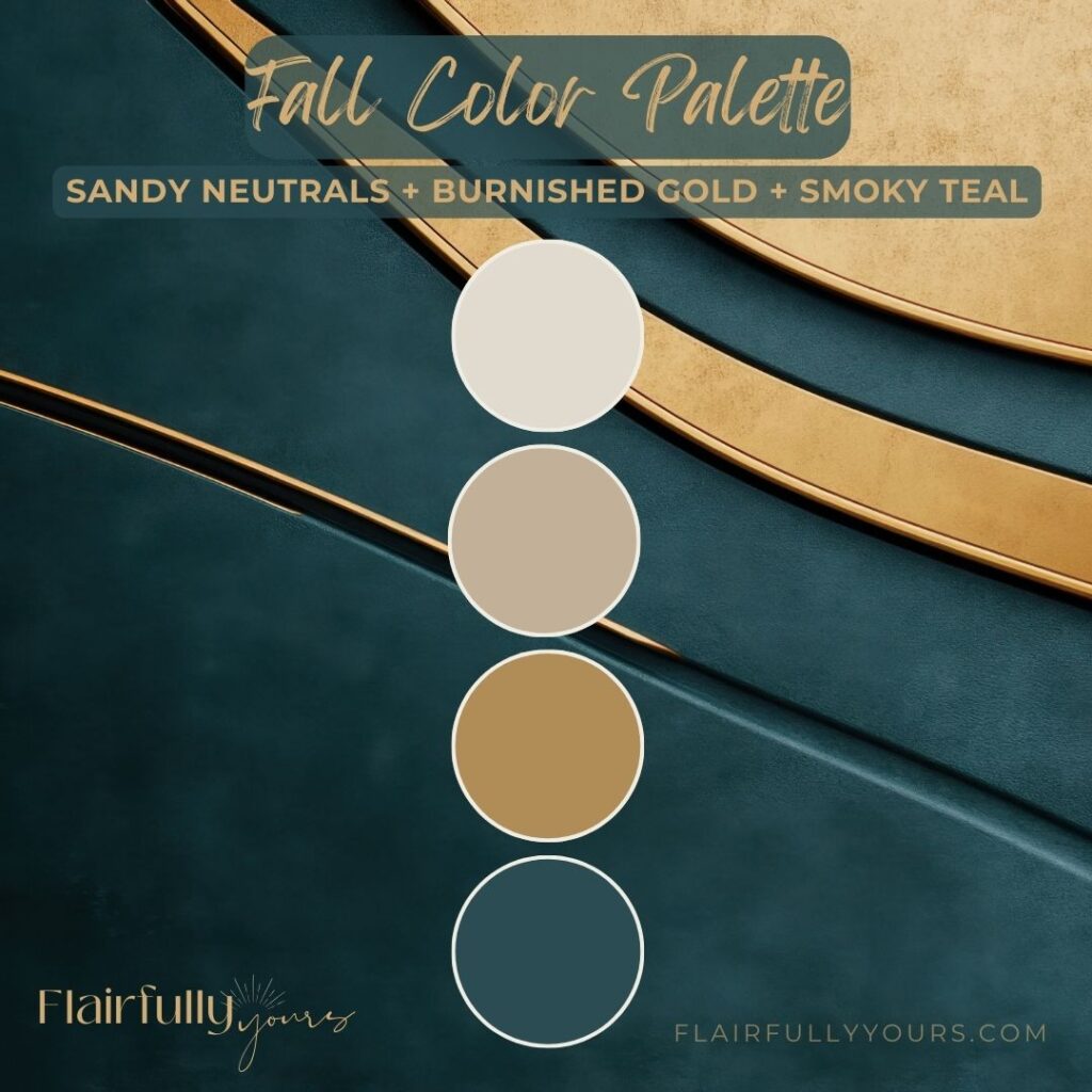
✨ Why it works: Gold warms up your neutrals while teal keeps things tied to that coastal calm you already love. The combo feels polished but still effortless.
Think cozy without the weight. Start with your go-to sandy tones (woven baskets, linen pillows) and add in a touch of smoky teal — a vase, a velvet pillow, or even a candle jar.
Too much teal can feel heavy — stick to one or two accents so it reads breezy, not bold. Then mix in burnished gold with candlesticks or a metallic tray.

Try It:
- Sandy neutrals: linen pillows, oat-toned baskets, driftwood trays
- Burnished gold: brass candlesticks, metallic trays, warm gold frames
- Smoky teal: velvet pillow covers, ceramic vases, glass candle jars
- Fall accent: a set of modern metallic pumpkins in gold and white
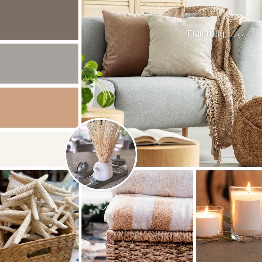
Fall Color Palette 2: Creamy White + Soft Coral + Driftwood Gray

✨ Why it works: It’s soft and muted without tipping too sweet. Think sunset glow meets shoreline stones.
Not your summer coral — this one is dustier, softer, and perfectly grounded for fall. Think a muted clay tone. Anchor it with driftwood gray so the palette stays calm, not candy-colored.
The trick to keeping coral cozy? Let creamy whites do the heavy lifting — they soften the look and keep it coastal.
Try a soft coral throw pillow cover, a driftwood-look bowl filled with seasonal stems, and creamy white ceramic accents.
Try It:
- Creamy white: ivory candles, ceramic pitchers, cotton throws
- Soft coral: dusty coral pillow covers, linen napkins, ceramic accents or freshen up a bedroom with these pretty clay colored sheets. Take it to your bathroom with these burnt orange hand towels.
- Driftwood gray: weathered wood accents, gray-toned baskets, wool throws
- Fall accent: ivory ceramic pumpkins. Check out this set in neutral tones.
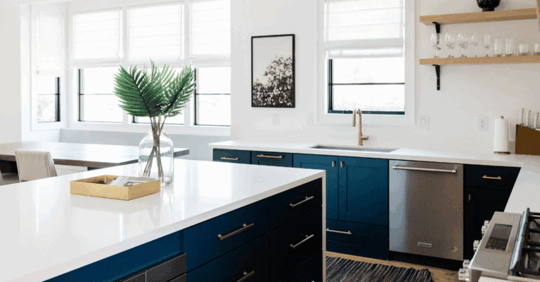
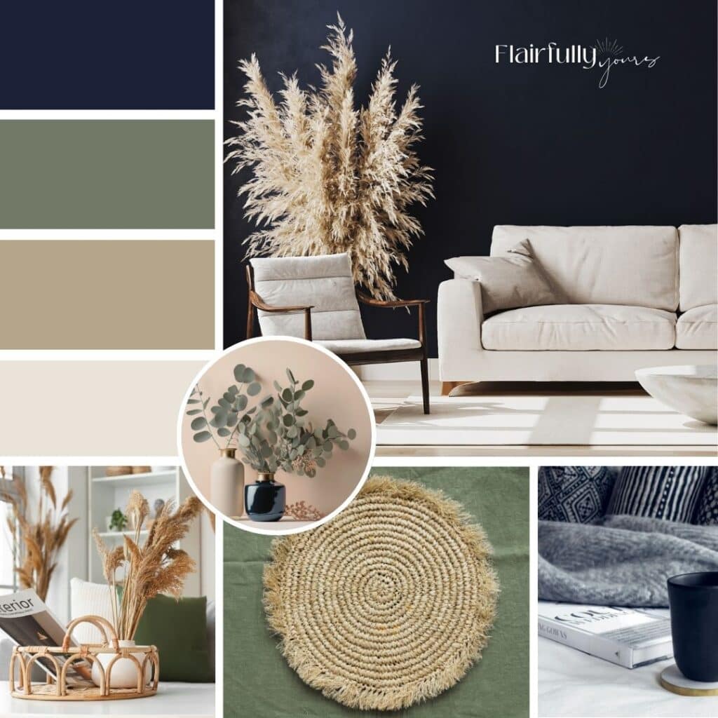
Fall Color Palette 3: Warm Taupe + Olive Green + Navy Blue

✨ Why it works: Navy and olive feel fall-ready, but they don’t compete with the soft coastal base colors you already have in place.
Love this idea? Keep it handy.
When you’re craving moodier vibes, this palette delivers. Taupe keeps things warm, navy adds depth, and olive layers in earthy comfort.
Taupe throws, a couple of navy accent pillows, and an olive-green vase or jar instantly shift the tone.
Afraid navy will feel too formal? Break it up with olive accents — the green keeps things relaxed and coastal.
Want moody without losing the cozy? Layer olive and taupe textures first, then sprinkle navy as the accent.
Try It:
- Warm taupe: knit throw blankets, taupe rugs, textured pottery
- Olive: ceramic vases, glassware, eucalyptus stems. I’m obsessed with these cozy corduroy pillow covers and this gorgeous textured knit throw.
- Navy: pillow covers, woven throws, accent bowls
- Fall accent: an olive-toned glass or ceramic pumpkin as a sculptural piece
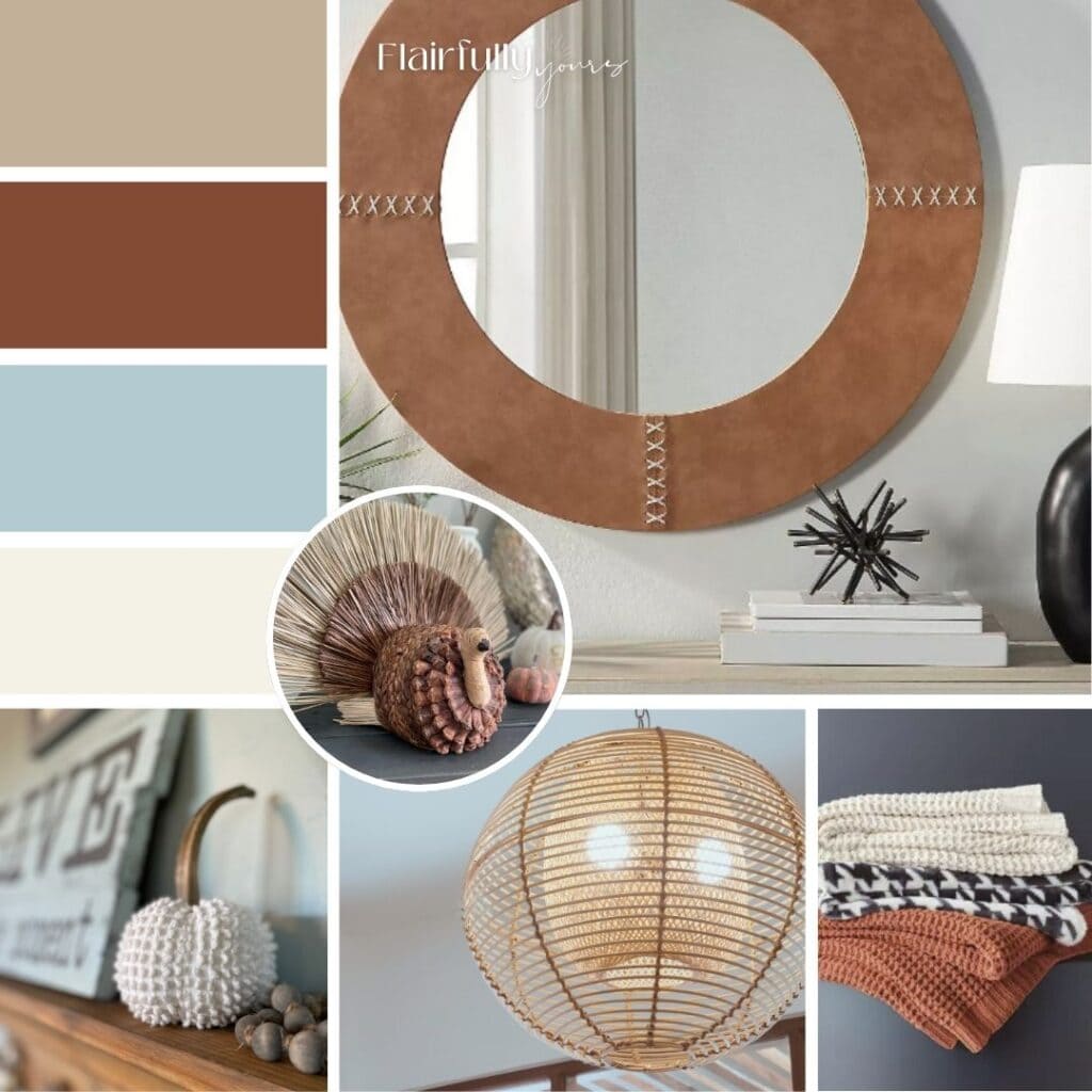
Fall Color Palette 4: Ivory + Rust + Warm Sand (with the Coastal Blues You Already Have)

✨ Why it works: This palette is warm, cozy, and made to layer right into your coastal home. Rust is your seasonal pop, sand keeps it grounded, and ivory keeps it light and soft. Paired with the coastal blues you already have, the whole look feels seasonal and coastal at the same time.
What makes it so approachable is that it builds on what you likely already own: sandy textures, ivory accents, and a foundation of blues. Rust simply steps in as the seasonal guest star. Start small with easy textiles — a pillow cover, a striped runner, or napkins — then echo sand in woven trays or baskets, and let ivory take the lead with throws, pottery, or candles.
Want it to feel extra pulled together? Rust pairs beautifully with natural greenery — think eucalyptus stems or dried pampas in an ivory vase. The mix gives you that cozy fall vibe while still feeling modern and coastal..
Try It:
- Ivory: textured throws, pottery, pillar candles
- Rust: pillow covers, linen napkins, ceramic vase, or a striped table runner.
- Warm sand: rattan trays, woven baskets, natural fiber rugs
- Fall accent: rust-colored faux stems (maple, eucalyptus, or pampas) styled in a clean ivory vase. Or try these fluffy taupe pampas grass stems paired with a set of modern ceramic vases.
Make It Yours
Here’s the best part — you don’t need a cart full of pumpkins to make your home feel like fall. Just pick the fall color palette that speaks to you and bring it in through 2–3 accents: a pillow, a throw, a vase, or a set of napkins.
That’s it. Easy in, easy out.
If you’re leaning toward a softer fall look, neutrals are always a safe and stylish bet. I put together 3 neutral fall vignettes here that show how to create cozy moments without going overboard on color. Pair them with any of these palettes and you’ll have a home that feels collected and coastal this season.
And if you want to add even more seasonal depth, check out my post on 7 natural textures that bring coastal style to life — even adding just one or two alongside these palettes can completely shift the vibe.
Color + texture together? That’s where the fall magic really happens.

✨ Once you’ve picked your palette, put it to work—check out my styled fall console tables for real-life inspiration.
So, Which Fall Color Palette is YOU?
Your home already has its own rhythm, its own style. Fall decor should highlight that — not fight against it.
By skipping the heavy-handed orange-and-black routine and layering in these coastal-friendly fall color palettes, you’ll get a seasonal look that feels warm, cozy, and still true to you.
Tell me: are you leaning gold + teal, coral + driftwood, olive + navy, or rust + sand?
Drop your favorite in the comments or email me — let’s see which one wins. 🍁