Stop Overthinking Paint Colors
If choosing paint colors feels harder than it should, take a breath.
You’re not behind. You’re not bad at this. And you’re definitely not alone.
Most people don’t struggle with color because they lack taste.
They struggle because they’re trying to choose everything at once; without a clear way to decide what matters most.
The good news?
You don’t need more inspiration. You need fewer decisions, with clearer roles.
Once you have that, choosing a color palette — and choosing paint colors — stops feeling overwhelming and starts feeling… doable.
Why Color Feels So Overwhelming
Color overwhelm usually sneaks up quietly.
You save a few images.
Then a few more.
Then suddenly everything looks good — and nothing feels right.
That’s not a you problem. That’s an options without structure problem.

When every color is competing to be the star, your brain has no way to decide:
- what sets the mood
- what supports the space
- what should stay quiet
Overthinking doesn’t come from indecision. It comes from caring.
You just need a simpler way to think about color.
If this sounds familiar because you love too many colors to narrow things down, I walk through exactly how to choose one confidently here.
If you’ve ever wondered whether there even is a “best” option when choosing paint colors for your home, I dive deeper into that idea here, and explain why context matters more than perfection.
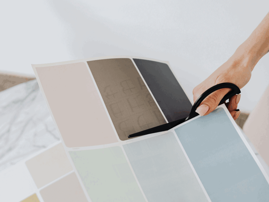
Start With Inspiration — Not a Blank Paint Chip
One quick mindset shift that makes choosing paint colors feel much easier:
You don’t start by picking paint — you start by picking something you already love.
An inspirational decor piece — a piece of art, a rug, a pillow, even a wallpaper sample — can give you instant direction. It helps define the feeling you’re after before you ever look at paint.
That inspiration piece isn’t the whole plan. It’s the starting point.
Once you know what you’re building around, choosing paint colors becomes a process of support and refinement, not guesswork.
This is exactly how I approach color in real homes:
Inspiration first. Clarity next. Decorating last.
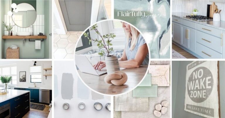
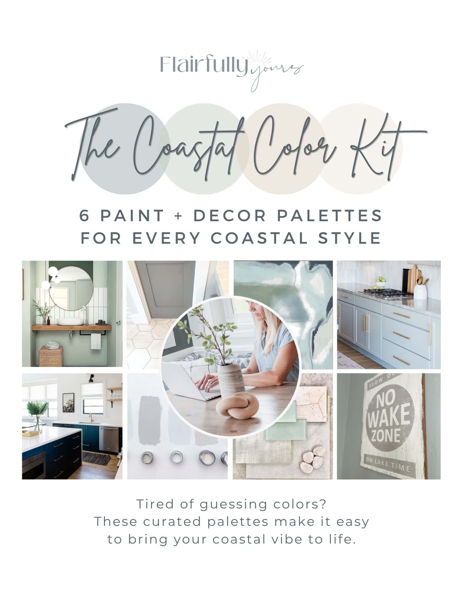
My Coastal Color Kit makes it easy — 6 ready‑to‑use coastal palettes with exact paint shades, decor pairing ideas, and guidance on what not to pair so your spaces feel calm, cohesive, and intentional without second‑guessing.
The Simple Framework for Choosing Paint Colors (Without Overthinking)
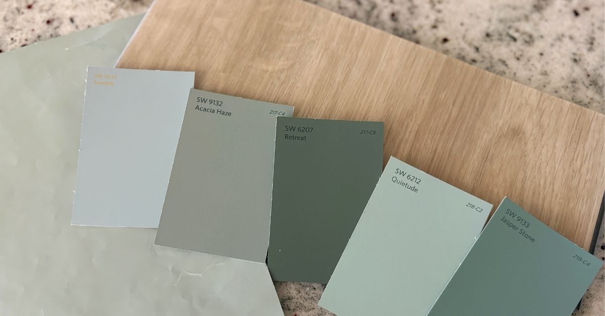
If you’ve been following me for a while or browsing the blog, you may have noticed something consistent about the color palettes I share.
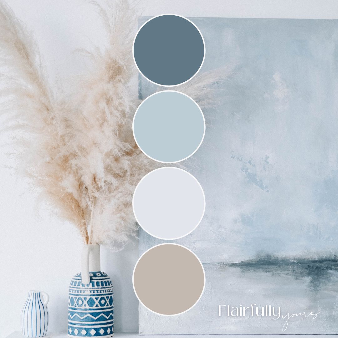
Most of them include four colors.
That’s not accidental. And it’s not about rules.
It’s about clarity.
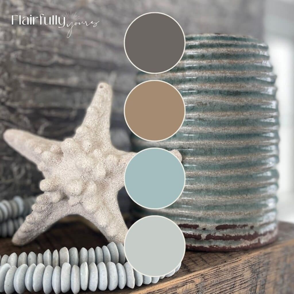
Over time (and through a lot of real-life decorating), I realized that spaces feel calmer when each color has a job, not just a place.
Instead of asking, “Do these colors go together?”
I think in terms of what each color is responsible for.
Here’s the framework — and how to apply it in your own home:

1. Choose Your Hero Color
This sets the mood.
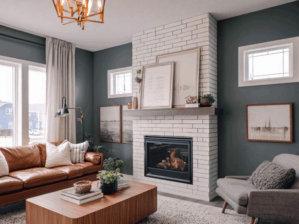
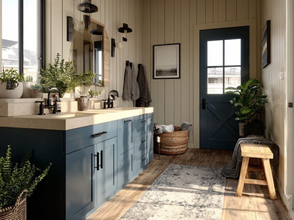
Your hero color is the emotional anchor of the space. It defines how the room feels: calm, airy, cozy, grounded, refined.
If you’ve read my posts about choosing paint or creating a coastal vibe, you’ve heard me say this before:
Mood always comes before the exact shade.
There should only be one hero. When everything tries to be the star, decision fatigue creeps in fast.
To-do:
Write down one word you want the room to feel. That word guides your hero color choice.
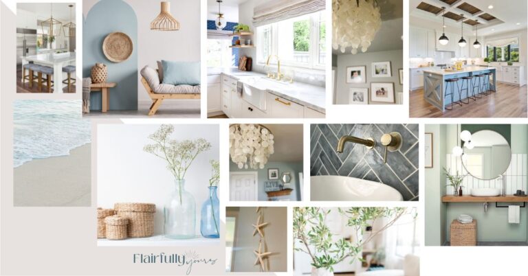
If you’re drawn to coastal style, remember this: coastal is a feeling, not a theme, and the hero color should support that mood first.
Love this idea? Keep it handy.
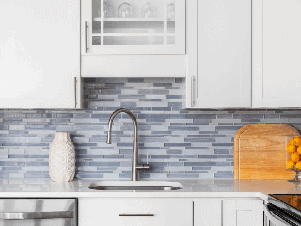
2. Add a Support Color
This adds depth without chaos.
A support color works with your hero, not against it. It adds interest and layering without pulling attention.
This is the color that quietly makes everything else look better.

To-do:
Choose a color that looks good next to your hero — not louder than it.
3. Anchor with a Neutral
This gives your eyes a place to rest.
Neutrals aren’t filler. They’re stabilizers.
They create breathing room and allow the hero and support colors to shine instead of competing. This is one of the biggest reasons calm homes actually feel calm.
To-do:
Identify where your space needs visual rest (walls, trim, larger surfaces) and let neutral live there.
4. Finish with an Accent
This adds interest intentionally.
Accent colors are small but powerful. They bring personality and contrast — without overwhelming the space.
A little goes a long way when the rest of the palette is clear.
To-do:
Pick one place for an accent: a door, a piece of furniture, or a small zone.
⭐ Quick Win: Do This Before Choosing Paint Colors
Before you buy samples or scroll Pinterest again, try this:
- Choose one inspiration piece you love
- Write down the feeling it creates
- Pull one hero color from it
- Decide what will support, ground, and accent that color
You’ve just created a color palette. Without starting from scratch or overthinking every option.
That’s it. You’re ready to move forward.
If you like simple frameworks that make decorating feel doable, this same step-by-step approach is one I use throughout my decorating process as well.
Don’t forget that trim colors play a powerful role in your home’s color scheme. If you’re unsure how trim fits into your coastal scheme, check out How to Choose the Right Trim Colors for Your Coastal Home.
Why This Framework Works (and Feels Better)
When each color has a job, you stop questioning everything at once.
You’re no longer asking:
“Do all of these work together?”
You’re asking:
“Is this doing what it’s supposed to do?”
That shift removes pressure — and builds confidence.
Calm spaces aren’t about playing it safe.
They’re about making fewer, clearer decisions and trusting them.
Want a Calm Place to Start?
If this framework helped but you’re still thinking, “Okay… but what colors should I even look at?” — that’s completely normal.
My Top Coastal Paint Color Guide is a curated set of go-to shades for walls, cabinets, trim, and accents —meant to inspire without overwhelm.
Use it as a reference alongside the roles you just defined.

Get the Top Coastal Paint Color Guide →
A Final Reassurance
You don’t need to follow trends.
You don’t need the perfect shade.
And you don’t need to overthink this.
Clear roles create calm spaces.
Fewer choices create better outcomes.
Confidence beats endless inspiration — every time.
You’re closer than you think.
And now, you know exactly where to start.