6 Best Tips for Choosing Coastal Colors in Your Home
If you’ve ever stood in front of a wall of paint swatches and felt overwhelmed, you’re not alone. Choosing the right coastal colors for your home can feel like a daunting task—but it doesn’t have to be.
The truth is, selecting the right colors isn’t just about picking a pretty shade. It’s about creating a cohesive flow through your home, where every room feels connected and calm. And that starts with choosing the right coastal colors.
Let’s break it down step by step with some practical tips you can implement in your space today!
Tip 1: Start with a Base Color Family, Not Just a Single Color
The biggest mistake I see is people choosing a single color and hoping it will work in every room. Coastal design is all about creating a cohesive feel, so you need a base family of colors that naturally complement each other.
Instead of focusing on one color, choose a family of shades that naturally work together. For instance, start with:
- Soft sandy neutrals (think light taupes and soft creams)
- Muted ocean blues (from light seafoam to deep navy)
- Warm driftwood tones (beiges, light grays, and soft browns)
These colors are versatile, they work together seamlessly, and they create that calm, coastal atmosphere you’re after.
Pro Tip
Hold a paint swatch up against your sofa or flooring (or any piece that’s not going anywhere). Does it still feel cohesive? If the color clashes with your existing furniture or finishes, it’s time to rethink the palette.
Tip 2: Build Color Around Your Coastal Style
Your coastal style should guide the colors you choose. Whether you’re going for a relaxed beach vibe, elegant sophistication, or something casual, knowing your style will steer you toward the right colors.
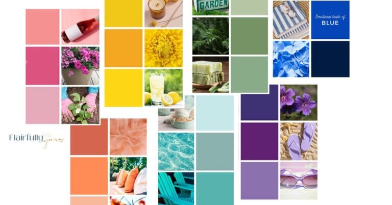
Here’s a breakdown of 6 different coastal styles and the colors that fit each:
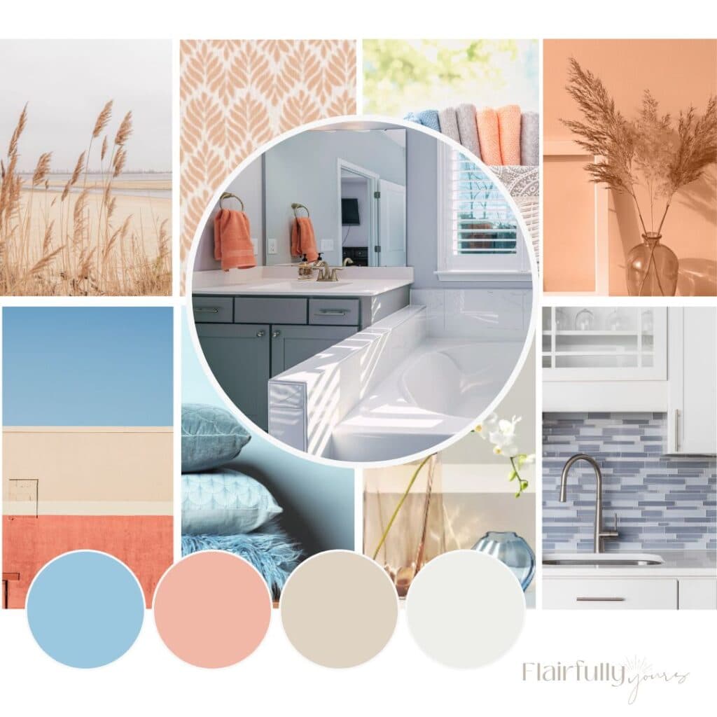
- Coastal Calm: Soft neutrals and light blues for a relaxed, serene vibe
- Dreamy Hues: Pastels like seafoam green and pale blues to evoke the feeling of cool ocean breezes
- Nature Sands: Earthy tones like warm tans and soft browns for a grounded, natural feel
- Lakehouse Breeze: Soft whites and cool blues for a crisp, clean lakeside vibe
- Coastal Glam: Deep blues and warm metallics for an elegant coastal look
- Citrus Splash: Bright accents like zesty yellow or coral paired with coastal blues for a vibrant, energizing space
Knowing your coastal style will guide you to the right color choices that reflect the vibe you want in your home.
Pro Tip
When selecting your coastal palette, think of your favorite vacation spots or beach destinations. The colors you’re naturally drawn to in those places will help guide your color choices and create the perfect, personalized coastal vibe.
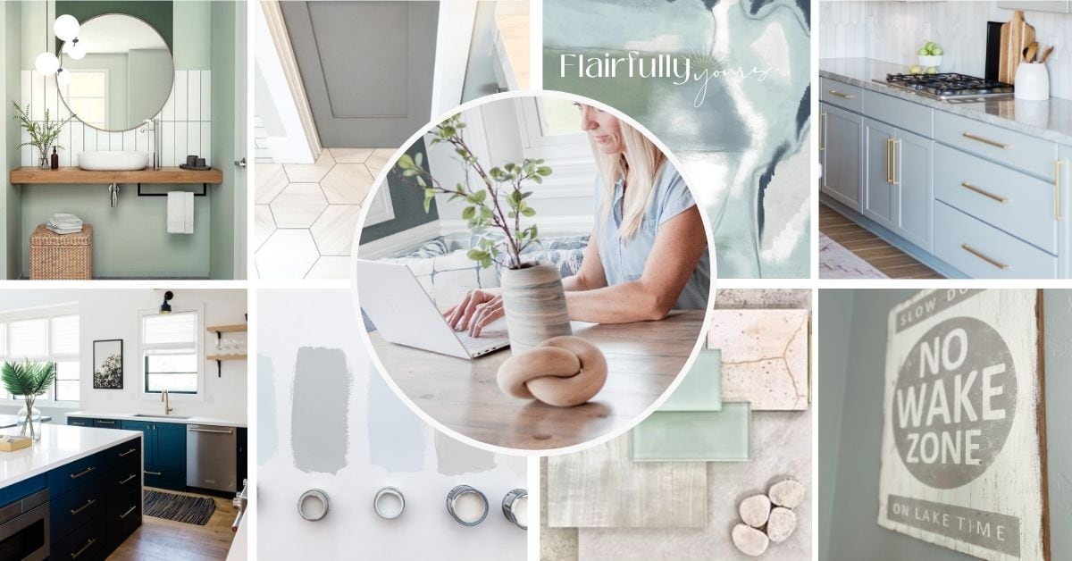
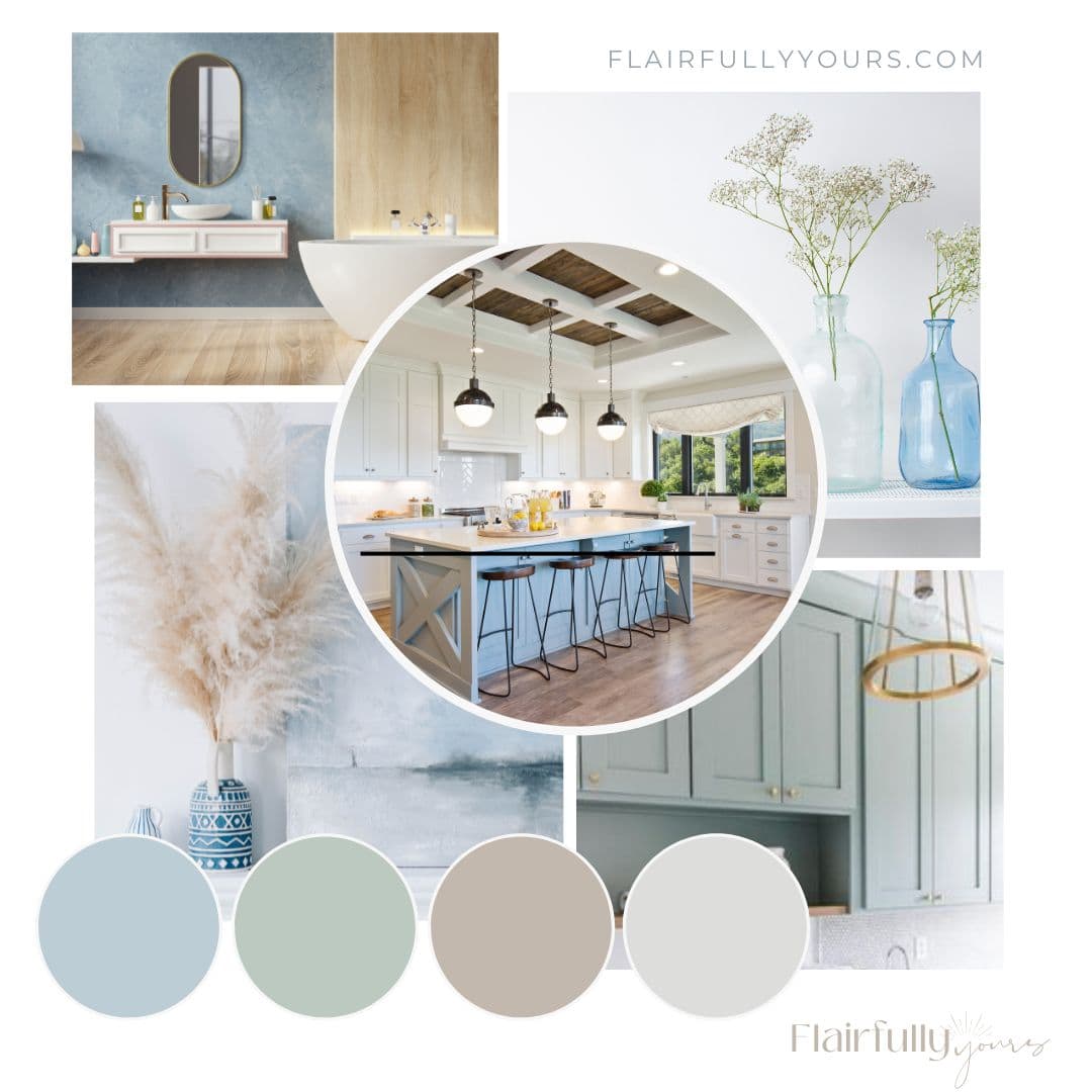
Tip 3: Use Wall Color as the Backbone, Not the Whole Story
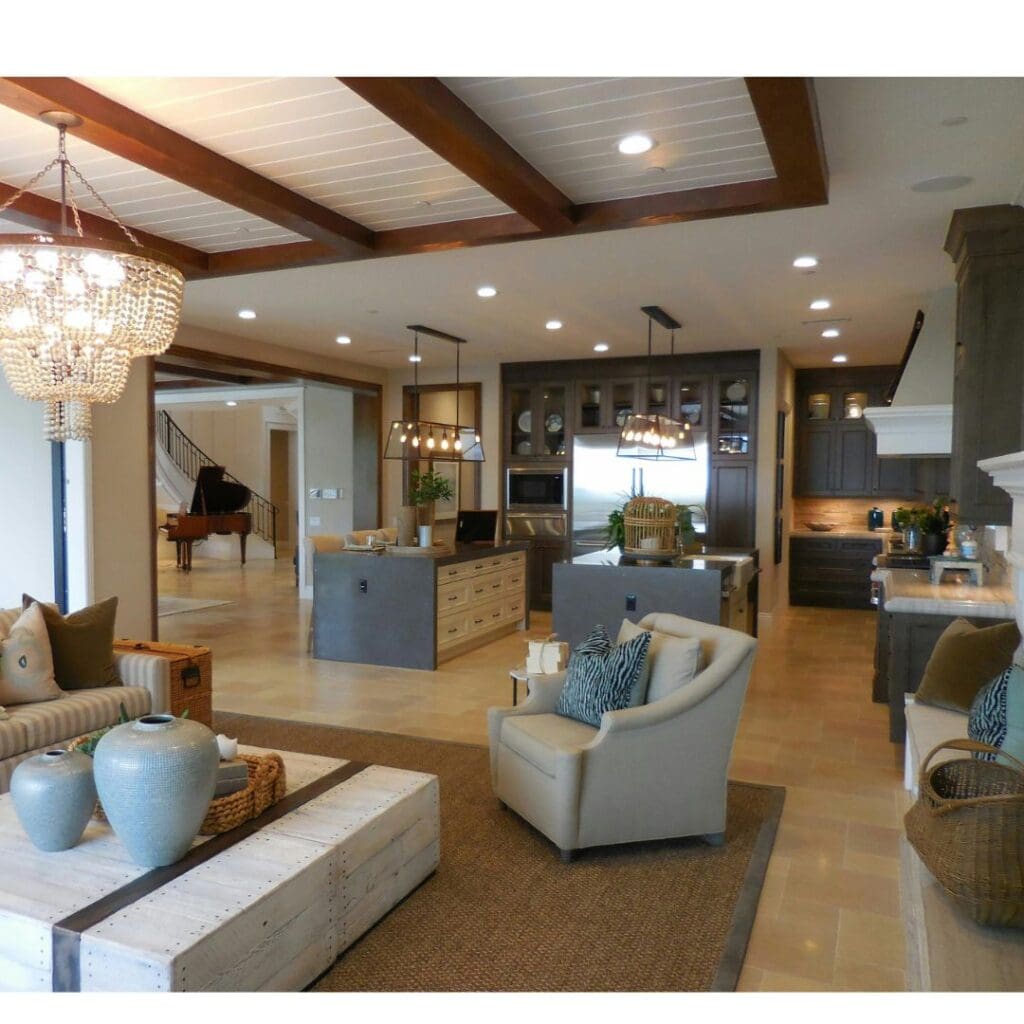
Your walls are the largest surface in your home, but they shouldn’t carry the whole design. Think of your wall color as the backbone of your room, setting the tone, but leaving room for accent colors, decor, and furniture to shine.
Start with a neutral base—soft grays, whites, or beiges—and use those to create a calming backdrop. Then, add accent colors to complement your furniture, textiles, and finishes.
For example:
- In the living room, you might choose a soft neutral for the walls and add pops of coastal blue through pillows and throws.
- In the bedroom, you might use a light neutral with a subtle dusty blue or seafoam green to create a peaceful retreat.
Pro Tip
Don’t be afraid to mix muted shades with richer accent tones. These pairings allow the colors to feel balanced instead of overwhelming. The key is to add color in layers, not just one bold color everywhere.
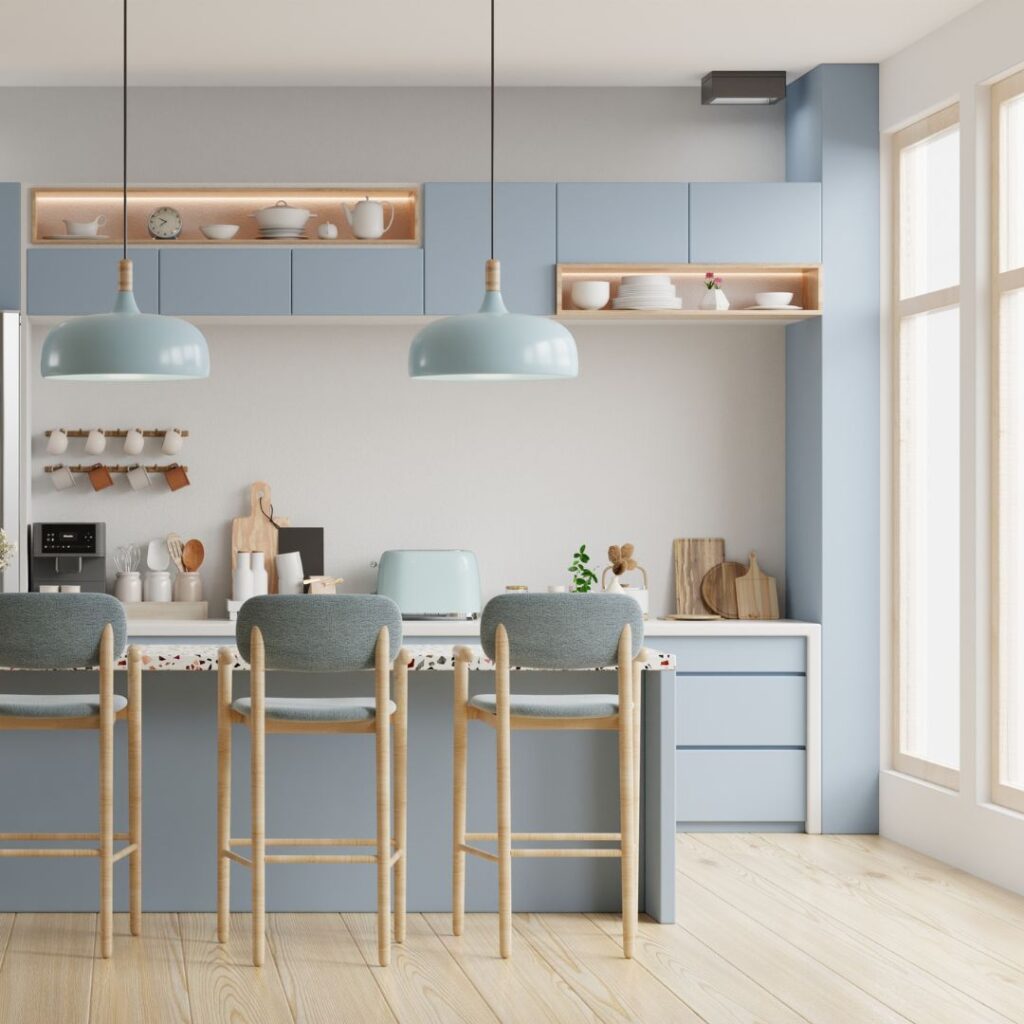
Tip 4: Link Rooms with Intentional Color Choices
Creating a cohesive color flow throughout your home doesn’t mean every room has to look the same. It’s about repeating accent colors from your coastal color palettes throughout the rooms, so the space feels connected—but each room still has its own vibe.
Here’s how to make it happen:
Love this idea? Keep it handy.
- Start with a neutral base in key areas—soft whites, warm grays, or light beiges—to create a calming foundation.
- Use the same accent colors (but in different ways) throughout your home. For example:
- Living Room: Neutral base + coastal blue and driftwood accents (through cushions, artwork, etc.)
- Kitchen: Same neutral base + soft sandy tones and a touch of coastal green
- Bedroom: Neutral base + seafoam green and light coastal blue for a serene retreat
By sticking to a neutral base across the house, you create a cohesive flow, but it’s the repetition of accent colors that ties everything together.
Whether it’s coastal blues, driftwood tones, or soft greens, the key is to repeat these colors in subtle ways across each room. This keeps everything connected while allowing each space to have its own personality.
Pro Tip
Don’t be afraid to mix tones within your chosen palette—think light coastal blues paired with muted seafoam or soft grays. By layering different shades of your accent colors, you can add depth and create a sense of movement in your space, keeping it visually interesting without feeling overwhelming.
For example, combining a soft blue with a deep navy in one room adds richness, while lighter seafoam tones can help brighten up the space. Layering shades of the same color family allows you to create contrast without losing the cohesive flow that keeps the room connected.
Bonus Tip
Pay attention to texture as well! A matte wall color can look stunning next to glossy finishes, like a reflective light fixture or polished wood furniture. Mixing matte and shiny textures will make each tone pop and add visual intrigue.
Tip 5: Let Your Decor Support Your Color Choices
When designing with coastal colors, the goal is to create a relaxed, effortless feel. Colors should complement your decor, not overwhelm it.
Coastal style is often defined by clean lines, unfussy details, and natural materials—and your colors should work in harmony with these elements to create a serene space.
Here’s how to make sure your colors enhance your decor, rather than competing with it:
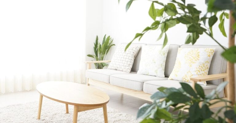
- Soft coastal neutrals (like light taupe, soft gray, or cream) pair perfectly with simple, clean-lined furniture—like a neutral sofa with wooden legs or a linen armchair. These colors don’t overpower the design but help balance the room’s elements.
- Coastal blues, when used thoughtfully, can highlight natural textures like light wood or wicker, without overwhelming the space. For example, a soft blue accent wall can feel soothing when paired with uncluttered, minimal decor.
The key is to let your decor shine with clean, intentional design choices. Don’t go for bold colors that fight against your furniture and finishes. Instead, choose hues that complement and highlight the simplicity of your coastal aesthetic.
Pro Tip
Keep your design minimal and refined. Soft blues, beiges, and whites enhance unfussy details like simple furniture and open shelving. When in doubt, less is more—choose colors that bring out the beauty in your decor, not distract from it.
Tip 6: Test Your Colors in Your Own Space

Testing colors in your space is the only way to make sure you’re choosing the right one. The coastal colors you love might look completely different in your room, depending on your lighting and surrounding finishes.
The soft blue you loved in the store might end up looking too bright, or the neutral beige could feel too dark when it’s on the walls. Make sure the “greige” you thought was perfect doesn’t look yellow or pink in your space!
Here’s how to test:
- Test swatches on different sections of your walls.
- Observe how they change under natural and artificial lighting.
- Consider how the colors interact with your furniture, floors, and decor.
- Move your swatches around to see how they look from different angles.
Pro Tip
If the colors clash with your existing design elements, it’s time to rethink. The key is to make sure your colors complement your space and work in the context of your home.
How the Coastal Color Kit Helps You Get It Right
Still unsure? That’s exactly why I created the Coastal Color Kit.
If you’ve been struggling to select the perfect coastal colors for your home, THIS is the solution you need.
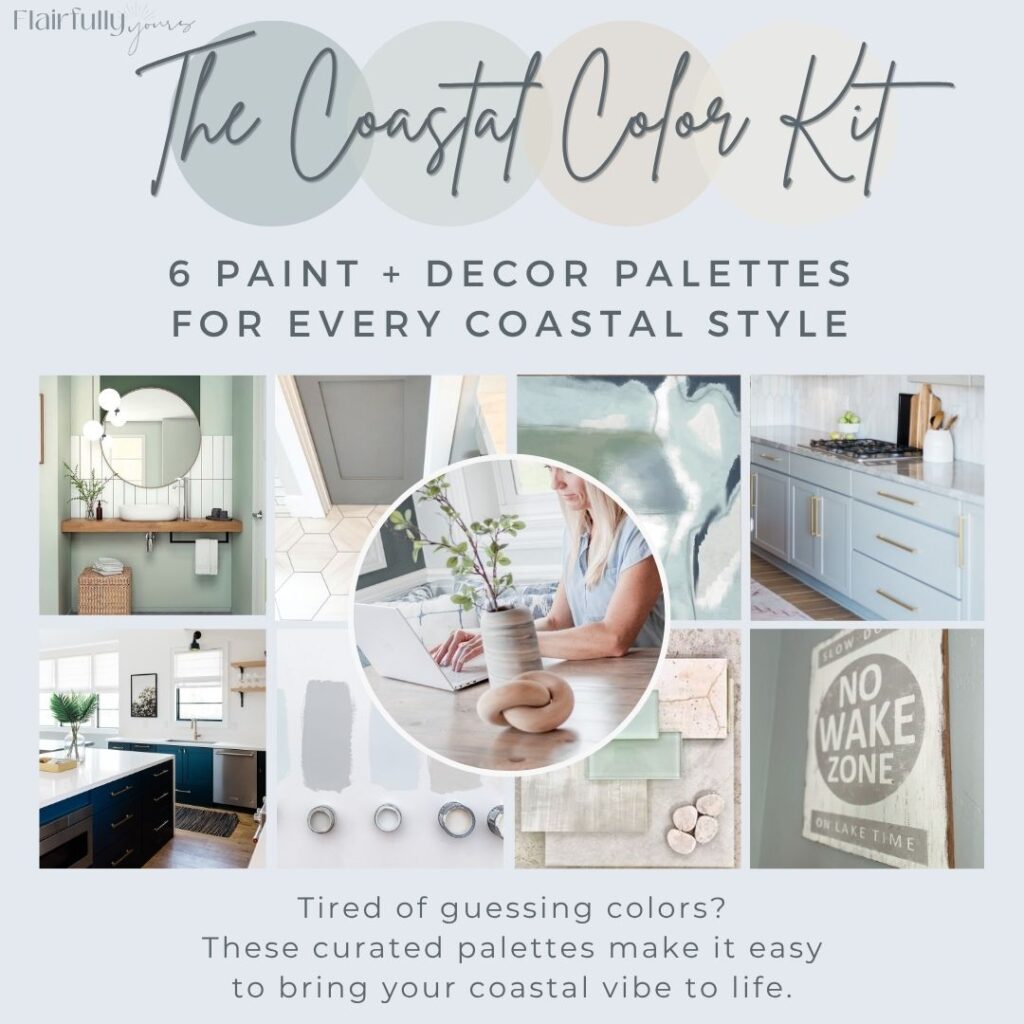
With the digital Coastal Color Kit, you get:
- 6 curated palettes that work seamlessly with every coastal style
- Mood boards to visualize how the colors will look in your home
- Decor pairings to complement your chosen colors
- What to skip: Avoid common color mistakes that can throw off your whole design
- Testing tips to make sure the colors look right in your unique space
It’s your shortcut to choosing colors with confidence and creating the cohesive coastal flow your home deserves.
Ready to make the right choice?